Polaris
Ugal Coast
FlameCursed
Strategically-placed pits block our hero's progress.
ywkls
First draft- title screen
Sheik
Not retro. Just old.

 This topic is locked
May the way of the Hero lead to the Triforce.

Posted 07 August 2016 - 09:46 PM
Polaris
Ugal Coast
FlameCursed
Strategically-placed pits block our hero's progress.
ywkls
First draft- title screen
Sheik
Not retro. Just old.
Hero of Time

Posted 07 August 2016 - 09:49 PM
Yes I'm that guy who dreamt Dani was Zelda. LOL Cimfam/zelda

Posted 08 August 2016 - 05:02 AM
Why do you always make this so hard for me because these are so good.
Im voting Ywkls....mainly because of a gut feeling. These are all great.
Master

Posted 08 August 2016 - 08:15 AM
Nulling my vote since I'm in this one. So, here's my thoughts on the others.
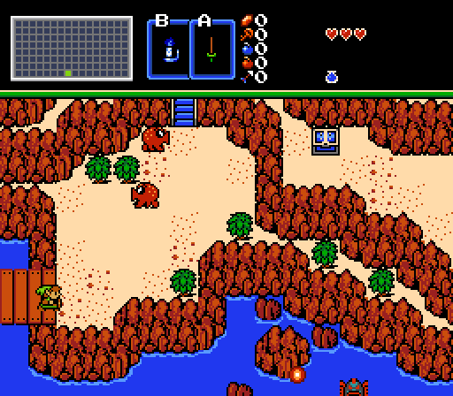
Polaris- That tileset defiinitely looks different than any I remember. The cliffs are very brown, the enemies and Link look strange and even the items and treasure chest seem... off... somehow.
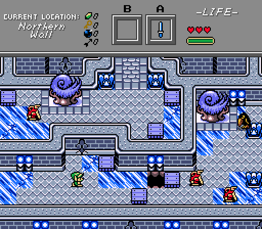
FlameCursed- A very icy dungeon entrance. I think that tileset is designed to make that sort of thing easy, because I've never had any luck with achieving that sort of atmosphere in the overworld. Definitely my favorite competitor, this week.
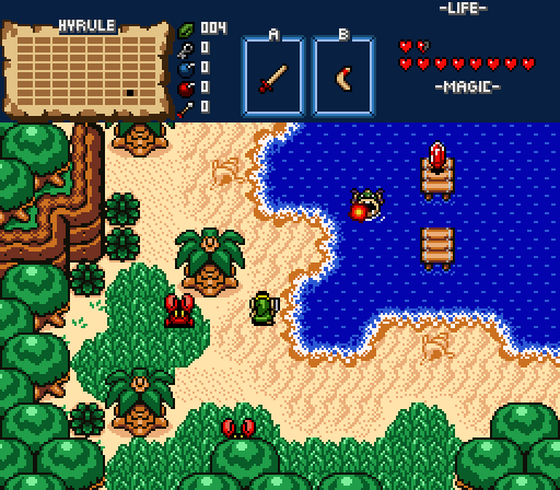
Sheik- That shot does remind me of the original Legend of Zelda. There's not much going on here, though.
Pretty good effort, overall!
Edited by ywkls, 08 August 2016 - 08:16 AM.
Tell all with glee, Argon's on PureZC

Posted 08 August 2016 - 09:15 AM
All look really good... Difficult choice this week.
Polaris: That tileset is so awesome. Cartoony classic? I like it a whole lot and the screen design looks fun to play.
FlameCursed: Though those walls at the northern edge look really confusing to me, it looks real good overall. It got me wondering what
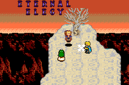
Ywkls: That looks like a great title screen! I just think those letters aren't very fitting for the title. I'm sure there are others in the PZC database to use. It's gradient type of shading doesn't really fit the rest of the graphics, so optionally you could change the shading and coloring on them.
Sheik: That screen design is just perfect and I've always liked the NewFirst tileset. I love the little Z1 styled ladder bridge. Is this a Z1 remake by any chance?
I voted for Sheik, but it was a tough choice, all others were very good too.
Deified

Posted 08 August 2016 - 12:19 PM
Thanks for the feedback everybody.
Sheik: That screen design is just perfect and I've always liked the NewFirst tileset. I love the little Z1 styled ladder bridge. Is this a Z1 remake by any chance?
Yeah, this is some kind of Z1 remake. Or spin-off maybe. Basically, I am remaking the BS Zelda overworld in Newfirst right now. I plan to make a Dark World version of it, too.
ringle

Posted 11 August 2016 - 07:37 AM
Polaris - Great to see this tileset being used again. Very nicely done. I like the layout of this screen, and it's very nice and simple.
FlameCursed - Very nice screen here. This reminds me a lot of the Temple of Seasons from OoS and the screen looks well made too. I can't see any criticisms with this one, so good job.
ywkls - It looks alright, but it's the weakest of the shots this week IMO since it does look quite weird. There's a lot of weird colouring here (especially with the tree, snow ground and NPCs). I like the concept though.
Sheik - Awesome work here. This tileset is being used so nicely, I really love what you're doing here. Good work.
I voted for Sheik this week.
May the way of the Hero lead to the Triforce.
Posted 15 August 2016 - 08:23 PM
With 40.43% of the vote, the winner of Screenshot of the Week 571 is FlameCursed!
Congratulations!
Voting totals:
- Polaris (7 votes [14.89%])
- FlameCursed (19 votes [40.43%])
- ywkls (5 votes [10.64%])
- Sheik (16 votes [34.04%])
0 members, 0 guests, 0 anonymous users


