"ZC64" Logo
Overview
Creator:
Radien
Added: 08 Dec 2006
Downloads: 73
|
Download Tile (2.19 KB) |
||
| Tags: 16-color, Decoration, Misc, Original | |||
")
Information
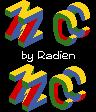
Beta Link made a nice submission titled "Nintendo64 "N" Logo." It was an amusingly out-of-place rippable logo of the console that produced Ocarina of Time.
Limzo made the comment that he wished it was a "Z," instead. I took the comment to heart and made this.
You can rip the Z and the C on the top 3 rows if you want each letter to be centered, or you can rip the bottom 3 rows and have them close together. If you don't like the C, which I added as an afterthought, the Z stands just fine [View Full Description]
About Reviews
Description
Beta Link made a nice submission titled "Nintendo64 "N" Logo." It was an amusingly out-of-place rippable logo of the console that produced Ocarina of Time.
Limzo made the comment that he wished it was a "Z," instead. I took the comment to heart and made this.
You can rip the Z and the C on the top 3 rows if you want each letter to be centered, or you can rip the bottom 3 rows and have them close together. If you don't like the C, which I added as an afterthought, the Z stands just fine on its own.
Since Beta Link's version wasn't in any particular tileset's palette, I colored into DoR CSet 6 for the heck of it. They are easily recolored, though, as they use just four colors total.
****NOTE:****
Before you say it, this is NOT a "5-minute edit" of Beta Link's submission. I was only able to imitate his idea and the size of the logo. I pretty much had to remake them from scratch, otherwise, so no cocky comments, please.
Credits
Beta Link
Limzo
Nintendo...(?)
Limzo
Nintendo...(?)