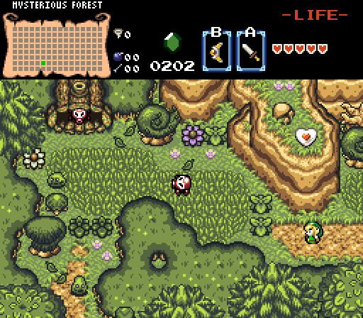
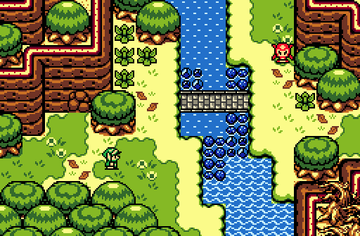
MrPow - Pretty good start actually, I like the direction you're going with this screen. I'd probably try to fix up the mountains on the top-right since they look like they're kinda going into each other, which looks quite weird and causes some really bad perspective issues. The big tree on the top-left looks odd too, since it kinda looks like there's no base (even though I assume the forest brush would be the base of the tree). Other than that though, nice screen.
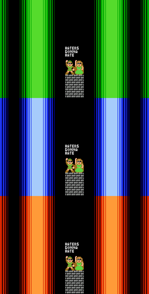
Mitsukara - D E A L W I T H I T
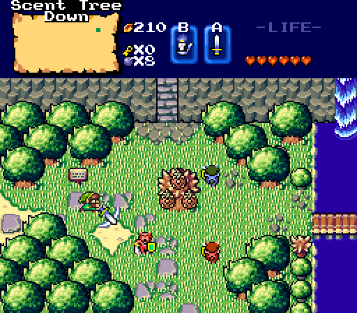
Alestance - Very nice screenshot. I really like how this modified BS tileset is coming along. Like Sheik said though, I'd probably suggest making those seeds smaller so that you can kinda see more of the tree. Either way, nice work.
Joelmacool - Another great shot. I like the design of this one, especially with the different types of trees and detail you have. I don't really have any complaints with this one, so good work!
I voted for Joelmacool this week.


 This topic is locked
