Joelmacool12
"Somewhere here there is a castle, in that castle I'd like you to steal the gem." ~ Link's Dad
ywkls
It's a good thing we can switch the time of day whenever we want, isn't it?
Jared
New palettes are weird...

 This topic is locked
May the way of the Hero lead to the Triforce.

Posted 06 September 2015 - 05:30 PM
Joelmacool12
"Somewhere here there is a castle, in that castle I'd like you to steal the gem." ~ Link's Dad
ywkls
It's a good thing we can switch the time of day whenever we want, isn't it?
Jared
New palettes are weird...
life is fragile, temporary, and precious

Posted 06 September 2015 - 05:40 PM
What's up my playas

Posted 06 September 2015 - 07:11 PM
Edited by ZeldaPlayer, 06 September 2015 - 07:12 PM.
King of Pridenia, Safehaven of the LGBTQ

Posted 06 September 2015 - 07:36 PM
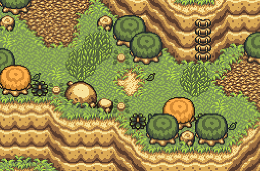
Joel - Why do the steps just stop all of the suddenly? They go up and abruptly stop. Other than that, pretty nice screen.
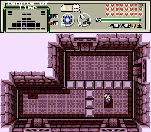
ywkls - It's a solid screenshot, but the room feels too empty.
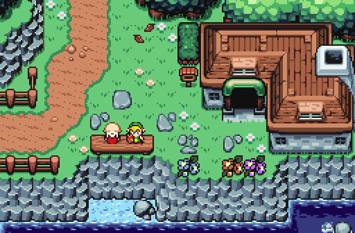
Jared - Possibly Link and the old man going fishing early in the morning? This one gets my vote.
Master

Posted 06 September 2015 - 08:04 PM
Nulled since I'm in this one. On the others.
Joelmacool12- a very nice mountainside. If that's the tileset that I think it is, I know from experience how hard it can be to get those things to look the way that you want.
Jared- I'm really liking that Tileset. Once it is released, I may do a quest in it some day. One of the things I used to look for in tilesets was unique entrances to dungeons and options when it came to doing stuff in the overworld as well as a lot of palette choices. From what I've seen of the other shots you've done, this has a lot of potential.
Good job by all!
Deified

Posted 06 September 2015 - 09:12 PM
I approve of all of these screens. All three show skill at screen design, so it's a matter of picking the best, plain and simple.
Joel - Again, very good design. But it lacks possible extra elements, such as enemies, protagonist, and/or a subscreen potion, which might make a difference in a tie breaker sort of scenario for me. Good work with what would have still taken up at least 80% of the effort, I think.
ywkls - Love the choice of graphics for a simple but functional dungeon room.
Jared - Beautiful screen, and I like the palette. You pulled it off sir. I really don't have to say much. One of these days I will get around to voting for somebody else's screen, but today is not one of them. I also noticed the moment of romance too. You really get that impression.
Addicted to Overwatch

Posted 07 September 2015 - 04:18 AM
Joel - Why do the steps just stop all of the suddenly? They go up and abruptly stop. Other than that, pretty nice screen.
This is because this is part of the floor (Above from where the ladder ends). At first it seems strange but then you start to see what I mean.
one point nine hero

Posted 07 September 2015 - 08:34 AM
ringle

Posted 07 September 2015 - 08:40 AM
Joelmacool12 - This is an amazing shot, with the perfect setting of a mountain. Screen design is impeccable and I have no criticisms at all other than that ladder which just randomly cuts off into the mountain. Other than that, great work.
ywkls - A pretty standard dungeon shot. There isn't much in the design area of things but it gets the job done.
Jared - Another really great shot. Just like Joel's, I really love the use of screen design. The palette looks very interesting too, it reminds me of Lake Hylia from Minish Cap for some reason. Other than that, amazing work man.
Overall, it was extremely hard to decide who to go for this week. Jared and Joel are equally amazing for me, but since I can only choose one, I guess Joel's was just barely better.
May the way of the Hero lead to the Triforce.
Posted 13 September 2015 - 11:16 PM
With 63.16% of the vote, the winner of Screenshot of the Week 524 is Jared!
Congratulations!
Voting totals:
- Joelmacool12 (8 votes [21.05%])
- ywkls (6 votes [15.79%])
- Jared (24 votes [63.16%])
0 members, 0 guests, 0 anonymous users


