"The only way forward is to go up." - Guy in cave.
bmc10011
This place looks fun.
GrantGreif
Meh. I'm sure he's fine in there.

 This topic is locked
May the way of the Hero lead to the Triforce.

Posted 19 April 2015 - 10:06 PM
💙

Posted 19 April 2015 - 10:07 PM
If all else fails, vote for Joel. He made please.
Edited by Shane, 19 April 2015 - 10:12 PM.
Saint Alestance - Eliminator of the ZGP format

Posted 19 April 2015 - 10:10 PM
Joelmacool? More like JoelmaDROOoooooooooor I could vote for him, too.
Defender

Posted 19 April 2015 - 10:11 PM
voted joel this time because it looks the best out of all three
bmc1011
Screenwise alone, it looks too plain to me.
That doesn't mean the overall experience will suffer.
GrantGreif
That screen is so bright I feel like I'm bout to go more blind than I already am
Edited by SyrianBallaS, 19 April 2015 - 10:14 PM.
Initiate

Posted 19 April 2015 - 11:00 PM
More EZGBZ? Aw, you shouldn't have.
Joelmacool12: Looks nice. I like the adventurous feeling it gives.
bmc10011: Once again, it's a good screen design-wise, but it's too derivative of Isle of Rebirth (the lower levels of Sunken Basin, the Cucco enemies) for it to get my vote.
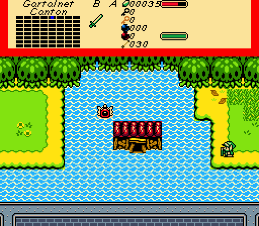
GrantGelf: Nothing special, honestly. A bit blocky in places, devoid of enemies and action, not too visually interesting, and it looks like you misspelled "Canyon" (none of the definitions for "canton" on Wiktionary really fit).
Deified

Posted 20 April 2015 - 07:46 AM
Edited by NewJourneysFire, 20 April 2015 - 07:49 AM.
ringle

Posted 20 April 2015 - 11:12 AM
If all else fails, vote for Joel. He made please.
Indeed.
Time to review the screens for this week:
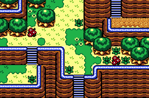
Joelmacool12 - IMO the best screen of the week. That's a very solid mountain shot and the elevation of each mountain is perfectly done. Details are really nice and spaced out and it's got everything needed for my vote this week. Great job!
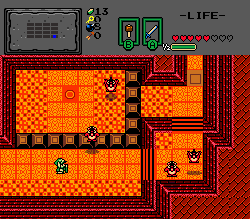
bmc10011 - A pretty solid shot. Nothing too special but those red Legendary Roosters everywhere make the area seem pretty unique. Then again, screen design wise, it's not much, but it's pretty good.
GrantGrief - I'm not a really big fan of this shot sadly. It's not bad by any means, but the majority of the screen seems to be water with a single broken house and some land on the sides. The grass section over on the left is quite plain and maybe a bit of water details could help the water look less bland.
Joel. Let me be the first to say you're showing a lot of improvement.
Actually, I told Joel this quite a while ago ![]()
Edited by Eddy, 20 April 2015 - 11:15 AM.
Deified
Posted 20 April 2015 - 11:23 AM
Actually, I told Joel this quite a while ago
Let me be the first after Eddy to say you're showing a lot of improvement.
💙
Posted 20 April 2015 - 11:26 AM
I actually I also told Joel he was improving a while back too... I think you are a tad late. But I agree with you and Eddy nonetheless. ![]()
Deified
Posted 20 April 2015 - 12:06 PM
Edited by NewJourneysFire, 20 April 2015 - 12:08 PM.
Addicted to Overwatch

Posted 20 April 2015 - 12:34 PM
I actually told myself when I was born... so yea...
Screenshots looks cool.
I'd say my favourite is Joelmacool12's.. no bias.
What's up my playas

Posted 20 April 2015 - 01:45 PM
Unbeknownst to danger we call upon your help

Posted 20 April 2015 - 04:05 PM
Joel - because is dangerous to try new things here.
It's just better to follow the same old same old.* //
The Magma Chicken dungeon and house in the middle of the water does not work.'
"Or else i want to see the chickens Spitting out FIRE and magma flame streams at the player from their beaks."
Or the water house needs to be on a big Raft or boat unless is sunken only show the rooftop.
Edited by SkyLizardGirl, 23 April 2015 - 02:33 PM.
Trofessional Pransposer

Posted 20 April 2015 - 07:34 PM
Experienced Forumer

Posted 21 April 2015 - 07:15 AM
Joelmacool12 - A nice, mountainous shot. It gives a nice feel of elevation and, while still keeping that nice mountain feel, avoids cramping the player with to little walking space.
bmc10011 - Looks interesting. I don't know why but for some reason I feel like it might be a bad idea for Link to walk on the alternate floor tiles. I really don't know why it would be a bad idea though, and for all I know it may not be a bad idea. It just looks like a bad idea to me haha.
GrantGreif - For some reason, this is the screen that I would most like to play. While visually it's not very appealing, it really makes me wonder whats in the flooded house. Visually, I think it could profit from less symmetry. In my opinion, the trees at the top are a little too uniform and I find it odd that the house is practically the same distance from either island.
0 members, 0 guests, 0 anonymous users


