Jump to content

Photo

Screenshot of the Week 484

Dwarlen Zahalfor Evan20000 Twilight-Prince

  • This topic is locked This topic is locked
41 replies to this topic

Poll: Screenshot of the Week 484 (77 member(s) have cast votes)

~

You cannot see the results of the poll until you have voted. Please login and cast your vote to see the results of this poll.
Vote

#1 The Satellite

The Satellite

    May the way of the Hero lead to the Triforce.

  • Members
  • Real Name:Michael
  • Pronouns:He / Him

Posted 01 December 2014 - 08:40 PM

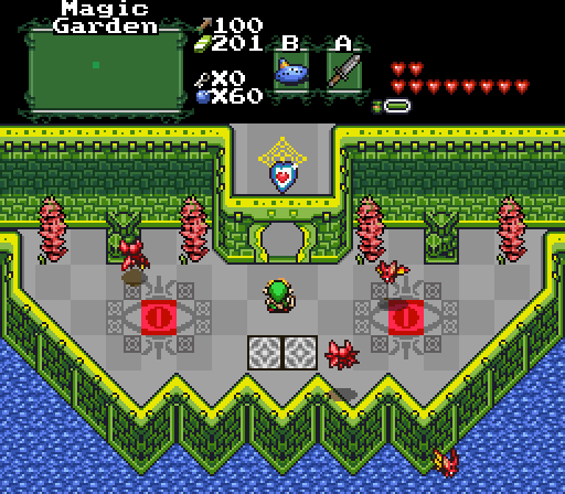
Zahalfor

Zahalfor.png

Link: Where in Zelda Classic have I warped to?


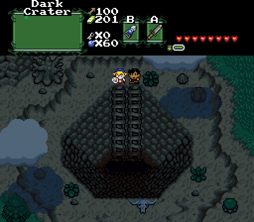
Dwarlen

Dwarlen.png

NPC: "Link, you go first." Link: "Seriously? It's dark down there, you go first!" NPC: "But Link, you're the hero! And the one with the sword I might add."


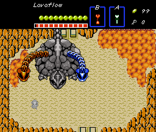
Evan20000

Evan20000.png

TS needed an extra shot this week and I suck at making screens, so have a boss fight instead.


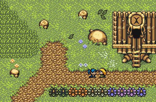
Twilight-Prince

Twilight-Prince.png

Thought I'd try something a bit more simple. Two childhood friends visiting each other.~


  • Twilight-Prince, Lightwulf, Evan20000 and 1 other like this

#2 HavoX

HavoX

    Has more posts in Doomworld than in PureZC

  • Members
  • Real Name:Jon
  • Location:Republic, Missouri

Posted 01 December 2014 - 08:41 PM

Evan20K wins, everyone else can go home now. :P


#3 Evan20000

Evan20000

    P͏҉ę͟w͜� ̢͝!

  • Members
  • Real Name:B̵̴̡̕a҉̵̷ņ̢͘͢͜n̷̷ę́͢d̢̨͟͞
  • Location:B̕҉̶͘͝a̶̵҉͝ǹ̵̛͘n̵e̸͜͜͢d҉̶

Posted 01 December 2014 - 08:42 PM

No, this isn't a mockup.

The video is a bit old and the bug with the tail has long since been fixed.
  • SpacemanDan, Eddy, Avaro and 5 others like this

#4 Twilight-Prince

Twilight-Prince

    The Adversary

  • Members
  • Real Name:Starts with a letter of the alphabet.
  • Location:Way Out There

Posted 01 December 2014 - 09:16 PM

My screen was made in about 15 minutes...I don't expect it to go far. XD


#5 Haylee

Haylee

    ~ Hope of Energy Nede ~

  • Contributors
  • Real Name:Haylee
  • Pronouns:She / Her
  • Location:Italian Restaurant in Koorong

Posted 01 December 2014 - 09:41 PM

Zahalfor - Those colors are seriously hurting my eyes. Are those sprite CSets? If so, there's your problem. This screen needs quite a bit of clean up.


Dwarlen - Gets my vote this week. It's nice looking, detailed, and uses all of the screen to make it look nice.


Evan20k - Honestly not a fan of it. Sure, there's a cool looking boss on the top left corner, but the rest of the screen looks otherwise fairly bland.


Twilight-Prince: Similar to Evan's it only uses one section of the screen, and sticks to that section as the focus. It'd be nicer if there were some more detail on the top half to balance out the detail on the bottom half.


  • Shane, Demonlink, coolgamer012345 and 1 other like this

#6 nicklegends

nicklegends

    Trofessional Pransposer

  • Contributors
  • Real Name:Ed
  • Pronouns:He / Him

Posted 01 December 2014 - 09:51 PM

Dwarlen's shot harnesses a feeling of adventure and spurs my imagination, not to say the other shots were poorly composed.
  • Shane, Avaro, Evan20000 and 1 other like this

#7 Dawnlight

Dawnlight

    My name is NOT Jason!

  • Members
  • Real Name:Justin
  • Location:Chicago, IL

Posted 01 December 2014 - 10:04 PM

Evan20k wins my vote. I wonder how functional that boss is? 


#8 coolgamer012345

coolgamer012345

    🔸

  • Members
  • Location:Indiana, USA

Posted 01 December 2014 - 10:17 PM

the first shot is like.. I guess if the colors where fine it would look better, probably a lot better.

The second shot is the best one (to me, of course), the depth of the pit looks weird (I would imagine it would look darker 'sooner'), but it isn't too much of a problem. Evans shot is just.. its just bad. the screen is very bland, there is a random bit of lava, the colors clash, the colors of the ground 'stakes' (forgot what there name is and Link is grey, .. (the last reason is kinda subjective, but still)


the last shot is okay, there are open corners, and for some reason, at the end, there is a pruple bush, then 2 blue ones, then anpther pruple one, rather then something like two purple bushes then 2 blue bushes, following the pattern. also, there is a random bit of CSet 4 grass near the NPCs.


My vote goes to Dwarlin's shot.


  • Shane and HavoX like this

#9 Lejes

Lejes

    Seeker of Runes

  • Members
  • Location:Flying High Above Monsteropolis

Posted 01 December 2014 - 10:28 PM

I voted for Evan. It's so rare to see something that would actually be worth playing in a screenshot contest.


#10 Shane

Shane

    🩶

  • Moderators
  • Location:South Australia

Posted 01 December 2014 - 10:51 PM

I voted Dwarlen because it was the most (if not only) aesthetically pleasing screen. The others were too unstructured or bland or using the wrong Csets.


  • coolgamer012345 likes this

#11 SUCCESSOR

SUCCESSOR

    Apprentice

  • Banned
  • Real Name:TJ

Posted 02 December 2014 - 02:15 AM

I don't usually vote on these but chat brought me here so I figured why not? Zahalfor and Dwarlen both had great concepts. I nearly voted for Zahalfor's because I love the use of tiles to make a grouchy looking face for a castle entrance. If that closed door made a 3rd eye I would have been sold. What killed it for me was those red things up against the wall. I don't know if you are using them wrong or they are just supposed to be ugly. Dwarlen's shot just works all around and really stimulates my curiosity gland. Obviously voted for it.


Evan's shot is not particularly interesting or pretty but it's a boss room and that's just how boss rooms are.


Twilight-Prince, while there is nothing offensive about it there is a lot that doesn't work. Most notably, a straight line of bushes no matter how many-colored it is still looks just like a straight line of bushes. That isn't all that bad but the left third of the screen seems to try to break up the squareness but the squareness works unlike the odd tallgrass shape butting up against the odd dirt-path shape with nothing else there to take focus away. On that side of the screen you might either go for 'less is more' or more of something else. I really love the right third of the screen!


  • nicklegends, The Satellite, Shane and 4 others like this

#12 Twilight-Prince

Twilight-Prince

    The Adversary

  • Members
  • Real Name:Starts with a letter of the alphabet.
  • Location:Way Out There

Posted 02 December 2014 - 05:19 AM

Evan20k wins my vote. I wonder how functional that boss is? 


If the video Evan posted here says anything, the boss is quite functional.~


...Just don't ask him to script it again.


  • Evan20000 and Demonlink like this

#13 Jenny

Jenny

    Hero of Time

  • Contributors
  • Real Name:Jennette

Posted 02 December 2014 - 07:41 AM

I voted for Dwarlen as his screen gives off a neat atmosphere. 


Zahalfor: The screen works for what I assume it wants to do; but the colors are just odd. I can't really comment much further than that as it's still a functional screen... but those colors lol.


Evan20000: The screen design itself is rather basic and empty. Are you sure you didn't mean to enter Enemy of The Month?


Twilight-Prince: Pretty basic but that's what it seems to be going for. As for a screen it looks like those bushes at the bottom would get in the way when moving from the screen below, but that's only minor. Basic overall but that's not really a bad thing.


  • Shane and Twilight-Prince like this

#14 TheLegend_njf

TheLegend_njf

    Deified

  • Members
  • Real Name:Grant

Posted 02 December 2014 - 08:13 AM

Dwarlen gets my vote.

I think Zalhalfor's image could have been the best if he just used a different palette. The palette he is currently using is kinda ugly. No offense. :(

Edited by NewJourneysFire, 02 December 2014 - 09:35 AM.

  • Shane likes this

#15 DCEnygma

DCEnygma

    you're going to have a bad time

  • Members
  • Real Name:Justin
  • Location:Indianaland

Posted 02 December 2014 - 08:21 AM

Zahalfor - Hm, not really feeling this one. I can't make out what those red pillar things are supposed to be, the Hylian eye center tile being all red (including the edge around the iris) looks really bad, and with the color of the floor I'm not about sure the perspective at the top of the screen (i.e. is that heart piece just through the door and it's an archway, or is it on an upper level and you walk through the door to enter the building?). Overall, just doesn't work at all for me.


Dwarlen - WOW. There is a definite sense of foreboding with this scene. It's a perfect example of saying a lot while using very little. I don't have any suggestions or anything, well done screen. :)


Evan20000 - Well, that sure is a Trinexx. The sprite work is really solid on it and I like the arena composition, though I'd question why a half-ice dinosaur thing is hanging what is either a lava filled desert or a volcano. :P (and yes, I questioned it in LTTP as well.)


Twilight-Prince - I like the premise of the screen, and it looks like an area that fits well in a small village, but there's just not much happening in the left half of the screen. This is another situation where the screen is good and will look great in a quest, but as a featured screen doesn't really jump out at me.


Dwarlen wins this week, though Evan and Prince both had good screens as well. :D


  • Twilight-Prince likes this


Also tagged with one or more of these keywords: Dwarlen, Zahalfor, Evan20000, Twilight-Prince

0 user(s) are reading this topic

0 members, 0 guests, 0 anonymous users