NewJourneysFire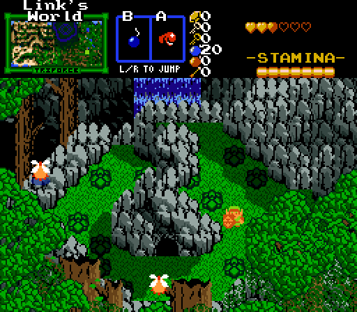
These Peahats better be flying types!
Russ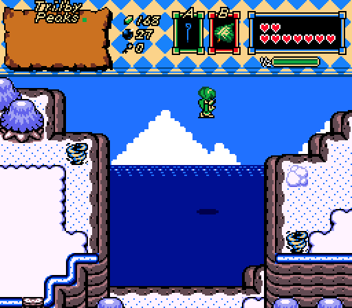
Soaring in the blue, Flügel der Freiheit!
nicklegends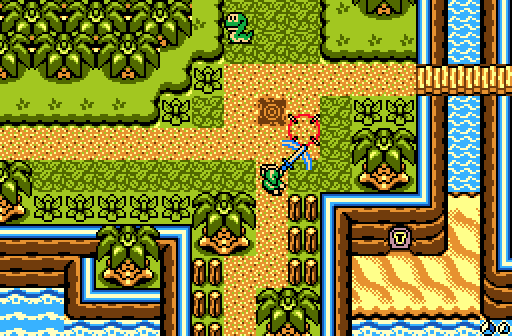
Take that, slithery snake guardian!
Demonlink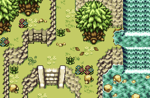
We need this tileset finished! :O
Benji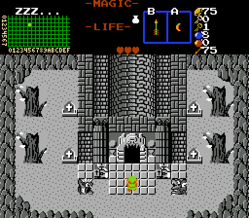
Is Link dreaming... or is it more than that?
Hoff123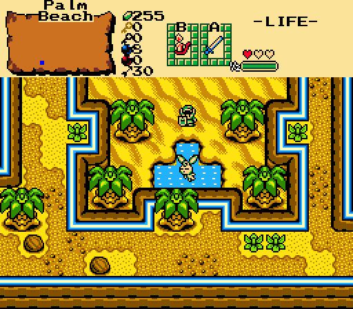
"Hi there! My mom has gotten pretty fat lately, so instead I have to do her work."

Screenshot of the Week 446
Started by
The Satellite
, Mar 09 2014 07:32 PM
NewJourneysFire Russ nicklegends Demonlink Benji Hoff123
-
 This topic is locked
46 replies to this topic
#1

The Satellite
-

- Members
-

May the way of the Hero lead to the Triforce.
- Real Name:Michael
- Pronouns:He / Him
Posted 09 March 2014 - 07:32 PM
#2
Shane
-

- Moderators
-

💙
- Pronouns:He / Him
- Location:South Australia
Posted 09 March 2014 - 07:38 PM
Voted for nicklegends, I love the environment and what's going on.
NewJourneysFire's I don't even understand at all, where are we supposed to walk? Readability comes a long way, there's just too much going on!
Russ's is a bit bland in the center, and on the upper snow terrain. Footprints could work.
Demonlink's was close second for the amazing screen structure, but I'm not a fan of the detailing (or rather the lack of detail in between) or water (graphics themselves).
Benji's is alright, but the tower has some serious perspective/visual issues.
Hoff123's is somewhat true to the OoA visuals (again), but the screen design feels man made rather than natural with it having a mirrored design.
Edited by Charizard, 09 March 2014 - 07:52 PM.
#3
TheLegend_njf
-

- Members
-
Deified
- Real Name:Grant
Posted 09 March 2014 - 07:45 PM
The center rock is like a pillar, you can walk behind it. (The bushes is a giveaway). At first look, one could assume that I carelessly layered rock tiles over bush tiles by mistake, but half of that center rock structure is overhead. Same goes for the trees in the foreground.NewJourneysFire's I don't even understand at all, where are we supposed to walk? Readability comes a long way, there's just too much going on!
Edited by NewJourneysFire, 09 March 2014 - 07:51 PM.
#4
Demonlink
-

- Members
-

Lurking in the shadows...
- Real Name:Miguel
- Location:Wouldn't you like to know?
Posted 09 March 2014 - 07:57 PM
All hail NJF, the guy who beat me I mean, reinvented classic with that beautiful new style! ![]()
#5
Astromeow
-

- Members
-

RESPECT DA OBOE SOLO
Posted 09 March 2014 - 08:04 PM
I had to null my vote. Just look at those beauties
#6
TheLegend_njf
-
- Members
-
Deified
- Real Name:Grant
Posted 09 March 2014 - 08:12 PM
I just noticed in Benji's the "ZZZ..." 
#7
strike
-

- Members
-

life is fragile, temporary, and precious
- Real Name:Olórin
Posted 09 March 2014 - 08:19 PM
I voted for nickel legends. Good screen. NJF was a little too over the top this time. Just a tad. Good turn out! 
-Strike
-Strike
#8
Shane
-
- Moderators
-
💙
- Pronouns:He / Him
- Location:South Australia
Posted 09 March 2014 - 10:06 PM
The center rock is like a pillar, you can walk behind it. (The bushes is a giveaway). At first look, one could assume that I carelessly layered rock tiles over bush tiles by mistake, but half of that center rock structure is overhead. Same goes for the trees in the foreground.
I don't think I'm going to do well in exploring your Overworld. So confusing. Q_Q
I kinda knew the rock pillar was overhead, but I personally don't like resorting to fumbling around screens looking for pathways hidden under things - and this screen looks like it encourages it a lot. I just want to know where I'm going. But to each their own I guess...
#9
TheLegend_njf
-
- Members
-
Deified
- Real Name:Grant
Posted 10 March 2014 - 06:07 AM
No hidden pathways, but a few overhead stone formations.
Update: however, this screen actually is hidden due to the trees. But that doesn't meant the whole overworld will be a mess of hidden pathways. I could make the overworld a mess of hidden pathways if you want. ;p
Update: however, this screen actually is hidden due to the trees. But that doesn't meant the whole overworld will be a mess of hidden pathways.
Edited by NewJourneysFire, 10 March 2014 - 06:17 AM.
#10
Rastael
-

- Members
-
Wizard
- Real Name:Raphael
- Location:Austria
Posted 10 March 2014 - 11:54 AM
voted for Hof123.
It's a simple, but very nice GB-screenshot ^^
@Russ: What script is that? Roc's cape? ![]()
- Hoff123 likes this
#11
Hoff123
-

- Members
-

The Hoff :)
- Location:Sweden
Posted 10 March 2014 - 12:25 PM
Oh I got a vote! lol Thank you ![]() .
.
#12
Eddy
-

- Moderators
-
ringle
- Real Name:Edward
- Pronouns:He / Him
- Location:London, United Kingdom
Posted 10 March 2014 - 12:28 PM
It was hard between Demonlink, Hoff123 and nicklegends.
And then it was a choice between Hoff123 and nicklegends (Demonlink's shot was pretty good, but the floor felt kinda... empty with design. I dunno how to put it, but something felt missing)
I eventually chose nicklegends. Sure, Hoff123 had that awesome Oracle of Ages-style screen, but I felt that nicklegends just put a little more effort into the screen, and all in all, it looks beautiful.
#13
Russ
-

- Administrators
-

Caelan, the Encouraging
- Location:Washington
Posted 10 March 2014 - 01:54 PM
It's a Deku Leaf that Moosh made for our random theme quest contest entry. The screenshot's from the same entry.@Russ: What script is that? Roc's cape?
I was torn between NJF and Nicklegends, but I think I'm throwing in my vote for the latter, for making a really good screen of the kind I haven't seen before without flashy custom tiles.
#14
Sheik
-

- Members
-
Deified
Posted 10 March 2014 - 04:27 PM
without flashy custom tiles.
While I have also voted for nicklegend's screen (though I really wish he would have used "borders" on these dirt roads) I don't see what kind of criteria "without flashy custom tiles" meets. I really don't understand those of you PZCers that dislike any custom content. That regressive attitude is just not making a lot of sense to me - if it was to be taken serious we would still be using the original classic tiles and nothing else. And yet here you are, making it sound as though creating custom content (most notably in the graphical department) is somehow bad or "cheap". It's not just on this one occasion, I've seen people getting that a lot here before (I've actually been on the receiving side more than once as well). Explain yourself, please.
- Shane and strike like this
#15
nicklegends
-

- Contributors
-

Trofessional Pransposer
- Real Name:Ed
- Pronouns:He / Him
Posted 10 March 2014 - 04:37 PM
I can't speak for Russ, but I took his comment to mean that my screen felt fresh despite not utilizing custom tiles, which means that custom tiles tend to be a plus instead of a negative. You and he agree on that point so far as I can tell, Sheik.
Either way, thanks for your votes. You're right to say that grass–dirt borders would help a lot.
Either way, thanks for your votes. You're right to say that grass–dirt borders would help a lot.
Also tagged with one or more of these keywords: NewJourneysFire, Russ, nicklegends, Demonlink, Benji, Hoff123


0 user(s) are reading this topic
0 members, 0 guests, 0 anonymous users

