Some alone time in the quiet waterfalls...
Jared
Marco
Simple, clean.

 This topic is locked
Grand Overlord Empress

Posted 22 September 2013 - 09:11 PM
Playing With Psychos

Posted 22 September 2013 - 09:31 PM
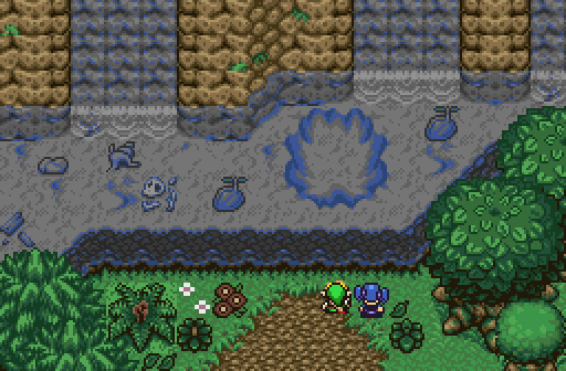
Voted for Jared. The tiles used together are a combination I haven't seen before, and they compliment each other well. The only thing that I think doesn't really fit in is the bush on the left side of the screen. Otherwise, I really love the rocky dirt ground, and the slashable bushes. Good work.
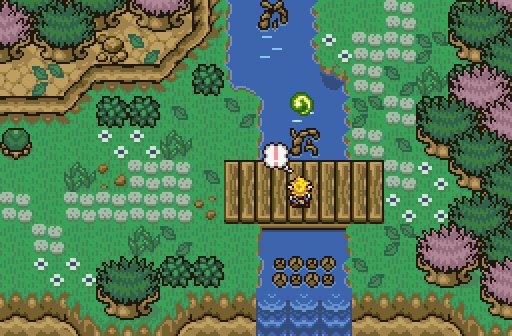
Demonlink's isn't bad, either. That large green plant on the left side is using the sand ground tiles though, and I don't really like when people use the default SD3 grass tile- it's much less detailed than all the other grass tiles available.
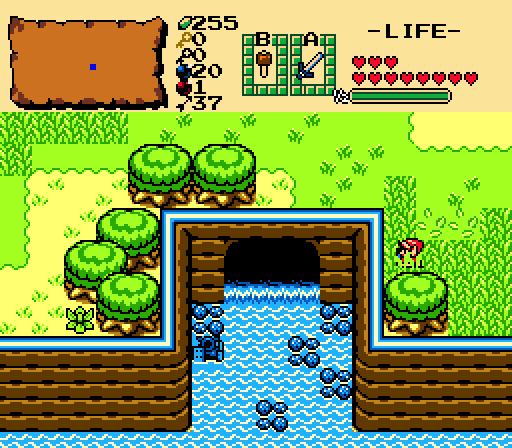
Marco's is really friggin' bright. Screen design is indeed simple, but not too particularly interesting. Not a bad shot by any means, except for that palette.
The Shaman of Sexy!

Posted 22 September 2013 - 09:57 PM
That is funny that all of the Link's are looking at the water. lol
I voted for Demonlink this week.
Everything must go away

Posted 22 September 2013 - 10:24 PM
Do do-do do-do, do do-do do Demonlink. I voted for that guy.
Lurking in the shadows...

Posted 22 September 2013 - 10:26 PM
Marco stays true to his word, a simple and clean shot! ![]()
💙

Posted 23 September 2013 - 12:51 AM
Voted for Jared because it looks like he's trying to stretch the tileset he is using to give the screen more personality and not to mention it's beautiful and functional. I agree with scoot in regards to the mini tree. Marco's is all crammed inside the center but I do admire the GB retro goodness and Demonlink's is good looking... but the default palette kinda kills it. Would be cool for a light spirit pond/lake/spring like in TP - it's got the design for it.
o_o

Posted 23 September 2013 - 07:22 AM
I don't like the open corners in Marco's screen so much, but it is nice.
The most interesting screen is Jared's though! The tiles used for the grounds are a nice change and overall the screen feels very creative. It's refreshing to see such a DoR screen and thus you have my vote.
Demonlink used transparent water pretty well I think, it's a standard DoR screen though.
Dead Man

Posted 23 September 2013 - 07:28 AM
Voted for Demonlink
My name is NOT Jason!

Posted 23 September 2013 - 08:22 AM
All the screens this week have waterfalls! (Now which one is Tiny_Dawnlight locked behind?) I ended up voting for Jared this week for the same reason Scootaloo stated. It has a perfect balance of variety. Though one gripe is how that pool of water is very close to the edge of the ledge on the top. I guess there may be a waterfall flowing on the side?
Trofessional Pransposer

Posted 23 September 2013 - 01:26 PM
Not a huge fan of any of the screens this week, to be honest. Demonlink's and Jared's shots have lots of random detail that distracts more than it adds; Marco's seems uninspired. I'll vote for Demonlink because I like the transparent waterfalls and the contour of the cliffside.
Guess I'm full of monsters and treasure

Posted 23 September 2013 - 02:59 PM
All of these had quite a bit of water.
Voted Jared. I prefer the water in his shot to Demonlink's, and the setting is, in my opinion, better than the the others.

Posted 23 September 2013 - 03:05 PM
Marco's seems uninspired.
Well I did select a random screen, the entire map itself was far from being 'uninspired simple design' not that I care to win or anything =p
It's Nuun Highland. We all remember our animal companions. I'd be happy to link the entire map
Deified

Posted 23 September 2013 - 07:56 PM
Demonlink's and Jared's shots have lots of random detail that distracts more than it adds;
What random details? All it is is a bridge with ground details and trees.
Tiny Little Questmaker

Posted 23 September 2013 - 08:16 PM
What random details? All it is is a bridge with ground details and trees.
Too much of a good thing is not a good thing. You have more ground detail than empty ground and it's kinda distracting.
Went with Marco this week. I don't really see this much use of empty space in quests anymore and I think it works really well in Marco's screen. It has some of the same problems with ground detail as Jared's shot, but it isn't as bad here because it's more organized and EZGBZ's ground detail doesn't stick out as much.
💙
Posted 23 September 2013 - 09:14 PM
I don't know. I like the detail in Jared's shot. It feels unified and not that distracting. Besides this is just a explorale screen once the cutscene is over. So without the cutscene and detail, it'd be boring.
Edited by Shane, 23 September 2013 - 09:15 PM.
0 members, 0 guests, 0 anonymous users


