Screenshot of the Week 359
#1
Posted 04 March 2012 - 11:54 PM
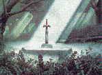
This tileset is so beautiful...
William
Link leaves his secret house, secluded in a mountain range, and heads to the enemy-occupied town near the old Hyrule Castle.
Twinblake
The desert of Gly'cov.
Dragonite
Yes, I entered Screenshot of the Week with a classic shot.
#2
Posted 05 March 2012 - 12:45 AM
That is to say while Jared's screen certainly is pretty, as far as design goes it's rather bland. I voted for Dragonite.
#3
Posted 05 March 2012 - 01:03 AM
where it's unlikely for Link to walk over them, it still is a very interesting concept for the area.
#4
Posted 05 March 2012 - 02:21 AM
#5
Posted 05 March 2012 - 07:24 AM
#6
Posted 05 March 2012 - 07:36 AM
Jared, you're using the wrong cset for those mountains. Those rocks are supposed to be grey, not green. Rookie mistake
Wow, I didn't know those were rocks. I thought they were leaves.
I voted for William. Jared's shot is all been there, done that as I've seen users like Revfan9 and NoeL use that tileset. Those shadows are also very questionable.
#7
Posted 05 March 2012 - 09:51 AM
1. Jared:
Beautiful, indeed. And used well, with wonderful "mountain formation in/next to a forest", so this was an easy choice for me.
2. William:
Fabolous tale-ish enclosed feeling, occupying the screen with mountains this much rarely gets to be this good, and I like those mountains, too. Those transparent clouds increase the loveliness of the screen very much!
3. Dragonite:
Lovely one combo wide things, perfect management of "walkability"/"solid combos". Besides one can't go wrong with Classic. (Still not.)
4. Twinblake:
Likable rocky desert area, it has avery deserty, complete feeling to it. Those here and there quicksands were an extremely good idea.
#8
Posted 05 March 2012 - 10:09 AM
The other ones are good too, but i won't comment them for now.
#9
Posted 05 March 2012 - 02:26 PM
#10
Posted 05 March 2012 - 06:35 PM
I really like that screen design going on in Dragonite's shot. It stands out from the rest.
I also like that palette Twinblake is using for the desert. It makes me wonder what music is playing there.
There's nothing wrong with William's shot, but it there isn't anything special about it.
Jared's shot is of a location that I'd like to visit. Very nice.
#11
Posted 05 March 2012 - 07:01 PM
Seeing how a classic set is tied for first and a Zelda Densetsu shot is currently in last I feel this refreshing sense that the curse of the tileset may finally be fading!
That is to say while Jared's screen certainly is pretty, as far as design goes it's rather bland. I voted for Dragonite.
I was just trying the tileset, after all. I love it so much!
Jared, you're using the wrong cset for those mountains. Those rocks are supposed to be grey, not green. Rookie mistake
I am? The browns look so much better in this CSet! Darn.
#12
Posted 05 March 2012 - 07:09 PM
I am? The browns look so much better in this CSet! Darn.
You are For designing with this tileset personally I usually have a SD3 map open in another window where I can see what stuff is ment to look like and for inspiration of course.
I voted for Twinblake, I like the truthful GB looks of it.
Edited by Yoshimi, 05 March 2012 - 07:10 PM.
#13
Posted 06 March 2012 - 02:10 AM
Edit: I wonder, is most of the tiles in SD3 set is from Secret of Mana or Children of Mana? SoM is on the SNES and I haven't noticed many of the features of what I've seen in that set while CoM is on the DS and I noticed several of the SD3 features, most notably the SD3 grass.
Edited by Orin XD, 06 March 2012 - 02:16 AM.
#14
Posted 06 March 2012 - 10:19 PM
#15
Posted 07 March 2012 - 03:56 AM
1 user(s) are reading this topic
0 members, 1 guests, 0 anonymous users