William:It's a quite solid screen, but nothing terribly new. It does quite well but won't win against strong competition.
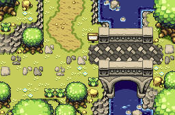
blackbishop89:I edited every single tile on this screen in some way. Woo.

It looks quite nice, but the only problem with SD3 sand is that it looks too flat if you don't add in some elevation changes. If you don't have those SD3 sandy inclines (I forget whether DoR has them), you might add in some mountains or large rocks to give it some rise and fall.
I realize this might only be used for a cinema scene, though, so only one or two additions would be needed, at most.
blue_knight:Excellent as usual. Don't change a thing.

It's a slightly less interesting shot for SOTW, though, so even though I think you did nothing wrong, I'll say that there have been more interesting World Tree shots.
Also: Link is about to enter the World Tree... with one quarter-heart??

M'thinks he might want to head for a town first, or at least smash up some pots.
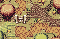
Nolornbon:Old men? Rupee-stealing custom enemies, I'm guessing?... That's a weird take on the idea.
I have a hard time saying what's good or bad about a Classic screenshot like this, though. It's just really basic.
Oh wait, one thing: see the base of the mountains, the diagonal parts? You should create a diagonal mountain base tile that is overlayed on top of grass. It's just too jagged as-is.
Yoshimi:Wow. Just wow.
You're doing an excellent job here. It's just a T-intersection, but what an intersection it is. And yes, this mixture of tilesets just works really well.
Are you using my new Minish Cap Octoroks? If not, check them out. They might have some additional sprites you could use ("spitting" sprites, specifically).
Koh:It's all right for what is apparently a custom tileset, but it's just a little, well, dull for Zelda. I think the browns should have higher contrast (darker darks and maybe lighter lights). I could say the same about the greens, but also, either make the greens a little more vivid, or darken them. Right now they're light but drab.
Naldrag:Ho-hum.

Classic mountains and scattered bushes, ZQuest shot. Not much going on here.
Gonken:Hey, lookin' really good.
I didn't know you were working on this. How's the project going?
It's a perfectly good tile demo shot, but I usually don't vote for those in SOTW, since they tend to be more about the tiles than the design. Still, nice work.
Yoshidude:Like Yoshimi, this is just a T-intersection with some Octoroks. However, there isn't really anything to showcase here. If you don't have much to interact with on a screen, at least have something to look at.
You could fit this idea in a narrower area. It would make the Octoroks more of a challenge and would leave room for more scenery.
It was between Yoshimi and blue_knight. I voted for Yoshimi.

 This topic is locked