SotW 184
#1
Posted 11 November 2007 - 02:27 PM
billy ronald
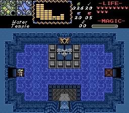
Somthing from the water Temple of HvT
CastChaos
Not even the Master Sword breaks this lightning seal?!
mudvayne
a mystical whisper under a meteor shower!
And may the best screen win. Voting begins now!
#2
Posted 11 November 2007 - 02:29 PM
The others are just too average.
#3
Posted 11 November 2007 - 02:30 PM
#4
Posted 11 November 2007 - 02:30 PM
#5
Posted 11 November 2007 - 02:35 PM
#6
Posted 11 November 2007 - 02:37 PM
And billy, you committed sin #1 when it comes to SotW. Thou shalt not use jpgs. GIFs/PNGs are your friend.
#7
Posted 11 November 2007 - 02:41 PM
And billy, you committed sin #1 when it comes to SotW. Thou shalt not use jpgs. GIFs/PNGs are your friend.
Ops i frogot to make it a gif becasue photo bucket convetes BMP to JPG scorry guys
Billy Ronald: your shot rules becasue it's me so (vote)
Cast chose : arvage shot
mudvayne : to weird for me
Edited by billy ronald, 11 November 2007 - 02:42 PM.
#8
Posted 11 November 2007 - 02:44 PM
And Billy: No comment :/ just plain sucks... (oops, a comment!)
#9
Posted 11 November 2007 - 02:52 PM
Mudvayne: Wonderful! Those mushrooms and even that crystal look like a dream... I also really love that palette. Even the clouds aren't bad, even though I like to use cloud shadow tiles for the same effect.
Maybe this will be the first SotW where only one of the contestants get vote?
I am aware that my screen isn't that SotW worthy. You know, I decided to submit this screen when I started to make it and then I simply couldn't refrain from submitting it... I thought about drawing new Inverted World castle tiles, but I didn't want to use time for that in the case of this simmetric castle... This is made upon the light world version and the light world version is made upon the LttP castle. That's why it's so simmetric.
EDIT: Billy, you pinpoint my averageness, but vote for yourself? What did I say about making up for bad detail with new tiles? O... k... leave it.
Edited by CastChaos, 11 November 2007 - 02:54 PM.
#10
Posted 11 November 2007 - 02:53 PM
#11
Posted 11 November 2007 - 03:05 PM
The subscreen portion is what looks like the most creative part of this screenshot, although not much of an improvement from your standard subscreen portion if you can call it one, as I am undecided on that. The room itself is not all that interesting despite using see through water. Not bad for a typical quest screen though.
CastChaos - 5/10
I like where you are going with this, but I don't find those windows to be appropriate for a castle exterior. Castle windows (most especially on a lower floor) are often narrower and are not covered with glass and that kind of trimming. Those statues don't seem to go well with the facade either. Perhaps look for other statues that would better match those walls. A road or something similar up to the main door to help differentiate it from the rest of the ground would certainly spice things up as well. Link's size, which I know you can't help unfortunately, makes the proportions of the castle vs. Link seem quite off.
mudvayne - 7/10
Nice work. It's creative, unique, and full of eye candy. I like the creativity with the subscreen portion, although some of the rectangles in it look a bit awkward. My vote for this week goes to mudvayne.
#12
Posted 11 November 2007 - 03:39 PM
#13
Posted 11 November 2007 - 04:51 PM
EDIT: I made a ton of spelling errors. (someone's been drinking)
Edited by Joe Dirt, 11 November 2007 - 04:52 PM.
#14
Posted 11 November 2007 - 05:21 PM
#15
Posted 11 November 2007 - 05:24 PM
And I think it clearly is the best of the three, however on closer inspection it does definately have a good few errors.
I hate that subscreen on it though. It just looks horrible.
0 user(s) are reading this topic
0 members, 0 guests, 0 anonymous users