Screenshot of the Week 80
#1
Posted 13 February 2005 - 04:42 PM
Dorian
Mr. Z
If you think this is too dark, your monitor isn't set to be bright enough for Zc
NoeL
See people, this is what happens when you don't weed your garden...
Shoelace
I wonder how you solve this puzzle?
Skateboarder
Just a reminder, Screenshot of the Month 20 is next week.
PrinceMSC
#2
Posted 13 February 2005 - 04:49 PM
Dorian: Nice shot, but it seems a little average.
Mr. Z: I can barely see the shot, as it is quite dark. Looks good from what I can see, though.
NoeL: HOLY ****. This one has my vote. Nice green evil thing (Botha).
Shoelace: This is a nice shot. I also like how you didn't just make it a boxed room. I like rooms where you can go to the next screen without using a door.
skateboarder11: I still like this shot. I just didn't vote for it. Don't hurt me. >_<
#3
Posted 13 February 2005 - 04:49 PM
Dorian: ... BS Tileset. Okay.
Mr. Z: Dark, prisony, but not much else. I hope to play it soon to see what else there is in store for us in that screenie.
NoeL's Shots do not need commentary. The own on their own.
Shoelace: .. Is .. Is it just me, or did I already see this shot last week?
skate: It's always a pleasure seeing this set. And this screen is laid out very, very well. I just may have to vote for this little gem.
Excellent job all participants this week!
#4
Posted 13 February 2005 - 05:04 PM
Dorian: While the center is great with a lot of detail, the edges seem somewhat empty in contrast, and that really lowers the shot's value. :\
Z: The shot is darkish. I can see details, but all of the darkness kindof blurs them, making them hard to see, so I can't go much for this shot.
NoeL: Nice custom boss. The walls are nice too. The only thing I think is bad about this shot is that there are several things in the shot that I have absolutely no clue what in the world they are.
Shoelace: The detail is fantastic, and it makes we want to know what is you have to do. Great job.
Skateboarder: Very nice. It's just like Z's. It's so dark that the little details can't be seen well. But, it's still nice.
My vote goes with NoeL.
#5
Posted 13 February 2005 - 05:39 PM
Dorian: Basic BS-Zelda screen. Not winning material, but it's not horrible.
Mr. Z: TOO DARK. >_<
NoeL: The one week I have a good shot, you enter. Stop dammit!
The screen looks nice... can't wait to fight this boss
Shoelace: Not bad, your dungeon designs seem impressive for a first quest.
skateboarder11: The screen isn't too dark in ZC. It's distorted, which has happened to numerous other screens here.
#6
Posted 13 February 2005 - 05:43 PM
If youi see this NoeL, PM me. I want to know when you can resend me teh quest so I can fight the boss.
#7
Posted 13 February 2005 - 06:02 PM
#8
Posted 13 February 2005 - 06:07 PM
Okay, there are just too many good shots this week. Many of you think NoeL's is best hands-down, but personally I think it's a close call between 3 entries.
Dragonboy:
I see you've toned down your colors, and your layout is even better. This shot looks great. Where did those trees come from?... I don't think I've seen them before, but they look very nice. The mountains don't look quite as good as the rest of the shot, but overall it's a very well-done shot
Dorian:
A standard BS shot... Not bad, but not terribly exciting. Hey, is that my tileset you're using?
Mr. Z:
You may think our monitors are not set bright enough for ZC, but you have to take into account that ZC is set against a black background when you have it on fullscreen, and SOTW is set against a very light green background. Also, my brightness is at max. Yeah, my monitor sucks, but y'know there's no shame in touching up your shot by raising the brightness before submitting it... As it stands I see almost nothing.
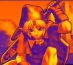
NoeL:
All I can say is, I hope this custom boss is as cool to fight as it is to look at. Don't skimp on the custom boss work, because dang, does that raise expectations. The boss is perfect, and so are the walls... I never have been fond of the floors from this dungeon set, but I guess in the end it deserves my vote.
Shoelace:
This is Pure used well enough to look as good as even Link's Birthday. Keep it up. This temple looks really appealing. Not quite a SOTW winner against this stiff competition, though. But great job nonetheless.
Skateboarder:
Very cool use of SD3; it's looking just great. Your use of cave tiles is perfect, but there's not much else going on in this screen. Not saying it'll look bad in quest, but as plith tells me so often, so shots are great in their own right but not good SOTW competitors. I guess it's true sometimes.
As stated, my vote goes to NoeL. I usually don't like being a sheep, but I have to go with the majority here. My second choice would be Dragonboy's, and my third would be Shoelace's.
#9
Posted 13 February 2005 - 06:08 PM
And those frames are yours BH4. I got them from Blade Of Ages.
Also, this is the LTTP set I was talking about. I currently agian remaking it. So if it's good, I'll keep it.
Edited by DragonBoy, 13 February 2005 - 08:02 PM.
#10
Posted 14 February 2005 - 10:07 PM
Dorian: Lemme quote here, "Welcome to...bland land."
Mr. Z: (hums Forsaken Fortress theme for a few seconds)
NoeL: Holy custom boss! This gets my vote.
Shoelace: Cool layout.
Skateboarder: looks different than the other ones you've been submitting. Nice.
Edited by zmaster, 18 February 2005 - 10:26 PM.
#11
Posted 15 February 2005 - 08:01 AM
DragonBoy- Awesome shot there DragonBoy. Very good use of tiles and colors. Super work.
Dorian- This shot isn't too bad. Very classical.
Mr. Z- Good looking shot Mr. Z. I like the evil dungeony look you have going on in this shot. Cool.
NoeL- Now, if this is not just super awesome work. The is a great looking shot NoeL. I love the boss, and very good colors and tiles. This is excellent. *votes*
Shoelace- Great looking shot Shoelace. I like ice dungeon/temples. This one looks very cool. I love the use of the water and floating ice. Maybe you could make some ice to match the tiny burgs to replace the squarish ice tiles you have there for walking. Just an idea.
skateboarder11- Nice looking shot there skate. Good screen setup, and this just looks nice all around.
Awesome work guys. Again, I missed it due to laziness.... Maybe next SotW.
#12
Posted 15 February 2005 - 09:20 AM
Awesome looking boss, although I dont think the map matches to well with it.
*Votes for NoeL*
Edited by Waluigi, 15 February 2005 - 09:21 AM.
#13
Posted 15 February 2005 - 11:25 AM
DB: Overall, a nice shot. Everything's well balanced. Gee, maybe I should participate someday?
Dorian: A bland shot. You should spread the action out more.
Mr. Z: A nice shot. However, the dark colors spoil it. Darkness nulls the eyes, making a poorer shot, unfortunately.
NoeL: Extremely interesting custom boss! It's hard to see such good work.
Shoelace: Interesting puzzle. Too bad it doesn't grab the eye. Still, it's a good puzzle, but an average shot.
Skateboarder: Awesome shot! Too bad it's from Seiken Densetsu set, so you lose points in originality. But it was very well done.
I couldn't decided between Skate's and NoeL's. Argh!
#14
Posted 20 February 2005 - 04:37 PM
PrinceMSC
#15
Posted 21 February 2005 - 08:39 AM
0 user(s) are reading this topic
0 members, 0 guests, 0 anonymous users