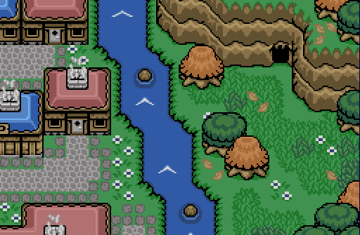
To the left is a city, to the right is the untouched plains!
Jared
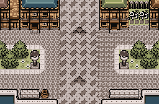
Welcome to Castle Town!
Shane
THERES YOUR SKY BACKGROUND YOU SKY BACKGROUND ENTHUSIASTS
Cukeman
The racetrack is always a popular destination~

 This topic is locked
May the way of the Hero lead to the Triforce.

Posted 20 March 2016 - 07:42 PM
💙

Posted 20 March 2016 - 07:51 PM
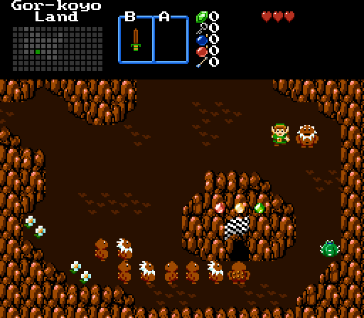
I liked Jared's the most and while I am in the contest I ended up voting for him. The palette goes hand in hand with the city atmosphere. Joel's feels like a simplified version, which isn't bad, but isn't the best either. It looks good and it works, so there's nothing wrong with it. I liked Cukeman's revamped classic tileset shot. But I'm starting to feel like this is more inside a cave, you know? Unless that's intentional; still looks good in any case. Wonderful shots this round.

Posted 20 March 2016 - 07:54 PM
I voted for Shane. I love the colors and background. It's all very pretty. However, it looks like entering from the left side of the screen would be pretty pointless. Aside from that, nice screen!
💙
Posted 20 March 2016 - 08:02 PM
You can't enter from the left (or right) actually. ![]() Thanks though!
Thanks though!

Posted 20 March 2016 - 08:13 PM
Very nice shots overall, but I voted for Jared in the end. I feel you really nailed the city feel with this shot. Some NPCs might liven the place up a bit more, but regardless it's a very solid shot. Nice work!
one point nine hero

Posted 20 March 2016 - 09:32 PM
Deified

Posted 20 March 2016 - 11:08 PM
Everybody must be home watching The Walking Dead in Jared's screenshot.
This post was not sponsored by The Walking Dead.
Edited by NewJourneysFire, 20 March 2016 - 11:09 PM.
"Tra la la, look for Sahasrahla. ... ... ..."

Posted 21 March 2016 - 12:05 AM
Joelmacool: A nice screen.
Jared: As everyone said the feel of your image is amazing. But it starts to break down for me when I take a closer look, because of the disparity in size between the GB Zelda tiles and the GBA Pokemon(?) tiles. Thinking about the size of person who would build a door that size, and then imagining them standing next to the light pole... that light pole is enormous by comparison. Sure there's no reason people can't build monumental light poles in the middle of their city but... just something I noticed. Your screen is still really impressive. I do wish there was something on the main path in the middle though, right now it's a huge unbroken stripe right down the center of the screen- if you were to cover it in one or two places with some people or maybe some wooden crates or a fruit stall, or some light shadow effects, maybe an overpass. Still, really good.
Shane: This is a nice screen, don't really have much to say about it though. Maybe add some flowers, or a couple enemies, maybe some that fly?
Cukeman: You chose a poor week to enter a screen using a classic-styled tileset.
Edited by Cukeman, 21 March 2016 - 12:06 AM.
💙
Posted 21 March 2016 - 12:09 AM
Maybe add some flowers, or a couple enemies, maybe some that fly?
So.. Peahats? Good idea. ![]()
BTW, Jared, if you want smaller lamp poles, maybe try the ones in Firebird?
"Tra la la, look for Sahasrahla. ... ... ..."
Posted 21 March 2016 - 12:38 AM
So.. Peahats? Good idea.
BTW, Jared, if you want smaller lamp poles, maybe try the ones in Firebird?
lol, I was thinking peahats, but didn't know if you'd go for that ![]()
Might try just narrowing these lamp poles a few pixels here and there.
Edited by Cukeman, 21 March 2016 - 02:14 PM.
Magus

Posted 21 March 2016 - 05:11 AM
Joelmacool - I think I am a little bit fed up with the remembrence tilesets lately, at least I have no idea why else I don't jump in excitement for such a beatuilful screen.
Jared - there are a few tiny things bothering me, the cut up house in the left is not a bad idea, but looks slightly more like a tile error than whatever it is supposed to be. The ground tiles also are not always perfect, especially around the triforce. The stone bench (?) and the light pole look a bit too plain compared to the other tiles (like your light pole last week was too detailed), the hight does not bother me at all.
I really was 100% sure you wouldn't be able to create a castle-city-atmosphere with only a few houses, but you just did it... So obvioulsly I just had to vote for you ![]()
Shane - if this is a new pallete I just love it. I prefer LA mointains and especcially together with the trees it looks a lot like the mountains bend out of the screen to you while the trees bend away from you (I hope this is understandable, no idea how to describe that better). Also the mountain corners look a bit off at times, I would rather use the down tiles that the middle tiles where they connect.
Cukeman - great tiles an colors (the light parts of the mointains are maybe a bit too pinkish). I must say that the mountains look rather small compared to Link and the goron sprites, but I think that is not really a problem. The really problem is the plain ground, compared to the more detailed mointains and sprites it just lacks something. Could also be that the brown is just to dark (it looks to me like they walk on chocolate pudding).
Deified

Posted 21 March 2016 - 08:09 AM
I voted for Cukeman. Digging the Gorons.
ringle

Posted 21 March 2016 - 10:08 AM
This is a pretty close contest.
Joelmacool - Really nailed the divide between both sides of the screen here. I like how one side is a city and the other side is a field area. The graphics are pretty spot on too.
Jared - Awesome job with the town here. I really love how everything looks. Like somebody else mentioned though, a few NPCs here and there can liven up the place a bit. Looks really good anyways.
Shane - Loving the mountain shot. Everything looks great and I got no big criticisms for this shot (well, except a few minor things like the way the mountains go into each other, but I know that's out of your control)
Cukeman - This is a really cool classic tileset you're using here. Looks pretty custom to me, and I really like how they look.
I voted for Shane this week.
Deified

Posted 21 March 2016 - 10:40 AM
Thank you for the critiques, everyone! I really appreciate them, and will keep them in mind! I will be adding NPCs, although I wish I had more than just the outdated GB ones. Sigh.
A critique on my own screen, I feel like the houses look a little messy. The house tiles I use look a little crowded and not seamless. I will be using different ones, or editing current ones to fix it. I really just like the "metal" house bottoms, as they looked city-ish. ![]()
Yes I'm that guy who dreamt Dani was Zelda. LOL Cimfam/zelda

Posted 21 March 2016 - 03:10 PM
Cukeman. Not an easy decision for me, but this is a little easier than last week. I for one love the classic tilesets a bunch, but i do understand everyone's concerns.
PureZC Events →
Screenshot of the Week →
Poll Screenshot of the Week 812Started by Taco Chopper , 15 Apr 2024 |
|

|
||
 |
Matthew
PureZC Events →
Screenshot of the Week →
Poll Screenshot of the Week 811Started by Taco Chopper , 01 Apr 2024 |
|

|
|
PureZC Events →
Screenshot of the Week →
Poll Screenshot of the Month 200Started by Taco Chopper , 01 Apr 2024 |
|
|
||
|
|
Shane
PureZC Events →
Screenshot of the Week →
Poll Screenshot of the Week 810Started by Taco Chopper , 20 Mar 2024 |
|
|
|
|
|
Phosphor
PureZC Events →
Map of the Month →
Poll Map of the Month 149Started by Shane , 02 Feb 2024 |
|

|
0 members, 0 guests, 0 anonymous users

