Jump to content

Photo

Screenshot of the Week 497

Dwarlen joelmacool12 bmc10011 Chris Miller

  • This topic is locked This topic is locked
14 replies to this topic

Poll: Screenshot of the Week 497 (53 member(s) have cast votes)

~

You cannot see the results of the poll until you have voted. Please login and cast your vote to see the results of this poll.
Vote

#1 The Satellite

The Satellite

    May the way of the Hero lead to the Triforce.

  • Members
  • Real Name:Michael
  • Pronouns:He / Him

Posted 01 March 2015 - 07:05 PM

joelmacool12

joelmacool12.png

Its a lake... in hyrule... what more do you want!


Dwarlen

Dwarlen.png

The source of the problem - before the problem became a problem.


bmc10011

bmc10011.png

Link's in prison. Have fun getting out!


Chris Miller

Chris_Miller.png

Link had better stop admiring the craftsmanship before the bats get him.


  • Lightwulf likes this

#2 ShadowTiger

ShadowTiger

    The Doctor Is In

  • Members

Posted 01 March 2015 - 07:11 PM

- joelmacool12
I was about to vote for this one, (It reminds me of Jamien's quests. :P ) but I feel like it could have used a bunch more detail in some places. Where the tall grass meets the shore, and its corners, for example, or the water meeting the shallows, but I guess it's unavoidable. It does look a bit odd though. I don't know how detailed the Classic set can get, but I feel like it could be taken to the next level. Still pretty darn good though. Can't wait to take a crack at that quest.

- Dwarlen
Chock full of detail everywhere the eye looks, not full of straight lines, doesn't hog your vision in any one particular place, and it has a thematic vibe to it. Do this again. And again and again. Voted.

- bmc10011
Ooh, a block puzzle. The walls don't seem to match the floors in my opinion. I know the choice of combos is limited in the GB tilesets, but the colors seem to clash a little bit. Orange and purple is an odd combination. Maybe I'm insane. Could use less empty space, oddly enough.

- Chris Miller
This has the potential to be amazing. I'd love to see more "background" art nice and dark way back behind the scenes. Also the two bottom corners feel incomplete somehow. Maybe water or dirt? The space above the scene, under the passive subscreen also feels very, very empty, even if it's incomplete for all I know.
Once again though, I definitely can't wait to play through whatever this will be.
  • strike likes this

#3 nicklegends

nicklegends

    Trofessional Pransposer

  • Contributors
  • Real Name:Ed
  • Pronouns:He / Him

Posted 01 March 2015 - 07:20 PM

My vote goes to joelmacool12 this week.  While his shot is neither the most creative nor the best-designed, he commands his color composition better than any of the other shots. Why red trees? Why purple floors? Why blue statues? If all shots were shown in monochrome, I'd vote for Dwarlen instead because of his shot's variety and aesthetics. Frankly, I see this week as a compilation of missed opportunities.


#4 SkyLizardGirl

SkyLizardGirl

    Unbeknownst to danger we call upon your help

  • Banned
  • Real Name:Arianna Crystal Ritter
  • Location:Earthia

Posted 01 March 2015 - 07:29 PM

joelmacool12


I really like this one' - seems very cool on the eyes. You should at least use the diagonal water shadow curving as it gives the water a more curvy texture even if it's just straight diagonal for your classic set.  


Spoiler
 

Example of water mostly.


124_nbcq2e.png  


Dwarlen   

One of those oddly frosted cakes in the bakery - but still i guess worth tasting and biting.  


bmc10011

The only thing i am not sure you mention about, the prison of block puzzles seems to actually get to me.  I am not the greatest at block puzzles.  When i see a block puzzle i am just steps away from putting down the controller and groaning .. /// 'i cannots go any further'  within the given quest.  


Chris Miller

Gazing at the Fluttery Blue Sassy Valkyrie butterfly princess whom 'some wish to capture.'

I can see why this shot seems to desire to be a winner.*


Edited by SkyLizardGirl, 02 March 2015 - 04:13 PM.


#5 strike

strike

    life is fragile, temporary, and precious

  • Members
  • Real Name:Olórin

Posted 01 March 2015 - 08:18 PM

His was kind of a rough week.

Joel's shot was really solid but just bland.
Dwarlin is good except for the pallete. I like the name of the woods though
Bad pallete
It feels too gimmicky and out of place

But all these shots do, as nickelegends said, have the potential to be really good with very few changes.

-Strike

#6 DragonDePlatino

DragonDePlatino

    Pixel Dragon

  • Members

Posted 01 March 2015 - 09:34 PM

Voted for Dwarlen. The atmosphere on that shot makes it look like something straight out of LttP.


#7 Shane

Shane

    💙

  • Moderators
  • Pronouns:He / Him
  • Location:South Australia

Posted 01 March 2015 - 09:41 PM

Voted for Chris Miller. I really like the dark creepy aesthetics, it reminds me something Cukeman would of done.


#8 justin

justin

    Adept

  • Members

Posted 01 March 2015 - 10:29 PM

Dwarlen, voted. It stands out. The setting is nice. The standoutishness is likely because of the strange palette, and when I really stare at it, it gets stranger.

Joel, runner up, very nice use of the set. The structure of Dwarlen's screen is just more interesting.

Chris, another close runner up. I like the wall tiles. While the statue is cool, I think a neat game play screen in this style would have sold me more.

Bmc, eh, I just don't get it. The little chest nook is cool.

#9 LinkFan212

LinkFan212

    EVERYDAY is a BIG DAY

  • Members
  • Real Name:Caleb
  • Location:Over There

Posted 01 March 2015 - 10:47 PM

(FOR THE FIRST TIME, I'M NOT LATE!!!)


As like most others, I voted for Dwarlen. His screen had nice textures, and the detail was amazing. The red eyes in the cave make me wonder if the fairy is in trouble or something. It may be one of the first quests in that quest, for the fact that you just have a wooden sword, and you have three hearts. But then again, I have no idea. Lel


Joel was amazing as well. HUGE improvement from what I remember with everything else he's done, very proud of that work Joel. Reason why it didn't win was just cause I enjoyed Dwarlen's better, even though yours still was awesome. I enjoyed that nice happy look, and it seems mid game. Since it says your at a lake, that may be a starting screen for an up coming area or such, mainly because your on land, or you may be on an island. Who knows besides you?


bmc1011, yours looks ok. It's not bad, nor is it the best. Just a random ol' dungeon screen is all I see, with some dead people along with it. XD But then again, you are in prison...


Chris's looked awesome too. First of all, the graphics look good. Link and the bats look better, so as everything else. But that statue looks amazing. The detail is awesome, and I would hope it has some important part in the quest, but either way, still looks good. And Link seems to be trying to avoid looking at the statues...you know...;)


Anyways, another good week with screens. Good job all! :D


  • Avaro likes this

#10 Twilight Knight

Twilight Knight

    Tell all with glee, Argon's on PureZC

  • Members
  • Real Name:Sven
  • Location:Rotterdam, NL

Posted 02 March 2015 - 07:42 AM

I see Dwarlen has now mastered the SD3 grass and I love the atmosphere in his screenshot. I do think it is a bit cramped though, but I sometimes experience this too when making screens myself and then find there is simply no other way to build the screen if you need to include certain details. That's why I voted for Dwarlen.


PS. that's some sexy scenery, Chris Miller!


Edited by Twilight_Knight, 02 March 2015 - 07:43 AM.

  • Dwarlen likes this

#11 Eddy

Eddy

    ringle

  • Moderators
  • Real Name:Edward
  • Pronouns:He / Him
  • Location:London, United Kingdom

Posted 02 March 2015 - 11:15 AM

Nice set of screens this week.


joelmacool12 - This is probably the best I've seen from you on PureZC in a VERY long time, I'll give ya props for that. As far as screen design goes, this uses Instrumentality very well, and I appreciate the effort put into this screen. Really great stuff.


Dwarlen - I love the forest setting to this screen as it gives a really cool atmosphere. The water pool in the middle is a bit empty though, so you can probably add a bit of detail, but nonetheless, nice stuff.


bmc10011 - This is pretty cool. I like the skeletons on the floor which gives pretty cool effect as well as the block puzzle on the right side. That's all I can say really.


Chris Miller - That statue looks really neat, and the design is pretty cool too. The background seems a bit empty, but I assume that was done for effect, so that's cool with me.


In conclusion, my vote actually goes to joelmacool12 this week. Dwarlen would've came in second. Great job everyone.


#12 Nathaniel

Nathaniel

    Deified

  • Members

Posted 02 March 2015 - 11:38 AM

Great week.  I like them all.  That makes voting harder, but in a good way.

Joel - A fantastic classic screen.  The kind that I love.

Dwarlen - Amazing, both graphics and design.

bmc - Block puzzle is in the gameboy house!  Nice functional dungeon screen.  Nothing to criticize here, except that it has less pizzazz when compared to the other screens.  It most certainly belongs in a quest.

Chris Miller - I'd die too, being too busy staring at the magnificence.  I'm not often a fan of pure black backgrounds, but sometimes you need it to really emphasize other things.  The stone floor and walls are a nice touch that fits well with the statue.

Not an easy decision, but I chose Dwarlen.  The screen reaches for perfection.


#13 Dwarlen

Dwarlen

    Experienced Forumer

  • Members

Posted 02 March 2015 - 01:17 PM

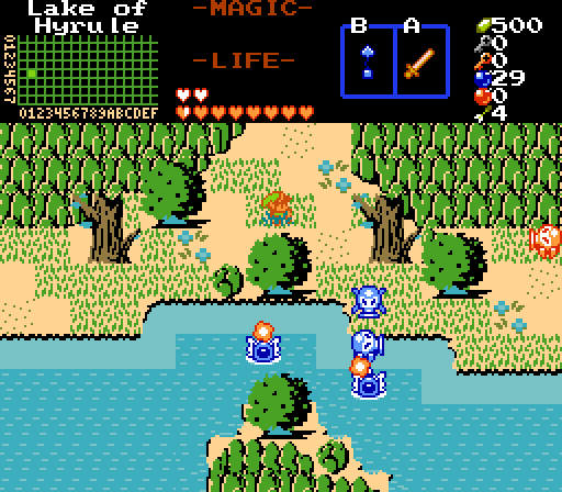
Thanks a bunch for the feedback everyone :D. Main compliant seems to be the palette, but I doubt I'll change it much, as I am more or less going for that "oddly frosted cake in the bakery" look as SkyLizardGirl put it. However, looking at the shot again, I personally think it might help if I change the cliff's color a little bit. There's something about the color there that has been irking me anyway.


As for the pool of water, it would probably help if you could see the two fish jumping in it, but I was more focused on catching the red eyes in the shot rather then the fish so... the poor fish kinda got left out :shrug:.


By the way, LinkFan212, the wooden sword, three hearts, wooden shield, and no 'B' item is all a little bit misleading. In reality I'm expecting Link to have more like five or six hearts, a magical shield, a bomb bag and a couple other 'B' items, along with being very close to a white sword upgrade.


And thanks a bunch Twilight_Knight for the compliment, I have been trying to improve my grass skills :). As for the cramped look, hadn't really though about it, but on closer inspection, by the time an enemy was added to this screen, one would really notice just how cramped it is. However, it's not a combat area so I don't think it will cause any problems.


Now, for my own thoughts:

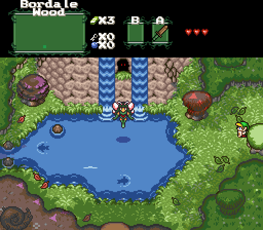
joelmacool12 - Whenever I see a well done screen in a classic style tileset, I always feel a little envious, as I don't feel like I could make screens like that myself, though if I tried, I might be able to get the hang of it. Either way, I like this screen, though the shallow to deep water transition looks a little odd to me.  I'm curious, does that rock hidden behind the right hand tree serve any purpose? ;)


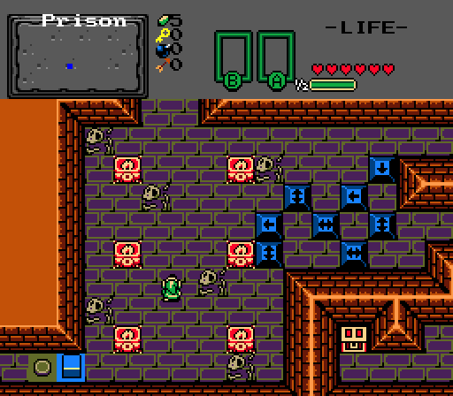
bmc10011 -  Nothing really catches my eye here, though it could certainly be part of a fun dungeon to play through. I might add that I personally don't have a problem with the orange walls and purple floor. To me, they give the dungeon a undesirable look, suitable for a prison (then again, people seem to think my palette is a little off so you might want to discard my opinion on that ;)).


Edited by Dwarlen, 03 March 2015 - 08:50 AM.

  • LinkFan212 likes this

#14 Zahalfor

Zahalfor

    Newbie

  • Members

Posted 07 March 2015 - 10:57 AM

Great work everyone! I have to null my vote because I'm wowed by Dwarlen's screen and he's my brother and I'm loving have that screen in our future quest!


joelmacool12: I love it. The screen has a nice feel and makes me think I just arrived at the lake, coming down from the top of the screen. Though I do wonder about the blue leaves and blue tree trunks, but I'm guessing the colors are set up so that that can't be helped much haha. Barring my probably biased opinion of Dwarlen's screen, you'd have won my vote :).


Dwarlen: you've been busy while I was gone haha. Looking forward to seeing this in our next quest project. And you're giving me something to live up to as I craft the overworld!


bmc10011: this screen gets my writer's mind going: why's Link in prison? Who put him there? what's his plan when he gets out? etc :D. The colors make me think it is in a fairly lighthearted quest, nothing too dark and sinister, and it looks like it would be fun to play. I like it :).


Chris Miller: you're obviously a pretty good drawer! Love the ladders especially.


Thanks everyone for sharing, a good turn out all around this week. :)


#15 The Satellite

The Satellite

    May the way of the Hero lead to the Triforce.

  • Members
  • Real Name:Michael
  • Pronouns:He / Him

Posted 08 March 2015 - 08:44 PM

With 43.75% of the vote, the winner of Screenshot of the Week 497 is Dwarlen!


Dwarlen.png


Congratulations!


Voting totals:

- joelmacool12 (10 votes [20.83%])
- Dwarlen (21 votes [43.75%])
- bmc10011 (0 votes [0.00%])
- Chris Miller (17 votes [35.42%])


Also tagged with one or more of these keywords: Dwarlen, joelmacool12, bmc10011, Chris Miller

0 user(s) are reading this topic

0 members, 0 guests, 0 anonymous users