Lunaria
Lethal lava land
ywkls
I won't have any trouble here... right?
Joelmacool
Link just left that cave... what was in it?
TheRock
I hope the tracks don't break on me

 This topic is locked
May the way of the Hero lead to the Triforce.

Posted 11 September 2016 - 07:34 PM
Lunaria
Lethal lava land
ywkls
I won't have any trouble here... right?
Joelmacool
Link just left that cave... what was in it?
TheRock
I hope the tracks don't break on me
Master
Posted 11 September 2016 - 07:40 PM
Not voting since I'm in this, one, so here's my thoughts on the others.
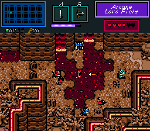
Lunaria- That's a very nice subscreen, along with excellent use of a Gameboy Tileset (I'm guessing EZGB 2.5) to pull off a desolate, lava-filled area.
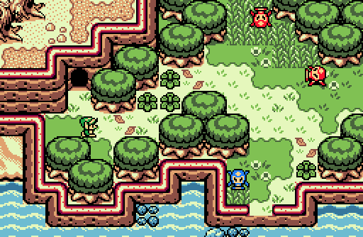
Joelmacool- Bright and shiny, this one is. (But enough Yoda-speak.) There's some good contrast going on with the shoreline, the woods and the desolate area at the top left.
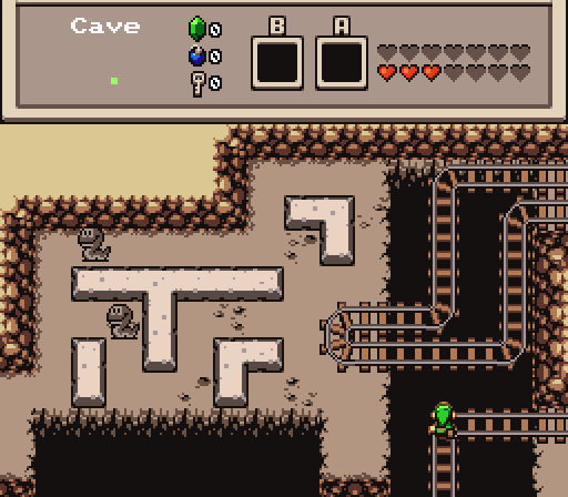
TheRock- I dig that cave. Also, seeing those mine cart tracks makes me want to plop in my script that runs those and zip through there like Indiana Jones!
Very good effort by all!
Hero of Time

Posted 11 September 2016 - 09:07 PM
I voted for Lunaria this week.
Good use of EZGBZ.
ringle

Posted 12 September 2016 - 02:50 AM
Lunaria - Very nice screenshot. I haven't got any critiques with this one, but man that's a really good use of the tileset and it feels very GB authentic, which is nice.
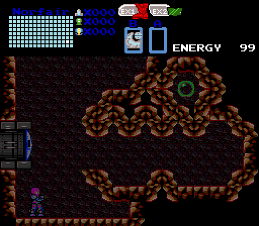
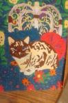
ywkls - Nice screenshot, but it does seem quite empty and bland, especially with the background. I do like the formation with the rocks, but other than that, there isn't anything else I can say.
Joelmacool - Another really good screenshot with no critiques. I especially like the palette with this one and it fits pretty well with the screen. I also do like how the screen is all split up into different parts (beach on the bottom left, forest on the top-right, and wasteland on the top-left).
TheRock - Decent screenshot, but I feel like it's a bit too empty and lacking of any detail. Maybe some more ground detail would be good, or some other objects laying around would be nice. Also, those ropes look horribly out of place compared to the rest of the screen since that makes some really huge style clashing problems.
Overall, it was very close between Joel and Lunaria. I'm probably going for Lunaria this week though, I really like that lava land ![]()
"Tra la la, look for Sahasrahla. ... ... ..."

Posted 12 September 2016 - 03:32 AM
Voted for ywkls. It's playful and imaginative.
Addicted to Overwatch

Posted 12 September 2016 - 12:01 PM
Nice screenshot Lunaria! I like the volcanic feeling ![]() Though I do notice a few tile errors, for example: http://prntscr.com/ch70sq and http://prntscr.com/ch710z
Though I do notice a few tile errors, for example: http://prntscr.com/ch70sq and http://prntscr.com/ch710z ![]()
Edited by Joelmacool, 12 September 2016 - 12:01 PM.
Rabbits!

Posted 12 September 2016 - 12:12 PM
Tell all with glee, Argon's on PureZC

Posted 12 September 2016 - 01:10 PM
I voted for Lunaria this week. I'm thinking it would be cool if you put some steam coming out of the lava maybe?
Rabbits!
Posted 12 September 2016 - 01:59 PM
Yes I'm that guy who dreamt Dani was Zelda. LOL Cimfam/zelda

Posted 12 September 2016 - 07:55 PM
Lunaria gets my vote, simply because this screenshot jumps out the most.
Doyen(ne)

Posted 13 September 2016 - 01:43 AM
Lunaria- this was a very solid screen, well planned-out and good on the eyes. There were only a few little nitpicks, and those are all tile-based limitations. One, the neon tubes at the tops of the mountains are always an eyesore, though with the overall reddish theme, this wasn't bad this time around. But the interior bends have leaks- visible next to the trees in a couple of places. Two, the lava edges have sharp brown edges inside of them. This was subtle; I didn't notice it at first.
ywkls- hey, it's Metroid! Actually, this reminds me of 'Action 52', a cartridge for the NES that claimed 52 different high-quality action games. It looks like a (cheap) clone of the real Metroid- but I love Metroid and I'm happy to see it where I can. I hereby dub this hero Seamus McErin, Space Spelunker. 94% for creativity. 71% for prettiness.
Joelmacool- another solid screen. It could have come right off of my Game Boy Color (well, almost). It suffers the same problem as Lunaria's, i.e. Red Neon tubes that leak in the corners. It's harder to see the leak in this shot, as the ground color blends it out for the most part. Square blocks of grass are an interesting choice- you'd think by now people would have figured out how to round off corners and rough up edges a little? It's a good scene, if a little uninteresting. This is one of those 'normal' screens that leads to the wowza temple a little later on, amiright?
TheRock- I like how vibrant Link is in this otherwise drab screen. Even the Rope enemies seem to blend in- which in this case I find a feature, not a bug. I would have liked to have seen a few trestle support beams plunging into darkness, or some kind of distress on the tracks from just hanging in mid-air, but the fact that the far back wall (as it dives into the pit) and the tracks overlap shows me a level of depth the other screens lack. Unlike the previous entries, I couldn't find a single tile that felt out-of-place with artifacts like the leaking neon lights, brown-instead-of red lava, and the lack of a red-outline on the lower lip of the giant mouth-eyeball wall. That makes this one the winner in my eyes.
Now, if the rules specifically stated that you could only use unedited tilesets, that would probably change things. But as it stands, I don't see why people aren't creating custom tiles to fix these little visual bugs?
💙

Posted 13 September 2016 - 04:12 AM
I voted Lunaria. It has a unique colouration that's pleasing to look at and has plenty of things going on without visually being chaotic, a good screen I say. And also, I don't mind the quirks within the tileset and I think it's nit-picky to pick them apart since I can see similar quirks in Firebird too (the base of the walls for instance). ![]()
"Tra la la, look for Sahasrahla. ... ... ..."
Posted 13 September 2016 - 12:31 PM
Now, if the rules specifically stated that you could only use unedited tilesets, that would probably change things. But as it stands, I don't see why people aren't creating custom tiles to fix these little visual bugs?
I dunno, tile usage isn't the same skill as sprite creation. I try to remember that some people make shots in a single day so the contest meets its quota.
Rabbits!
Posted 13 September 2016 - 01:59 PM

Posted 13 September 2016 - 04:01 PM
I feel a little boring for voting for the obvious favorite, but I also gotta go with Lunaria.
It's a very professional looking screen in a nice palette. Very well-decorated, and for the most part looks like it could belong in a GB game. My only issue is with the transition to grass in the upper right. The band of brighter colored grass doesn't look right to me, since it's usually used for larger patches in the middle of grass. I also feel like an actual grass patch on one of those spots would add a bit of texture that's lacking here. But when I'm criticizing two barely visible tiles out of the whole shot, you know you've done a good job.
Joelmacool's shot is also very nice. I don't really have any complaints here, it's just that I've seen a lot of shots like this one, so it doesn't stand out as particularly creative.
TheRock: I love train and minecart tracks for some reason, so this one appeals to me. I'm interested in where the rest of the tracks lead and how the layout of the cave works.
ywkls: Nice terrain monster! I know your work tends to be Metroid inspired, and I recall seeing several monster-head fixtures in those games, so it fits the theme.
0 members, 0 guests, 0 anonymous users


