LTTP negative syndrome
#1
Posted 06 December 2005 - 08:12 PM
Have you ever noticed that Link to the Past often has what I'd call "negative syndrome?" Basically, the game's graphics contain many instances where the shading is backwards. This means that the part of the graphic that would normally contain the darker pixels, contains lighter pixels instead. It's really weird, and it makes me wonder what they were thinking.
Still don't understand/believe me? Here, let me give my most noticeable example: LTTP floors.
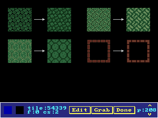
On the left side of each arrow, you'll see the original floor pattern. The arrow points to a color-swapped version of the exact same tiles. Look closely, and you'll see that the lightest color has been switched with the darkest color (or the second darkest).
I don't know about you, but I think the edited version of each tile looks WORLDS better. And all I did was swap two colors. Dungeons aren't the only place this happens in LTTP, but I've already recolored most of the odd-looking overworld tiles, so I don't have any examples on hand. Also, some overworld tiles actually looked funny because of formatting that happened in the Pure tileset, rather than because of the original LTTP graphics.
Those of you who are using LTTP graphics, I recommend you give this a try if you come across some funny-looking tiles with weird light-colored outlines. Just switch the lightest color with the darkest (or more often, the second-darkest), using the CTRL-S keystroke in the tile pixel editor. If it looks like an improvement... then hey, go for it.
#2
Posted 06 December 2005 - 08:26 PM
#3
Posted 06 December 2005 - 08:33 PM
Also, something I learned in drawing classes and high school drama stage makeup: when you want a portion of an object to look raised, you make the entire area lighter. For indentations and edges, you make it gradually darker. If an object has a light outline, it's usually only seen on the side the light source is coming from.
#4
Posted 06 December 2005 - 08:38 PM
#5
Posted 06 December 2005 - 09:37 PM
Maybe you should make a new Enchaned version of the LTTP set?
#6
Posted 06 December 2005 - 09:51 PM
Do you mean the big trees?
Actually, I'd consider LTTP's big trees to be all right. Gashin was able to improve them by adding an extra brown, but, for the number of colors they originally used, they were pretty good.
If you're thinking of the part of the tree that has a lighter outline, well, it only has the lighter shading on the top, which is okay because the sunlight shines down on that area.
There are some LTTP houses with odd shading in Pure, but that wasn't LTTP's fault; Pure doesn't have enough browns to color LTTP houses properly, so the original compilers had to do something different.
The tiles I've "enhanced" will be available in the DoR tileset. You can also find a ton of improved versions of tiles from LTTP and GBC Zelda in Gashin's Sun Tower set.
#7
Posted 06 December 2005 - 11:22 PM
#8
Posted 07 December 2005 - 12:09 AM
In particular, the floors you're using here were generally intended to look shiny, frosted or like polished stone. The exception is the first example, which looks more like cracked mud with the swap than it did originally.
#9
Posted 07 December 2005 - 12:11 AM
#10
Posted 07 December 2005 - 07:34 AM
In particular, the floors you're using here were generally intended to look shiny, frosted or like polished stone. The exception is the first example, which looks more like cracked mud with the swap than it did originally.
Well, I don't know about keeping tiles "flatter," but if it was a color issue, then it was probably an issue of overall brightness rather than color availability. After all, I only switched around colors; I didn't increase the number of shades used.
Still, I wouldn't be surprised if it was done on purpose, considering how often it was done. There are some parts of LTTP where there are notable errors due to rushed production, but they are usually inconsistencies rather than across-the-board discrepancies. However, whatever they did on purpose, I think it didn't work. Even if my alternative isn't the best (nobody's perfect, after all ), I think that later in the life of the SNES, graphic artists figured out better ways to shade things. LTTP was released fairly early on, you know.
SoS:
Well, glad you like them. That's how they'll look in DoR... but even if people don't like them, I'll have non-LTTP floor tiles as well. One can find some pretty snazzy floor tiles by browsing RPGMaker tilesets.
#11
Posted 07 December 2005 - 10:15 AM
Honestly, I'm rather amazed that they were able to get away with such a thing. Doesn't it just kinda seem wrong to you that they can, and yet it still looks so very very right? Nobody seemed to complain about ALTTP's graphics. It really makes you reconsider how we look at graphics as a whole.
...
Though, to be fair, I really did notice the difference in potstands with pots and potstands without. The pixels are clearly different, and not just in terms of color. Same with the tree miscolorations. It was very, very evident on them, particularly when used in DoY. (Not that DoY had bad graphics. It just didn't touch up things where they could have been touched up.)
#12
Posted 07 December 2005 - 02:21 PM
Perhaps "negative syndrome" is just your imagination.
Sure, aLttP's floors look flat, but they still look good;
The switched ones look odd.
#13
Posted 07 December 2005 - 05:16 PM
The first set is a good example of this, as the first one seems to be low, and flat, very much like flattened stone, while the second one pops out a little more and dosent look as flat...
Second set is a incrediable transformation... I personally like the second better, simply for the sake that the first one looks like a ruined temple kinda floor, while the second one looks kinda like more of a bambo floor. Personally I think the first one is much better.
Third set, yet again, the first one looks scratched, rugged, and flat, while the second just looks like a elevated floor with lots of circles popping out.
and fourth one, I think it has to do with the attention put on the floor, I think the second would take away from the floor, because if you actually put it agaist a wall it would look higher up than the floor, unlike the original which just looks like an edge...
So basically I really dont think LttP did this unintetionaly, it was proboly on purpose Graphics can be a very tricky thing ^^
#14
Posted 07 December 2005 - 06:49 PM
Well, nobody complained about LTTP's graphics at the time. Since it was early on in the life of the SNES, few games had better. But compare to Final Fantasy 6. Star Ocean 1. Tales of Phantasia. The difference is phenomenal. It seems almost unfair to pit LTTP against them.
You don't often hear people complain about LTTP's graphics here because this is a Zelda fan site. Seriously. How often does anybody hear complain about Zelda graphics, save for Wind Waker?
Outside of these forums, I HAVE heard people complain about LTTP's graphics. It's just that it doesn't normally come up in casual conversation. LTTP is old. No one cares now unless they use them for fan projects. Actual conversation I had:
Friend: "So, Zelda Classic has improved Zelda 1's graphics? How good are they?"
Me: "Oh, pretty decent. They can usually manage to look as good as Link to the Past."
Friend: (chuckle) "Um... Link to the Past had good graphics?..."
Perhaps "negative syndrome" is just your imagination.
Sure, aLttP's floors look flat, but they still look good;
The switched ones look odd.
You can have your own opinion about whether it looks good or not, but it's not my imagination. Professional game designers don't draw this way anymore for 2D video games. If you don't believe me, check out some GBA RPGs and look at their floor and wall tiles.
Personally, I think nostalgia plays a large part in people's fondness for Link to the Past's graphics. Even for some who weren't around for its original release.
ZC-Ninja:
Yes, the floor border does look more raised than the original. But I still think the original was intended to look raised. After all, it has a solid black outline.
But now we're on the verge of talking about the overuse of floor borders. They were originally only used right up against a wall in LTTP. I think they needed them mostly for the diagonal walls, as a "transition" between two palettes. Also: LTTP walls lack a definitive outline at the base -- try putting a floor tile up against one of the LTTP walls in the Pure tileset, and you'll see what I mean. These days, in ZC, people used them to border everything, almost as though it's a requirement.
#15
Posted 07 December 2005 - 09:09 PM
0 user(s) are reading this topic
0 members, 0 guests, 0 anonymous users