Jump to content

Photo

Screenshot of the Week 513

Joelmacool12 GrantGreif Twilight-Prince Eddy bmc10011 Logos

  • This topic is locked This topic is locked
19 replies to this topic

Poll: Screenshot of the Week 513 (62 member(s) have cast votes)

~

You cannot see the results of the poll until you have voted. Please login and cast your vote to see the results of this poll.
Vote

#1 The Satellite

The Satellite

    May the way of the Hero lead to the Triforce.

  • Members
  • Real Name:Michael
  • Pronouns:He / Him

Posted 21 June 2015 - 07:45 PM

Joelmacool12
Joelmacool12.png
Only 1 more torch to light until I can face the boss of this shrine!
 
GrantGreif
GrantGreif.png
A screen from a quest that I might try to work on if I feel like it
 
Twilight-Prince
Twilight-Prince.png
From a dense forest, to a humid jungle, and now to the barren Barakan Desert. Sona's journey is long and arduous...
 
Eddy
Eddy.png
Amy prepares to venture through Level 4, the Skull Dungeon.
 
bmc10011
bmc10011.png
Look at the pretty purple clouds. I'm sure the air here is super clean. I might even be alive for more then a whole 10 seconds! That's right ten whole seconds!
 
Logos
Logos.png
"A small clearing in Evernight Forest houses 'Saria's Terrace'. Link can hear the sage calling to him, from the depths..."
  • Logos likes this

#2 SyrianBallaS

SyrianBallaS

    Defender

  • Members
  • Real Name:Samer
  • Location:Detroit, Michigan

Posted 21 June 2015 - 08:16 PM

JoelMacool12 has the best screen here for me


#3 Deedee

Deedee

    Bug Frog Dragon Girl

  • Moderators
  • Real Name:Deedee
  • Pronouns:She / Her, They / Them
  • Location:Canada

Posted 21 June 2015 - 08:48 PM

Question: what tileset is logos using?


  • Logos likes this

#4 SyrianBallaS

SyrianBallaS

    Defender

  • Members
  • Real Name:Samer
  • Location:Detroit, Michigan

Posted 21 June 2015 - 08:59 PM

By Link's sprites, I would assume Instrumentality


#5 SkyLizardGirl

SkyLizardGirl

    Unbeknownst to danger we call upon your help

  • Banned
  • Real Name:Arianna Crystal Ritter
  • Location:Earthia

Posted 21 June 2015 - 09:04 PM

I really like bmc10011 's Foggy smoke or clouds he's got going theres.


The obvious winner is obvious, .. but i wont be that fickle with my vote.


Edited by SkyLizardGirl, 21 June 2015 - 09:05 PM.


#6 Shane

Shane

    💙

  • Moderators
  • Pronouns:He / Him
  • Location:South Australia

Posted 21 June 2015 - 09:20 PM

It's either Joelmacool12 or Eddy for me, but in the end Joelmacool made the best out of the two. My only advice is to make the wall torches more orange/yellow. The others were good, but either nothing special or there's too much covering up the screen.


  • Eddy likes this

#7 Eddy

Eddy

    ringle

  • Moderators
  • Real Name:Edward
  • Pronouns:He / Him
  • Location:London, United Kingdom

Posted 22 June 2015 - 05:13 AM

Nulled as I took part this week.


Joelmacool12 - Holy, this screen looks amazing. I dunno how you managed to make a screen like that, but you really did blow me away this week. If I could, I would vote for this screen.


GrantGreif - This looks like a pretty solid screenshot. My only issues however is the mountains may seem a bit too straight and the ground seems a bit empty. Besides that, it's looking good.


Twilight-Prince - Another pretty neat screen. Again though, the screen seems a bit too empty, which I guess would make sense but something about that doesn't really make it stand out.


Eddy - Jesus Christ man, you've put Amy Rose in Oracle of Ages now? What the hell are you doing?


bmc10011 - This is a very cool screenshot. I really like the "ruins" feeling to the area. My only suggestion would be to make those clouds more transparent and a different colour since they blend in with the rest of the screen.


Logos - If Joel or myself didn't make a submission, my vote would've gone here. I really like the design in this shot and it reminds me of Promised Lands/Forbidden City. In other words, it looks really good.


  • Logos likes this

#8 Logos

Logos

    Gnome Child

  • Members
  • Real Name:Kevin
  • Location:USA, North Carolina

Posted 22 June 2015 - 12:55 PM

Nulled, because I'm in the poll. Everyone has really nice screens! But Joel, for someone who is known as a troll quest creator, that is one AMAZING screen you got there...

That screen was not made by any Joelmafool.

And Dimentio, I am using Instunentality, but with some custom sprites.

Edited by Logos, 22 June 2015 - 12:59 PM.

  • Eddy, Joelmacool and SyrianBallaS like this

#9 SyrianBallaS

SyrianBallaS

    Defender

  • Members
  • Real Name:Samer
  • Location:Detroit, Michigan

Posted 22 June 2015 - 01:15 PM

At first I thought Joel was a fool, yet, his creativity can be used better.


You can make joke quests, make sure they're funny.

Troll quests are not funny.


  • Avaro, Joelmacool and Logos like this

#10 Nathaniel

Nathaniel

    Deified

  • Members

Posted 22 June 2015 - 01:25 PM

Joel - Second glance looks better than the first.  Good choice of graphics, and it all seems to mend well together.  I especially love those wood planks in the center of the screen.  It's understandable that this screen got a lot of votes, but it still isn't my number one.

Grant - A nice gameplay screen conceptually.  All the straight lines in the tile usage make it less interesting, though.  There is more potential here, which likely comes with experience, experimentation, and inspiration.

Twilight-Prince - A conceptually simple desert screen with great attention to detail.  It really makes you feel like you are there.  This is a sort of situation where you can get away with open corners.  You know there is meant to be a lot of openness in most of the nearby screens.  My vote for this week, for something really appealing to me and a sort of thing you don't see as often.

Eddy - A fitting screen for what it serves as, but it's not the most interesting of screens either.  The usage of ledges here is definitely a plus.

bmc10011 - The purple clouds win at setting what sort of mood this screen is supposed to have, but other than that, it's okay.

Logos - Now there is an interesting usage of dark blue.  Interesting color twist with classic for sure.


  • Eddy, SyrianBallaS and Logos like this

#11 ZeldaPlayer

ZeldaPlayer

    What's up my playas

  • Members
  • Location:USA

Posted 22 June 2015 - 02:45 PM

Joel's I likes. Joel's I votes.

Edited by ZeldaPlayer, 22 June 2015 - 02:45 PM.

  • Joelmacool likes this

#12 symbiote01

symbiote01

    Doyen(ne)

  • Members
  • Real Name:Doug
  • Location:WA

Posted 23 June 2015 - 09:25 AM

Joelmacool12 - Again, my pick.  This palette is tasty for the eyes.  I'm always eager to see more from you.

GrantGreif - The colors are nice, and it's a good screen in general.  It does seem a little flat- straight cliff down one side, straight cliff up the other.  If I had to complain, it would be transitions- this time the wall/waterfall transition

Twilight-Prince - at first I was a little disappointed in this one- it looks messy and grainy.  Then I realized you have a sandstorm going on.  A good shot.

Eddy - lack of transition between the lava and the floor does this one no service.  The army of identical lava bubbles lined up in row after row doesn't help, either.  Transitions and more variation in lava would do this shot good.

bmc10011 - Purple.  Lots of purple.  I'd say the purple mist seems to obscure the purple background, but that's probably what you're going for.

Logos - A good classic-esque shot.  The one would have had my vote, if not for Joelmacool.  Blame him.


  • Eddy, Joelmacool and SyrianBallaS like this

#13 Eddy

Eddy

    ringle

  • Moderators
  • Real Name:Edward
  • Pronouns:He / Him
  • Location:London, United Kingdom

Posted 23 June 2015 - 09:34 AM

I guess I could quickly respond to some feedback.


Eddy - A fitting screen for what it serves as, but it's not the most interesting of screens either.  The usage of ledges here is definitely a plus.

Thanks for the comments! I guess I could've gone with a more interesting screen, but this is all I really got right now lol


Eddy - lack of transition between the lava and the floor does this one no service.  The army of identical lava bubbles lined up in row after row doesn't help, either.  Transitions and more variation in lava would do this shot good.

Thanks for the advice! I can definitely understand with the lava bubbles being all lined up like that, I guess I could go ahead and fix that up in the final product. Regarding the transitions between lava and the floor, I did it that way for GB authenticity. Since this quest is very strongly inspired by the Oracles, I tried to mimic the way it was done in the Oracles, therefore, what you see in the screenshot is the result. Either way though, I can still understand if you don't like the way I did the transition that much, that's perfectly fine with me :D


  • Shane and Logos like this

#14 Lecayle

Lecayle

    One bug, two bug, fix one, new bug. (Coder's humor)

  • Members
  • Real Name:Lecayle
  • Location:Tularosa, NM

Posted 23 June 2015 - 03:08 PM

Hmm....I liked the hazy atmosphere in bmc10011's the best, but I just wish that a transparency had been there.  Honestly, all of these screens remind me of why I love ZC.  The freedom!  The creativity!! I just wish I had more time to contribute again, be it quests or Screenies.  I have ZC2.10, but can't seem to find the time.  :(


#15 Hergiswi

Hergiswi

    don't look for me, i'm just a story you've been told

  • Members
  • Real Name:chris
  • Location:house

Posted 25 June 2015 - 03:04 PM

Oh man, we've got some bitchin' shots this week.


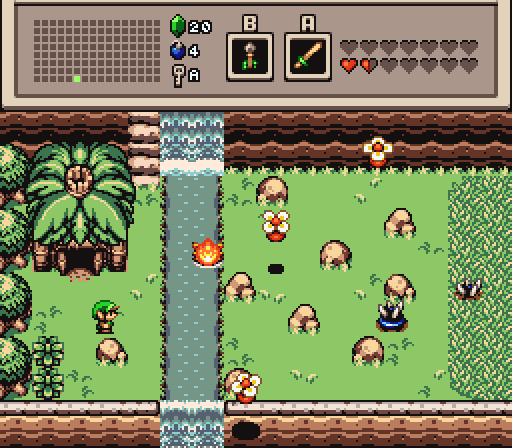
Joelmacool12 - I don't usually like the Pure tileset, but this screen impresses me. I like both the concept and the execution.


GrantGreif - This is a good looking screen. I should probably know what tileset this is by now, but I don't.


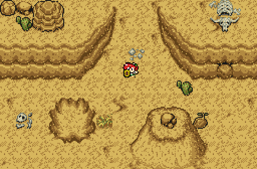
Twilight-Prince - It's hard to make a desert screen very interesting, but I think you've done all you can do here. There's a good amount of scenery without overdoing.


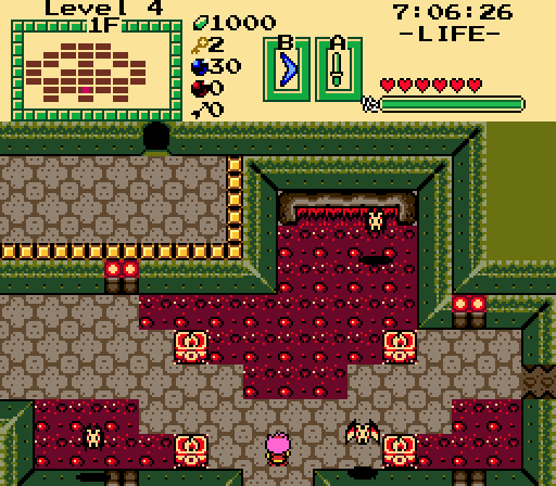
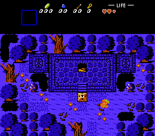
Eddy - I like everything about this screen except the one-tile doorway on the right. That pattern and color doesn't seem to match everything else that's going on.


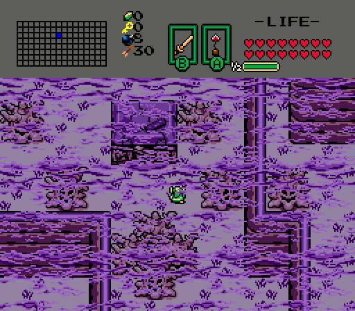
bmc10011 - This is a creative use of the GBC tileset. Is the fog animated in ZC? It almost blends a little too well when it's motionless, but I think it would be great if it was animated.


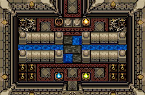
Logos - I always love seeing the classic tileset re-imagined, and this one does a good job of it. Normally combining borderless and bordered tiles makes things look strange, but you've pulled it off somehow. I'm not a huge fan of the coloration of Link though.


Despite all the obvious talent here, Eddy's shot won me over this week.


EDIT: Actually Eddy, I was going to comment on the lava-to-floor thing as well. I originally thought it looked strange, but if I remember correctly, that's how the Oracles series handles water in dungeons. So if you're meant to be able to fall into the lava and get hurt, I think it works. Otherwise a border or something might be better.


  • Eddy and Logos like this


Also tagged with one or more of these keywords: Joelmacool12, GrantGreif, Twilight-Prince, Eddy, bmc10011, Logos

0 user(s) are reading this topic

0 members, 0 guests, 0 anonymous users