DragonBoy- Love the atmosphere. The boat looks kinda flat.
Might Darknut- Cool screen and pallete. But do you really need to use the eagle head three times?
Gashin- Exelent detail, the broken bridge and the bricks and wood floating in the water.
Raiden- Got my vote. Did you make those leafy treetops yourself? It easily beats my SD3 palms from last week.

Screenshot of the Week 129
Started by
link3505
, Jul 03 2006 02:46 PM
-
 This topic is locked
30 replies to this topic
#17

IaN
-

- Members
-

Warrior
- Real Name:Ian
- Location:The frozen north
Posted 04 July 2006 - 04:21 PM
I really liked both Radien's and Gashin's, however I really liked some of the small details in Gashin's. I dunno, just something about the stuff in the water really drew me into it, and the bridge was really well done. I
liked Radien's too, because it's just an overall great screen. But there was one thing that caught my eye, both the Minish Cap evergreen trees and the small bushes get very dark at the trunks, however the big trees are quite light. I know this is how their respective tiles were made, but just a little observation. Also, the ALttP "continuous bush thingy" (I dunno what to call it ) looks a bit out of place at the corner where it goes over the dirt. Kinda like it's just placed on top. Maybe shade it a tiny bit or something, to make it look like it's ment to be there.
liked Radien's too, because it's just an overall great screen. But there was one thing that caught my eye, both the Minish Cap evergreen trees and the small bushes get very dark at the trunks, however the big trees are quite light. I know this is how their respective tiles were made, but just a little observation. Also, the ALttP "continuous bush thingy" (I dunno what to call it
Edited by IaN, 04 July 2006 - 04:26 PM.
#18
nicklegends
-

- Contributors
-

Trofessional Pransposer
- Real Name:Ed
- Pronouns:He / Him
Posted 04 July 2006 - 05:22 PM
Radien's was absolutely beautiful. Lush, green... I can feel everything in that shot. 
Gashin was a good runner-up--lots of detail!
Mighty Darknut's was good, but there wasn't enough veriety in tiles for me. IT did sport a good palette, though.
I also liked DragonBoy's shot. It wasn't that complex, yet it dressed itself up well in theming.
Gashin was a good runner-up--lots of detail!
Mighty Darknut's was good, but there wasn't enough veriety in tiles for me. IT did sport a good palette, though.
I also liked DragonBoy's shot. It wasn't that complex, yet it dressed itself up well in theming.
Edited by nicklegends, 04 July 2006 - 05:24 PM.
#19
NoeL
-

- Members
-

Legend
- Real Name:Jerram
Posted 05 July 2006 - 09:32 AM
... my God, Radien...
The tiles don'tmatch perfectly, but it's damn well good enough for me!
The tiles don'tmatch perfectly, but it's damn well good enough for me!
#20
Sabre2552
-

- Members
-

Experienced Forumer
- Real Name:Michael
- Location:Joo Ess Aye
Posted 05 July 2006 - 11:11 AM
I vote for Radien.
DragonBoy
------------------------------------
It's an alright screen, but, like said before, the boat looks like it's standing on water-looking tiles instead of actually in the water. The colors are kind of dull, but I don't know if that was on purpose or not.
Gashin
------------------------------------
There's nothing special about this screen. We've all seen these tiles before (though I've never seen the reflection, that's pretty cool . I know, Pure has been overused and no one complained then (well, people did complain, but meh), but they usually made up for that with an absolutely beautiful layout. This is just a broken bridge with some pretty little water... Not all that special.
Mighty Darknut
------------------------------------
The perspective is completely off. Is the big statue supposed to be upright or lying on its side? It would be amazing if this was a sidescroller screenshot, but It's a Metroid screeny in a Zelda format, so the statue is out of place. Other than the statue (which is wierd), there's nothing special about this screen (except for the bird-carts in the top-left corner which are out of proportion as well, and the out-of-place bend in at the top-right.
Radien
------------------------------------
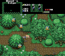
I really like these tiles, as I haven't seen them as much in use. The trees are really awesome. I just really like this screen regardless of it being solely a little forest scene. The picture was made to show off the trees, right? Well, they really catch my eye and make me want to vote for you. Success.
DragonBoy
------------------------------------
It's an alright screen, but, like said before, the boat looks like it's standing on water-looking tiles instead of actually in the water. The colors are kind of dull, but I don't know if that was on purpose or not.
Gashin
------------------------------------
There's nothing special about this screen. We've all seen these tiles before (though I've never seen the reflection, that's pretty cool
Mighty Darknut
------------------------------------
The perspective is completely off. Is the big statue supposed to be upright or lying on its side? It would be amazing if this was a sidescroller screenshot, but It's a Metroid screeny in a Zelda format, so the statue is out of place. Other than the statue (which is wierd), there's nothing special about this screen (except for the bird-carts in the top-left corner which are out of proportion as well, and the out-of-place bend in at the top-right.
Radien
------------------------------------
I really like these tiles, as I haven't seen them as much in use. The trees are really awesome.
#21
Siguy
-

- Members
-

�
- Location:The inactive user list.
Posted 05 July 2006 - 04:09 PM
Voted for gashins shot, raidiens is second because it looks alot like a real forest, more than any shot I've seen. The only thing it needs is some shadows and light rays.
#22
Radien
-

- Members
-

Courage
- Real Name:Steve
- Location:Oregon
Posted 05 July 2006 - 07:11 PM
Dear lord... could this be? Gashin submits a shot from his main quest, and I'm actually winning?...  ...Wow. Well, I guess there's a first time for everything! I guess it's partially because Gashin's last three shots have been from the same area, however impressive they are...
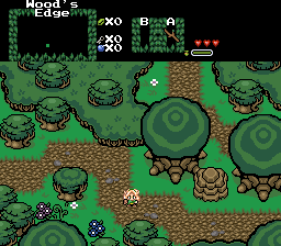
For those of you who asked ofr more detail along the dirt path: there's only so much I can do to add detail to such dark dirt (running out of browns and black is too dark), but I am going to make the path less straight now that I'm using SD3 grass borders, which look better when crooked. Also layered some flowers here and there since I couldn't fit any more on layer 0.
They are edits of something from an RPGMaker chipset. Obscure, and heavily edited around the outside, but not quite original. While I'm at it, I'll list everything else:
- Pine trees from Minish Cap
- Brush custom edited from LTTP tiles
- Grass and grass borders custom edted from SD3
- Peahats adapted from Minish Cap
- Resized Minish Cap bushes by Dart Zaidyer
...There. I dislike getting credit for what I didn't do, and vice-versa.
Lately I've been in the habit of submitting my screenshot early and making minor changes before SOTW is posted (retaking the screenshot, then reuploading). Gashin, however, has started uploading the shots to the actual PureZC website (probably a good idea). So there was one more inclusion that didn't make it into the above shot. Oh well...
Suggestion noted. However, there's only so much tile editing one can do until you're practically drawing every individual tile on the screen. I'll probably just rearrange the combos so that it isn't necessary to have it exactly like that.
"solely a little forest scene"... yes, forest scenes look really simple and harmless, until you try to make them. >_<; I've been putting off these upgrades for a long time because it's so hard to make them look right...
"Was it made to show off the treetops?" Well, yeah, that and the grass, the brush, the tree trunks (didn't make it into the final shot), and the peahats. I just liked this screen and saw that it'd never been entered in a SOTW. Here's what it used to look like.
Anyway, thanks for the vote and the comments.
For those of you who asked ofr more detail along the dirt path: there's only so much I can do to add detail to such dark dirt (running out of browns and black is too dark), but I am going to make the path less straight now that I'm using SD3 grass borders, which look better when crooked. Also layered some flowers here and there since I couldn't fit any more on layer 0.
QUOTE(Fire Wizzrobe @ Jul 4 2006, 01:18 PM)
Raiden- Got my vote. Did you make those leafy treetops yourself? It easily beats my SD3 palms from last week.

They are edits of something from an RPGMaker chipset. Obscure, and heavily edited around the outside, but not quite original. While I'm at it, I'll list everything else:
- Pine trees from Minish Cap
- Brush custom edited from LTTP tiles
- Grass and grass borders custom edted from SD3
- Peahats adapted from Minish Cap
- Resized Minish Cap bushes by Dart Zaidyer
...There. I dislike getting credit for what I didn't do, and vice-versa.
QUOTE(IaN @ Jul 4 2006, 02:21 PM)
liked Radien's too, because it's just an overall great screen. But there was one thing that caught my eye, both the Minish Cap evergreen trees and the small bushes get very dark at the trunks, however the big trees are quite light. I know this is how their respective tiles were made, but just a little observation.
Lately I've been in the habit of submitting my screenshot early and making minor changes before SOTW is posted (retaking the screenshot, then reuploading). Gashin, however, has started uploading the shots to the actual PureZC website (probably a good idea). So there was one more inclusion that didn't make it into the above shot. Oh well...
QUOTE(IaN @ Jul 4 2006, 02:21 PM)
Also, the ALttP "continuous bush thingy" (I dunno what to call it ) looks a bit out of place at the corner where it goes over the dirt. Kinda like it's just placed on top. Maybe shade it a tiny bit or something, to make it look like it's ment to be there.
Suggestion noted. However, there's only so much tile editing one can do until you're practically drawing every individual tile on the screen. I'll probably just rearrange the combos so that it isn't necessary to have it exactly like that.
QUOTE(Sabre2552 @ Jul 5 2006, 09:11 AM)
Radien
------------------------------------
I really like these tiles, as I haven't seen them as much in use. The trees are really awesome. I just really like this screen regardless of it being solely a little forest scene. The picture was made to show off the trees, right? Well, they really catch my eye and make me want to vote for you. Success.
------------------------------------
I really like these tiles, as I haven't seen them as much in use. The trees are really awesome.
"solely a little forest scene"... yes, forest scenes look really simple and harmless, until you try to make them. >_<; I've been putting off these upgrades for a long time because it's so hard to make them look right...
"Was it made to show off the treetops?" Well, yeah, that and the grass, the brush, the tree trunks (didn't make it into the final shot), and the peahats. I just liked this screen and saw that it'd never been entered in a SOTW. Here's what it used to look like.
Anyway, thanks for the vote and the comments.
#23
Revfan9
-

- Banned
-

Hero of Time
- Real Name:Dr. Pajamas
- Location:In front of a screen
Posted 05 July 2006 - 07:23 PM
Dragonboy:
Nice shot and all, but the boat looks like it's cardboard pasted onto the shot.
Gashin:
Beautiful graphics, but it just doesn't feel any different from your last shot.
MD:
There's really nothing to say about this shot. It's a square room that doesn't have anything we haven't seen before.
Raiden:
Everything feels too ordered. It's a forest, fix taht!
I nulled.
#24
Radien
-
- Members
-
Courage
- Real Name:Steve
- Location:Oregon
Posted 05 July 2006 - 07:34 PM
QUOTE(Revfan9 @ Jul 5 2006, 05:23 PM)
Radien:
Everything feels too ordered. It's a forest, fix taht!
Everything feels too ordered. It's a forest, fix taht!
*looks at shot* The dirt path is a bit straight. Other than that, I don't really plan on changing the layout much. Technically, it's not quite a forest, it's a road on the edge of a forest. It has been touched by human hands.
Personally, I think you're being a bit harsh on the entrants this week. I like all three of the other shots that were entered. *shrug*
#25
Linkus
-

- Members
-
.
- Real Name:Adam
Posted 06 July 2006 - 04:37 PM
Radien-Where did you get those new treetops??  I can't take my eyes off of them!
#26
Revfan9
-
- Banned
-
Hero of Time
- Real Name:Dr. Pajamas
- Location:In front of a screen
Posted 07 July 2006 - 08:14 PM
Linkus:
Radien:
What can I say? I didn't like any of the shots this week. And I wasn't talking about the road: I'm just fine with that being straight. I was talking about your actual forest part being too ordered. To me, the screen looks like it is divided into 3rds, clean down the middle. Fix that.
QUOTE
They are edits of something from an RPGMaker chipset. Obscure, and heavily edited around the outside, but not quite original.
Radien:
What can I say? I didn't like any of the shots this week. And I wasn't talking about the road: I'm just fine with that being straight. I was talking about your actual forest part being too ordered. To me, the screen looks like it is divided into 3rds, clean down the middle. Fix that.
#27
NineLives
-

- Members
-

Boom. Zoom. Dakota.
- Location:Los Angeles, California
Posted 08 July 2006 - 03:45 PM
What is the screw ball for? I mean, what item is it?
Well, ONE BIG complaint on MD's shot is that the screwball's black outline doesn't match the chozo statue, I mean, the chozo statue doesn't have a black line (I used a black line so it can match the outline of the item) If the statue doesn't have a black line, then the item has to NOT HAVE the black line, or else the screwball really looks wierd with that statue. You can have it vise versa, leave the statue how it is, and make the screwball have a different outline other than dark black, or dark colors.
Well, ONE BIG complaint on MD's shot is that the screwball's black outline doesn't match the chozo statue, I mean, the chozo statue doesn't have a black line (I used a black line so it can match the outline of the item) If the statue doesn't have a black line, then the item has to NOT HAVE the black line, or else the screwball really looks wierd with that statue. You can have it vise versa, leave the statue how it is, and make the screwball have a different outline other than dark black, or dark colors.
#28
link3505
-

- Members
-
Ancient
- Real Name:Ben
- Location:The Edge of Infinity
Posted 08 July 2006 - 07:34 PM
Gashin wins! yes, he does! the poll... is bugged. it SAYS Radien wins, but in reality, Gashin wins
...
OH FINE. Radien wins this week, but mark my words, I shall have my revenge!
GRUMBLE GRUMBLE
...
OH FINE. Radien wins this week, but mark my words, I shall have my revenge!
GRUMBLE GRUMBLE
#29
Revfan9
-
- Banned
-
Hero of Time
- Real Name:Dr. Pajamas
- Location:In front of a screen
Posted 08 July 2006 - 07:49 PM
[voice=SSB announcer]Congradulations Radien![/voice]
(p_o)>u A spot of tea as a reward for the victory, Master Radien?
...*throws the Bait at Gashin and tells him to let me into level 7*
(p_o)>u A spot of tea as a reward for the victory, Master Radien?
...*throws the Bait at Gashin and tells him to let me into level 7*
#30
/M/
-

- Members
-
6♣7♠8♥9♥10♥
- Location:Gotham City
Posted 09 July 2006 - 02:33 PM
Revfan, I don't think anyone gets your sense of humor or jokes...
Congrats Radien.; When will SoTW 130 start?
Congrats Radien.
0 user(s) are reading this topic
0 members, 0 guests, 0 anonymous users

