CyberGamer1539
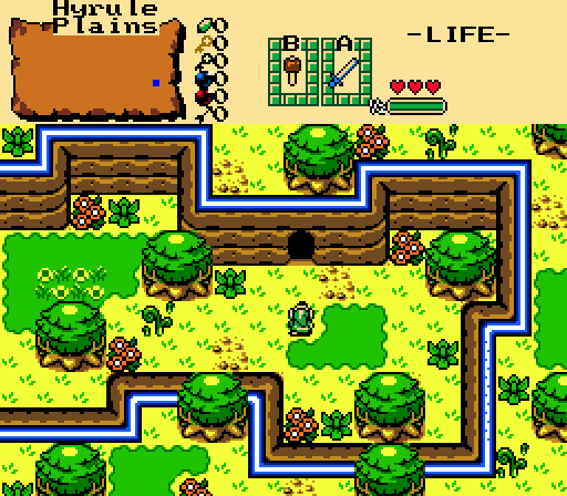
Look at my messy screen design!
ywkls
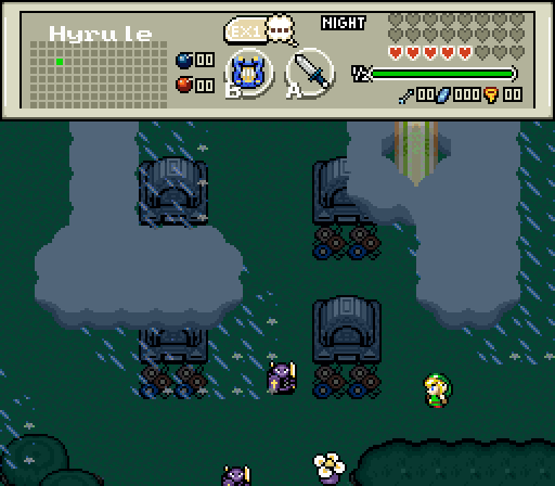
A break in the clouds! I'm saved!
Joelmacool
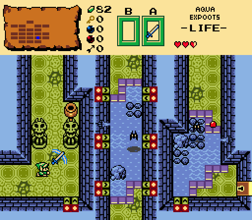
It's the "Aqua Expoots"!
Sephiroth
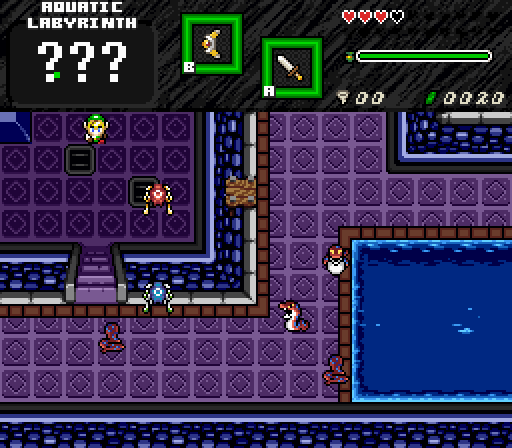
What a spacious room for a Labyrinth! Oh wait, is that a floating dock?
DragonDePlatino

 This topic is locked
May the way of the Hero lead to the Triforce.

Posted 01 May 2016 - 10:18 PM
CyberGamer1539
Look at my messy screen design!
ywkls
A break in the clouds! I'm saved!
Joelmacool
It's the "Aqua Expoots"!
Sephiroth
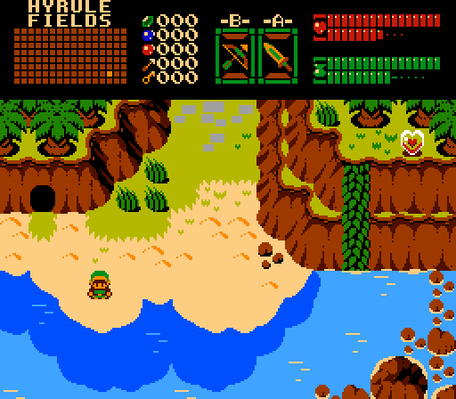
What a spacious room for a Labyrinth! Oh wait, is that a floating dock?
DragonDePlatino
Master

Posted 01 May 2016 - 11:26 PM
Nulled, since I'm in this one. So here's my reflections on my competition.
CyberGamer1539- It actually doesn't look all that messy to me. The palette is a tad bright, but not so as to be glaring. Otherwise, nothing particularly notable here.
Joelmacool- A very wet dungeon shot. The little spots where water comes out of the walls are a nice touch, though the logic behind the one on the left side of the middle (as in where the water comes from) escapes me.
Sephiroth- Do I sense a dungeon involving raising and lowering water levels, raft paths and the like? That sparks my interest right away. Not a bad shot either. My vote would have gone here.
DragonDePlatino- I get the sense that you're creating a tileset or some such. It looks like something between classic and gameboy. My only complaint is the look of the character, if he's supposed to be Link. As a representation of Link, it needs some work. Otherwise, okay.
A good showing all around.
Edited by ywkls, 01 May 2016 - 11:26 PM.
one point nine hero

Posted 02 May 2016 - 12:28 AM
"Tra la la, look for Sahasrahla. ... ... ..."

Posted 02 May 2016 - 12:39 AM
CyberGamer1539
A bit too yellow IMO. Are the mountain borders supposed to be so sharp? I'm not saying you designed them, but I wish they had rounded corners and that they weren't blue when nothing else is blue.
ywkls
The start of a nice shot, needs more ground detail. Is that a ghostly golden pillar or sunbeams?
Joelmacool
Interesting navigational layout. Not sure about the hidden clay pot.
Sephiroth
The floor borders are missing in the upper right corner (at first I thought was a wall going down, not up, dunno why). Personally I don't like floor borders visually blocking the stairway. I really like the layout a lot though.
DragonDePlatino
Totally love this tileset! And I noticed the button items are now much easier to see ![]() How the water meets the land looks a little oddly-shaped, but it's just one frame out of an animation so I can't really judge it. Darker water usually means deeper water though, so it's strange that it gets darker as it gets closer to the shore.
How the water meets the land looks a little oddly-shaped, but it's just one frame out of an animation so I can't really judge it. Darker water usually means deeper water though, so it's strange that it gets darker as it gets closer to the shore.
I like Sephiroth's and DragonDePlatino's the most.
Edited by Cukeman, 02 May 2016 - 12:43 AM.
ringle

Posted 02 May 2016 - 05:14 AM
CyberGamer1539 - Pretty nicely done. I like what you got going on here and it's a pretty decent GB screen.
ywkls - I like what you got going on here, but the screen seems a bit too much on the empty side and the cloud on the top-left looks kinda strange with the gravestone, it looks as if the grave is on the same level as the clouds or something.
Joelmacool - Nice job with this screen. I love the details and the design. Good job here.
Sephiroth - Pretty interesting screen here. I spy a gimmick with the water too. Maybe you could have some more stuff like pots and things like that, but that's up to you really.
DragonDePlatino - This tileset is coming along very nicely. This screen looks really awesome too and I love what you got going on here.
I voted for DDP in the end with Joel in 2nd.
💙

Posted 02 May 2016 - 05:29 AM
I voted for DragonDePlatino, I would love to use this tileset. Though why is the shallow water(?) darker than the deep water? I don't think this makes much sense as the beaches I have been to have light shallow water and dark deep water due to seaweed and all that.
Second place goes to Sephiroth. Loving that dungeon!
Hero of Time

Posted 02 May 2016 - 06:15 AM
voted for DDP. i'm trying not to get immediately suckered in by the novelty of a new tileset, but his happens to look really nice and it's being used in a good way
Magus

Posted 02 May 2016 - 06:19 AM
The Legendary Sephiroth

Posted 02 May 2016 - 06:26 AM
Sephiroth
The floor borders are missing in the upper right corner (at first I thought was a wall going down, not up, dunno why). Personally I don't like floor borders visually blocking the stairway. I really like the layout a lot though.
life is fragile, temporary, and precious

Posted 02 May 2016 - 07:44 AM
"Tra la la, look for Sahasrahla. ... ... ..."
Posted 02 May 2016 - 09:53 AM
The floor borders are actually not missing in the upper top-right. Look at the base of the walls in the lower section, there's also no floor borders there. The borders only visibly go around areas water can go.
Huh, so they're not floor borders, they're water borders. I can see your logic, it's just really unexpected to have a common graphic element not serving its usual function. Kind of hard to see it differently.
The Legendary Sephiroth
Posted 02 May 2016 - 10:49 AM
Huh, so they're not floor borders, they're water borders. I can see your logic, it's just really unexpected to have a common graphic element not serving its usual function. Kind of hard to see it differently.
Chosen One
Posted 02 May 2016 - 04:40 PM
DDP, your tileset rekindles my love for ZC.
Tell all with glee, Argon's on PureZC

Posted 02 May 2016 - 05:44 PM
I voted for DragonDePlatino, that screenshot is awesome! Cool and creative graphics and a clean design.
Joelmacool would be my second choice here, awesome looking dungeon which has a fun to play vibe.
The other 3 shots are pretty good too, but didn't really do it for me.
Yes I'm that guy who dreamt Dani was Zelda. LOL Cimfam/zelda

Posted 02 May 2016 - 06:05 PM
DDP gets it for me this week. Pretty masterful.
0 members, 0 guests, 0 anonymous users


