Jump to content

Photo

finalizing a pure tileset


  • Please log in to reply
73 replies to this topic

#31 Russ

Russ

    Caelan, the Encouraging

  • Administrators
  • Location:Washington

Posted 20 July 2008 - 12:58 AM

QUOTE(Lemon @ Jul 19 2008, 09:42 PM) View Post

I think we should ditch Pure and just upgrade the DoR set. It's far superior at this point and has pretty much everything Pure has to offer in it to boot.

DoR is good, but a certain part of me is still attached to Pure. PTUX ruined that feeling, but this tileset brought it back again. I really like it.

#32 Mitchfork

Mitchfork

    no fun. not ever.

  • Members
  • Real Name:Mitch
  • Location:Alabama

Posted 23 July 2008 - 11:02 AM

Well, I finally up and downloaded it. Here are my thoughts.

The move to DoR's palette structure was very nice, but the fact that many of Pure's tiles were not updated to take advantage of this is kinda disappointing. Some of your LttP trunks are deeply in need of this- you used the DoR edit for SD's tree tops, and that works well, but the other ones need more shading. May I recommend SD's edits? They're around the middle of the page. They add an extra gradient that makes them look much better. Also, I think that the Round Rock mountains could use an extra gradient- try ripping the ones from DoR.

You can tell there's some color loss on a few tiles, but they're solid for the most part. I think the real show-stopper here was the addition of Evile's palettes- most of these are simply stunning. I'm definitely going to rip a few of these for my quest.

So, yeah, good job. Definitely some good stuff here, but it's not as organized as past Pure sets.

#33 Russ

Russ

    Caelan, the Encouraging

  • Administrators
  • Location:Washington

Posted 23 July 2008 - 12:41 PM

I think i found a bug. There are not tiles for the big trees in the forest brush. I know DoR has them, and I'm pretty sure PTUX has them. Whether or not it does, they are a must-have.

#34 Alestance

Alestance

    Saint Alestance - Eliminator of the ZGP format

  • Members
  • Real Name:Lonk
  • Location:Pennsylvania

Posted 23 July 2008 - 02:41 PM

Luckily this is a beta and the tileset will grow and change.

#35 Akkabus

Akkabus

    Illustrious

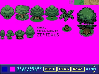
  • Members

Posted 23 July 2008 - 06:18 PM

@ ebola:

thanks for your helpful feedback. i'm beginning to realize that i have a lot of work to do before this can be released. in the meantime, rip what you want out of it.

i'll look into SD's submissions. she produced outstanding work.

when you say it's not as organized as the other pure sets, do you mean the combos, tiles, or something else? maybe i'm not the best person to organize the set, since i know where everything is. i'd love to hear more opinions on how it should be organized.

@ russ:

i'll look into it.

@ alestance:

luckily. ^_^

i have a question for people who've used this set (and possibly ezgbz) before: is it too cumbersome to draw the large non-interactive objects (e.g., big trees, dungeon entrances) on layer 1? i skipped the overlays on large objects because i thought it would crowd up the combo pages, but it might also complicate screen design. what are your thoughts?

Edited by Akkabus, 23 July 2008 - 06:18 PM.


#36 lucas92

lucas92

    Defender

  • Members

Posted 23 July 2008 - 06:25 PM

I like it, but as others said, the pink is very irritating. I would prefer it black, even if it's more confusing. Is there a way to fix that (a palette edit)?

About the layer issue, I don't think it's that much confusing to go to layer 1 for the large trees, but it takes 1 more map, which make the file larger... But makes the combo page less crowded. Better would be to leave it as it is.

btw, where are the Pokemon trees by Zemious? I don't see them anywhere in the tileset. Might be a good idea to include them. I'm pretty sure that they'll look a lot better with the pure palette. icon_wink.gif

#37 Russ

Russ

    Caelan, the Encouraging

  • Administrators
  • Location:Washington

Posted 23 July 2008 - 07:02 PM

QUOTE(Akkabus @ Jul 23 2008, 04:18 PM) View Post

i have a question for people who've used this set (and possibly ezgbz) before: is it too cumbersome to draw the large non-interactive objects (e.g., big trees, dungeon entrances) on layer 1? i skipped the overlays on large objects because i thought it would crowd up the combo pages, but it might also complicate screen design. what are your thoughts?

It's a good idea, but I think it's probably easier to just use overlays. Then again, the new way uses less space. But still, just go with overlays.

QUOTE(lucas92 @ Jul 23 2008, 04:25 PM) View Post

I like it, but as others said, the pink is very irritating. I would prefer it black, even if it's more confusing. Is there a way to fix that (a palette edit)?

Yes, please make it black. The pink is horrible. icon_wink.gif

#38 Akkabus

Akkabus

    Illustrious

  • Members

Posted 23 July 2008 - 08:43 PM

@ lucas:

i haven't had time to incorporate his trees into the set yet. if you want to use them for DoR, though, here they are:

IPB Image

you have to edit the tree trunk shading a bit since they look really ugly as it is.

@ lucas and russ:

thanks for giving me two completely persuasive but opposing viewpoints on the layer/overlays issue. now i'm really confused! =P

re: the pink transparency:

it stays. i know it's annoying that the questmaker sees pink, but ideally, the gamer shouldn't ever see it. all you have to do to get rid of it anyway is turn the first color of every active palette in your quest from pink to black. i'm too used to the pink to ever change it. icon_frown.gif

#39 Russ

Russ

    Caelan, the Encouraging

  • Administrators
  • Location:Washington

Posted 23 July 2008 - 11:37 PM

QUOTE(Akkabus @ Jul 23 2008, 06:43 PM) View Post

re: the pink transparency:

it stays. i know it's annoying that the questmaker sees pink, but ideally, the gamer shouldn't ever see it. all you have to do to get rid of it anyway is turn the first color of every active palette in your quest from pink to black. i'm too used to the pink to ever change it. icon_frown.gif

In that case, I'm changing it. The pink makes me relive the nightmares of working with NewFirst. *Shudders*

#40 Alestance

Alestance

    Saint Alestance - Eliminator of the ZGP format

  • Members
  • Real Name:Lonk
  • Location:Pennsylvania

Posted 24 July 2008 - 02:44 AM

Speaking of. The next First Quest remake like Newfirst should be remade. Yes I know Neofirst is supposed to do it, but its such a huge change that I can't consider it so.

#41 lucas92

lucas92

    Defender

  • Members

Posted 24 July 2008 - 09:40 AM

After playing with the tileset a little bit, I would say that pink should be removed... Strangely enough, it isn't even a transparent colour?! Maybe I'm doing something wrong...

#42 Joe Dirt

Joe Dirt

    Wizard

  • Members

Posted 24 July 2008 - 10:59 AM

QUOTE(Lemon @ Jul 20 2008, 12:42 AM) View Post

I think we should ditch Pure and just upgrade the DoR set. It's far superior at this point and has pretty much everything Pure has to offer in it to boot.

I somewhat agree with you, but what really needs to be done is have the Pure tileset go in a different direction. I see a lot of people who try to turn Pure into DoR, when they should really just use DoR. But instead of ditching Pure all together, it should be enhanced using new tiles that fit with it's style that are not from DoR, and Pure should not use DoR's palettes. Keep Pure unique instead of trying to clone DoR.

#43 Zemious

Zemious

    Magicite: Bahamut

  • Members

Posted 25 July 2008 - 12:04 AM

Use these tree's as well:
IPB Image


----
edit...
I didn't see your post.


You totally messed up the new trees... (Not pokemon)
Compare the two.

Edited by Zemious, 25 July 2008 - 12:07 AM.


#44 Mitchfork

Mitchfork

    no fun. not ever.

  • Members
  • Real Name:Mitch
  • Location:Alabama

Posted 25 July 2008 - 12:08 AM

QUOTE(Zemious @ Jul 18 2008, 06:02 PM) View Post

Here's, have these:
IPB Image

An easy rip and recolor, with the recolor button. icon_wink.gif

I think you already suggested them. icon_rolleyes.gif

#45 lucas92

lucas92

    Defender

  • Members

Posted 25 July 2008 - 10:17 AM

Maybe include those pure alttp perspective mountains:
http://www.purezc.co...ge=tiles&id=520

Or the Alttp simplified mountains:
http://www.purezc.co...ge=tiles&id=504

There is really a need of diagonal mountains...


0 user(s) are reading this topic

0 members, 0 guests, 0 anonymous users