I just thought I'd let everyone know, I've decided against switching tilesets. I love the BS MC set, but I figured if I have to edit and add a lot of graphics either way, I might as well use the set I already started. Plus, I still love the way it looks, but I do want to re-organize the palettes.
Link's Hangover
Created by
Anthus

Not Switching Tilesets, continuing with the "Hangover set"
Started by
Anthus
, May 20 2013 12:36 PM
3 replies to this topic
#2

Avaro
-

- Members
-

o_o
- Real Name:Robin
- Location:Germany
Posted 24 May 2013 - 01:57 PM
Well, I'm glad you've decided to use the "hangover set" 
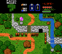
Do you focus more on the overworld or more on dungeons in your quest? I like the dungeons shots you posted. In the first update, you showed a structured map of the overworld, and I like that map a lot. Looks like there will be lots of "small sections" of the world Maybe, you also find a way to graphically personalise your dungeon graphics, like the overworld?
Do you focus more on the overworld or more on dungeons in your quest? I like the dungeons shots you posted. In the first update, you showed a structured map of the overworld, and I like that map a lot. Looks like there will be lots of "small sections" of the world
#3
Anthus
-

- Members
-

Lord of Liquids
- Location:Ohio
Posted 24 May 2013 - 05:00 PM
I think both are pretty important, but I probably focus more on dungeons. I generally get more ideas for puzzles, and challenges when looking at designing a dungeon. With overworlds, it's not that I lack inspiration, but sometimes I find it hard to think of stuff to put there, and stuff to do so it isn't just a bunch of screens with enemies. I've kind of taken a different approach to designing the overworld sections here though. They are planned more like dungeons. For example, in this quest Link will have to go to a forest area, and do some stuff to get the candle before he can move on to level 1. The forest is self contained, and has some environmental puzzles. I also like to break up the repetition of the overworld with some caves. As for that map I posted with the color coded grid, it's already kind of out of date. I'm still using the same general layout, but the areas won't be confined to a 12x12 area. This takes some pressure off of designing cause I don't have to force areas into a set shape, and instead, I can focus on making freeform areas the connect to each other in a more natural way.
As far as the dungeon graphics, Every dungeon will probably look very different. I don't want to give away too much yet, as this is still fairly tentative, but here are some examples: We're seen what the first dungeon is, so by comparison, the second dungeon will begin in the present time (looking the same, but maybe a deserty palette swap), maybe offering only one or two rooms, however, with a certain item, you can activate a timeshift stone, which takes you into the dungeon in the past where it then uses the regular NES dungeon walls, but don't worry, there will be more to looks at, as there are some moving parts that become active . Also, the third dungeon will have cave sections within, and possibly feature an underground lava stream (an idea I've wanted to use for years now). And, well, the only reason Level 2 shifts to Classic is cause I made it in Classic, and it simply works that way, and redrawing it in other graphics would take away from its look, I think. I would also like to have at least three dungeon wall sets.
As far as the dungeon graphics, Every dungeon will probably look very different. I don't want to give away too much yet, as this is still fairly tentative, but here are some examples: We're seen what the first dungeon is, so by comparison, the second dungeon will begin in the present time (looking the same, but maybe a deserty palette swap), maybe offering only one or two rooms, however, with a certain item, you can activate a timeshift stone, which takes you into the dungeon in the past where it then uses the regular NES dungeon walls, but don't worry, there will be more to looks at, as there are some moving parts that become active
#4
Avaro
-
- Members
-
o_o
- Real Name:Robin
- Location:Germany
Posted 25 May 2013 - 09:01 AM
I understand. Looking forward to it!
0 user(s) are reading this topic
0 members, 0 guests, 0 anonymous users

