Jump to content

Photo

Opinions on Aesthetic Cave Water

Water Cave Transparent water

  • Please log in to reply
13 replies to this topic

#1 Eggman666

Eggman666

    Newbie

  • Members
  • Location:Calgary Alberta

Posted 09 May 2017 - 08:24 PM

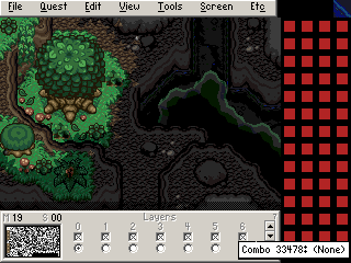
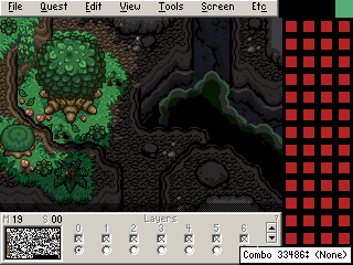
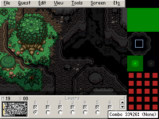
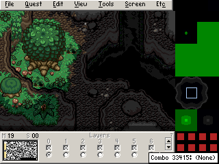
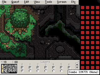
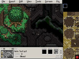
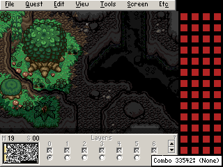
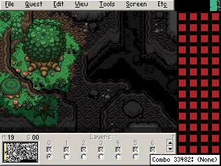
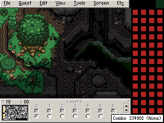
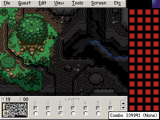
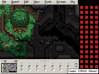
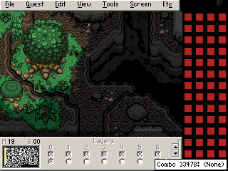
 I've been playing around with transparent cave water lately.

I have a few different versions and would love some other opinions on the matter.

All the elements of each screen shot can be interchangeable, removed or added.

Some look better than other as it's all experimental.

Unfortunately there are a few too many to animate.


Any ideas or elements not fitting well, let me know. Thank you  :D


1# zelda001_1.png

2#zelda002_1.png

3#zelda003_1.png

4#zelda005.png

5#zelda006.png

6#zelda003.png

7#zelda002.png

8#zelda001.png?t=1494280765

9#zelda004.png

10#zelda008.png

11#zelda009.png

12#zelda011.png

13#zelda010.png

14#zelda007.png

15#zelda014.png?t=1494280765


#2 Obderhode

Obderhode

    There is great power in knowledge.

  • Members

Posted 09 May 2017 - 08:55 PM

I can barely tell a difference between most of them. A good many don't look like water to me, I like the ones that resemble #1 and #2 the best (or have blueish/greenish in them at all).


#3 Neppy

Neppy

    Grand Overlord Empress

  • Members
  • Real Name:It's dangerous to go alone. Take Nep!
  • Location:Minnesota

Posted 09 May 2017 - 08:57 PM

Personally, I like how 4, 10, and 14 look as far as water goes. I'd say that this is a solid screenshot altogether though. One thing that I'm noticing though, is the small rocks in the shadowy area are pretty light compared to everything else. They seems to feel slightly off to me.


#4 Russ

Russ

    Caelan, the Encouraging

  • Administrators
  • Location:Washington

Posted 10 May 2017 - 02:55 AM

Three looks the best to me. Not a fan of one and two at all; I can't even tell what that green glob is supposed to be. Any of the ones without that look good though.

I know it's a bit outside the scope of the thread, but can I just mention how amazing the screenshot looks? You managed to make beautiful, realistic looking caves that throw eschew just about every common "rule" of cave-making.
  • Matthew and Naru like this

#5 Naru

Naru

    Magus

  • Members

Posted 10 May 2017 - 11:19 AM

I like 3 and 10 the most, though with 10 you have these sharp corners like in a square.


Edited by Naru, 10 May 2017 - 11:20 AM.


#6 Eddy

Eddy

    ringle

  • Moderators
  • Real Name:Edward
  • Pronouns:He / Him
  • Location:London, United Kingdom

Posted 10 May 2017 - 11:28 AM

I definitely like 3 the most, I really like the blue-ish look to it and fits the most out of all the others. Also gotta say, that screen is looking pretty nice too!


#7 Sheik

Sheik

    Deified

  • Members

Posted 10 May 2017 - 11:56 AM

I think textured water look better here if you want to use it as transparent water.


#8 Deedee

Deedee

    Bug Frog Dragon Girl

  • Moderators
  • Real Name:Deedee
  • Pronouns:She / Her, They / Them
  • Location:Canada

Posted 10 May 2017 - 12:24 PM

I think the blue sparkles in #1 with #3's water would look good.


#9 Eggman666

Eggman666

    Newbie

  • Members
  • Location:Calgary Alberta

Posted 10 May 2017 - 04:10 PM

So after a small tally and a few edits, here are the ones that might be top picks out of those selections.

A#giphy.gif

B#giphy.gif

C#giphy.gif

D#giphy.gif

E#giphy.gif


Originally the green blob was some sort of algae or light reflection aspect. I admit the blue looks sorta cool, but it may have to be put on the opposing side of the shadow. Blending this into different screens might be hard. The main reasoning behind finding the best one is due to layer constraints (if only they could just add 2 more layers) So once the best one has figured out, I'll have to hopefully, get them into 1 layer tops plus the regular layer 0. I doubt I would be able to get this into just layer 0.


Edited by Eggman666, 10 May 2017 - 04:20 PM.


#10 Matthew

Matthew

  • Administrators
  • Real Name:See above.
  • Pronouns:He / Him
  • Location:Ohio

Posted 10 May 2017 - 04:21 PM

D and B look the best to me.

Also, I have a question: How long have you been working with this program?

#11 Sheik

Sheik

    Deified

  • Members

Posted 10 May 2017 - 04:59 PM

Out of these I am liking B the best.


#12 Naru

Naru

    Magus

  • Members

Posted 10 May 2017 - 05:42 PM

I like E for being rather smooth, the others again form rather obvious and sharp lines and corners. The blue is a bit too intense for my taste and looks a bit unnatural to me while the purple part is just too purple, and why two colors anyway?. Though with E you have no animation in the upper part and it doesn't look like underwater. I think I like B the most, though I can't really say that I like D less.


#13 Anthus

Anthus

    Lord of Liquids

  • Members
  • Location:Ohio

Posted 11 May 2017 - 01:43 PM

D is my favorite. A looks good too. It looks good either way but I personally think the deep water border looks a bit odd in the others. With this transparent water, less is more, I think.

#14 Eggman666

Eggman666

    Newbie

  • Members
  • Location:Calgary Alberta

Posted 15 May 2017 - 08:39 PM

@ Obderhode -  I agree, a lot of them don't resemble typical water. 3 and 2 did it for me a bit. The green was suppose to be a form of algae? or some sort of green light reflection? But I don't see it working out. Unless I flip it and have the reflection come off the other side. Witch i shall try eventually here. Other than that 11 looks the most natural to me without all the extra stuff.


@ Neptune - You have been around quite a while to witness all the transparent waters that people have developed along the way. So you're suggestions is pretty good, If I was to darken the sand and underneath the water in a certain way, you think it would work? I think so. Therefor I shall try!  All of it though? And have like the higher spots lighter because it's closer to the top? Seems like a good idea. I definitely play with that.


@ Russ -  Thank you good sir! What can I say? :D  I agree with you too. The green doesn't really work that well. As much as I hoped. I still might play around with it though. I can't see blue being the reflective light in that area Although it does look cool. 


@ Naru - 3 looks pretty as well. I think 10 water overlay around the rocks, the ripples, because they aren't transparent, it adds too much light reflection and well. I'm no artists. I mainly just do edits, so I dunno if I can make or find better water ripples along the edges really. :(  I would love to find the best water out of all this and "try/attempt..." to make it 1-2 layers and not 4 without loosing it's looks due to csets and pallet limitations. Guess we shall see...


@ Eddy - Yeah seems a lot of peeps like 3. I do too. I'm just concerned that in a cave without much light, I dunno if you would be able to see blue, or even the bottom of the water for that fact. It's kind of an oddity to use transparent water in a cave actually...Now that I think about it. Thank you also! I try I try. I was really wowed by freedoms first quest swansong.  Been sorta obsessive over looks ( not really a good thing) But tis what I like? What else can I say. ?


@ Sheik -You think so? Iv'e seen some dirtyish water that has some gradient to it in daytime. I think that could work as textured water? But for the most part your probably right.  Also even here is questionable. I mean it's suppose to be sort of dark, I don't even know if you should see through it? But it looks cool.... lol


@ Dimentio - That would be #D in the second series. Sadly though the color transparency wasn't consistent when I overlapped it with blue, so only blue worked along the sides,with some purple in the front. With some editing I'm sure I could get it right though. That was a good combo that you suggested though. I enjoy the looks and turnout of it. 


~series 2~


@ ( ͡° _ʖ ͡°)    - #D & #B are pretty nice, both are variants of what Dimentio suggested, I like them both too. Its hard to pick for me out of those 5. They all look cool, but I might play around with flipping the blue on the opposite side as the shadow. If not #B,#C,#E will be voted out. I think about 3 years in total on and off.. I was around in the 1.90 era - 2.10. I never really did anything though other than play quests and try things out. Never completed a quest, I think I was a bit too over obsessed on mechanics and aesthetics and looks rather than completing a quest. I'll try not to make that mistake again. 


@ Sheik - What about it? It is using the strange blue. Just thought that one would be less voted for. It does look interesting though.


@ Naru - E is pretty nice, I dunno about realism for it though. Sadly I had some color distortion using transparency with the frontal version of water ripple effect using blue. So I was forced so split the colors up into purple and blue. Again I think with a bit of editing i could make it better. Also when using the transparent blue ripple overlay, the ripple animation doesn't show up as good. Could add that as an effect though, as not transparent. 


@ Anthus - I think you might be right. All the others exhibit some unrealistic traits. And seems like the more detail the more questionable it also becomes. I also would need to fix the purple in the front for this one as well.


Thank you all for your opinions and support on this matter. Over all I have to do some more aesthetic research to conclude this one. 
I also have to mix this down somehow into 1-2 layers as some of this water actually takes up 4, and is actually kinda useless other than for looks.


  • Anthus and Matthew like this


Also tagged with one or more of these keywords: Water, Cave, Transparent water

0 user(s) are reading this topic

0 members, 0 guests, 0 anonymous users