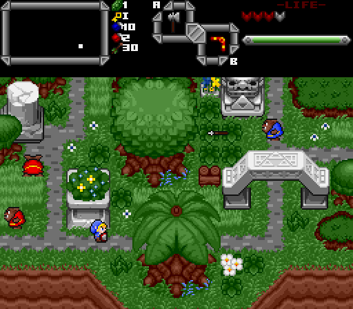
I had wondered about that myself. I assume those pits/caves won't be just perfect black squares in the final version or aren't anymore?

Screenshot of the Week 450
Started by
The Satellite
, Apr 06 2014 05:58 PM
DragonDePlatino Demonlink Astromeow
-
 This topic is locked
29 replies to this topic
#16

The Satellite
-

- Members
-

May the way of the Hero lead to the Triforce.
- Real Name:Michael
- Pronouns:He / Him
Posted 07 April 2014 - 04:31 PM
#17
DragonDePlatino
-

- Members
-

Pixel Dragon
Posted 07 April 2014 - 04:41 PM
I had wondered about that myself. I assume those pits/caves won't be just perfect black squares in the final version or aren't anymore?
Hmm...I've completed at least a dozen more tile pages for Koten, so I assume at this point you could get creative with overlaying pit tiles to make gradients! But we'll have to see. I have an idea or two for a good dungeon mockup, so that might be a good example. ![]()
#18
David
-

- Administrators
-

Fallen leaves... adorn my night.
- Real Name:David
- Pronouns:He / Him
Posted 07 April 2014 - 05:39 PM
Wow, all of the screenshots are really great this week! Ultimately, however, I choose Demonlink's shot because it looks great and has a nice mood.
#19
Moonbread
-

- Members
-
Playing With Psychos
- Pronouns:They / Them
Posted 07 April 2014 - 11:02 PM
Wait, you mean people couldn't tell that was a waterfall going down a pit? It honestly looked fine to me!
Voted for Dragon.
#20
Hoff123
-

- Members
-

The Hoff :)
- Location:Sweden
Posted 08 April 2014 - 04:49 AM
To me it looks like the small river should be more to the left and connect to the waterfall... but I guess I didn't understand that there was actually supposed to be some kind of pit in between...
#21
Lightwulf
-

- Members
-

Master
- Real Name:I'm not telling you my secret identity!!!
- Location:Ainrofilac, Ceh Sha Ah (I'm libingual)
Posted 08 April 2014 - 02:50 PM
@Demonlink: Sweet lookin' screen, man! ![]() I love it! The only reason I didn't vote for it is a lack of action: no Link or enemies or anything.
I love it! The only reason I didn't vote for it is a lack of action: no Link or enemies or anything.
@Astromeow: Pretty cool! ![]() Looks great!
Looks great!
... There's just something about the palette that strikes me as odd.
Also, I think the music block-thing would look more natural if the grass hung over it more. I had to squint and look up close to notice that the grass hung over it at all. A couple pixels of hangover aren't very noticeable against a 1-pixel dark border and gray background. I think it should be more like how the grass hangs over the pathways. Maybe you could also add a pattern (of grays, of course) to the face of the block.
@DDP: My vote went here. ![]() Awesome new tileset! There are a couple things that don't look right to me, though.
Awesome new tileset! There are a couple things that don't look right to me, though.
The palettes for the enemies and Link could use a darker tone for their darkest color; in a screenshot, they really blend in to the surrounding color rather than standing out as individuals. Partly because the background objects (Armos, big tree) have black but Link and the enemies don't have a color that dark (though Link's blue is close). The aforementioned background objects stand out a lot more. Not sure if this is fixable, considering your all-custom palettes.
The other thing is the waterfall. At first, I didn't see that the second (from the top) waterfall combo was darker. It might help to use a darker third waterfall combo underneath that; either that, or just use a plain black pit combo under the second one. Reason is that there needs to be some separation between the waterfall and the southern shore; with how it currently is, it looks like the waterfall is on a cliff face that meets the combo below it (but just in that column on the screen). I hope this makes sense.
- DragonDePlatino likes this
#22
DragonDePlatino
-
- Members
-
Pixel Dragon
Posted 08 April 2014 - 04:35 PM
@DDP: My vote went here.
Awesome new tileset!
Thanks for your feedback! And yeah, that waterfall has been giving me nothing but trouble. After seeing people's feedback and finishing my sideview tiles, I went ahead and just stuck a sunset horizon between the two cliffs. It looks waaay cleaner. As for the sprite palettes, I'm only able to use 3 colors + transparency for each sprite in keeping with SNES limitations. I could change the outline colors to black but then they'd look a lot more lifeless and would would blend with black tiles. But to make everyone happy, I'll try my best to include Csets with black outlines.
#23
Geoffrey
-

- Members
-

Chosen One
Posted 08 April 2014 - 11:21 PM
I can't believe that you didn't vote for me. I'm hurt, truly.

#25
anikom15
-

- Banned
-

Dictator
- Real Name:Westley
- Location:California, United States
Posted 09 April 2014 - 02:48 PM
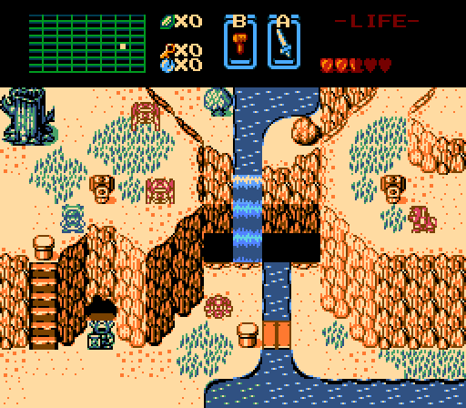
Honestly I don't like any of the screenshots this week. The palettes are ugly. Demonlink's is too dark, astromeow's looks wet with clashing elements (some things are clearly outlined, some things are softly outlined), Dragon's is good except the water seems too dark compared to everything else. Voted for Dragon based on design.
- Jared likes this
#26
DragonDePlatino
-
- Members
-
Pixel Dragon
Posted 09 April 2014 - 04:06 PM
May I suggest:
Yeah, that's definitely an improvement. If it weren't for the monochromatic green in Geoffrey's shot, it really would've gotten my vote. Remember your hue-shifting, people!
#27
Sheik
-

- Members
-
Deified
Posted 09 April 2014 - 05:03 PM
Yeah, that's definitely an improvement. If it weren't for the monochromatic green in Geoffrey's shot, it really would've gotten my vote. Remember your hue-shifting, people!
Tbh, I think the collection of tiles in that tileset is kind of a mess. I'm not a fan and I don't undestand what's different about this tileset as opposed to the DoR tileset.
#28
Geoffrey
-
- Members
-
Chosen One
Posted 09 April 2014 - 07:12 PM
May I suggest:
Astromeow, I think that we have a new palette. Thanks, Sheik!
#29
Haylee
-

- Members
-

~ Hope of Energy Nede ~
- Real Name:Haylee
- Pronouns:She / Her
- Location:Italian Restaurant in Koorong
Posted 10 April 2014 - 06:39 PM
May I suggest:
1 Problem: Dat Moblin of Moblinness
#30
The Satellite
-
- Members
-
May the way of the Hero lead to the Triforce.
- Real Name:Michael
- Pronouns:He / Him
Posted 13 April 2014 - 05:02 PM
With 47.92% of the vote, the winner of Screenshot of the Week 450 is DragonDePlatino!
Congratulations!
Also tagged with one or more of these keywords: DragonDePlatino, Demonlink, Astromeow


0 user(s) are reading this topic
0 members, 0 guests, 0 anonymous users

