Jump to content

Photo

Screenshot of the Week 500!

Theryan

  • This topic is locked This topic is locked
29 replies to this topic

Poll: Screenshot of the Week 500! (90 member(s) have cast votes)

Which of these many excellent selections is the best of this 500th screenshot contest?

You cannot see the results of the poll until you have voted. Please login and cast your vote to see the results of this poll.
Vote

#16 Cjc

Cjc

    Cor Blimey!

  • Members

Posted 23 March 2015 - 05:05 PM

I voted for RedTribeLink.  I was intrigued by the chain running under the grass, through the lock block, and up out of the screen.


It was really a toss-up, though, as all of the shots are fantastic.


(Note to self, work on the mountains!)


Funny story, I was actually having trouble getting mountains to work well with my pseudo-classic tileset so I found some rocks on the internet, reduced them to four colors, and then blurred them a little.  Perhaps if I reduce the noise they'll work better.

Also, I know the trees clash a bit but I couldn't bear to use the classic ones.  Perhaps these too need less noise.
Finally, I'm shocked I have as many votes as I do, because I made this screen in five minutes just for the purpose of having something in the 500th contest.  And I thought Classic was unpopular!  Thanks everybody!


#17 Matthew

Matthew

  • Administrators
  • Real Name:See above.
  • Pronouns:He / Him
  • Location:Ohio

Posted 23 March 2015 - 07:42 PM

I'm blown away from all these amazing submissions. I voted for Eddy though, as the screen helps build the hype for AR3! (That is what the screen looked like it would be from, anyway.)


  • Eddy likes this

#18 justin

justin

    Adept

  • Members

Posted 23 March 2015 - 10:42 PM

CJC, sorry not a fan, looks like a random DayDay assortment of tiles.

Geoffrey, very nice, although I agree with the suggestion that it tries to do too much. There is so little walking space on the screen. The spider's web looks out of place to me.

Joel, I've been liking everything I've been seeing from you lately. It doesn't stand up as overly interesting or unique against some of these other screens though, maybe could have won a normal week. Could use a bit of variety to ground detailing.

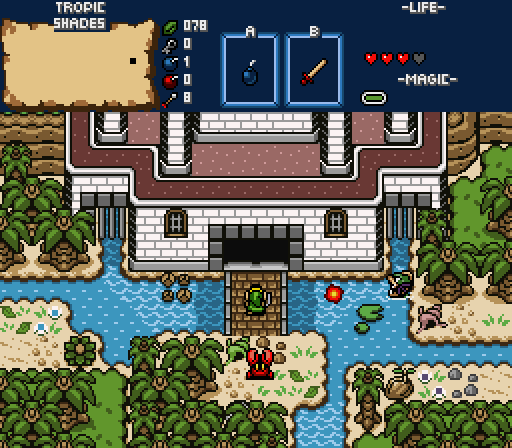
Eddy, very gameboy, maybe too much, I can't tell if it's a straight rip off or an homage. The tree tops over the dungeon look weird to me. Another gripe is the disjointed squareness to some tiles, not your fault, it's just their design. For instance the shells and step trigger break the flow of the sand, I wish someone would just improve on the game boy shortcomings with these types of tiles someday...

Theryan, I love this. The symmetry and asymmetry are nice, as are the colours. My critique is that the ground is overly detailed. Every tile is different, a little too busy, as with squeezing the skinny palms in everywhere, pulling a couple big and little trees out would help I think.

Coolgamer, very nice dor screen. Good detailing. Nothing else really going on though.

Nicklegends, very nice. The screen is easily one of the best in the contest, and I'm not going to discuss the nice points because of that. So onto the nitpicking... The shadows make the trees and details lose all their detail, which while effective on this screen, makes me concerned about how the adjacent screens look if they are more forest and more shadowed. The other gripe is the gameboy square tiles, the three bushes mostly, but also the sand tile to forest brush.

Twilight Prince, some interesting details, maybe a bit too many for one screen. The ground detailing could be better, see coolgamer's screen for a good example of subtle ground detailing. Actually, if your two screens were mashed together we'd be on to something. I'm also not sure I understand the overhead layer usage, are those the right tiles for that? It just looks like you dragged the tree top tiles across the screen with your mouse, especially in the top left with the topless tree bottom.

Deviance, I don't get it.

TS, nice clean lttp screen. Some issues with walking into stuff from adjacent screens. Like eddy's, it just feels taken from that game, and not unique enough to get my vote.


RedTribeLink, interesting. I didn't get the chains at first until someone pointed it out, now I think that is really cool, and I hope the concept is expanded throughout the dungeon. Not a fan of the trees in the dungeon with no light - it's dim and torches aren't lit, how are there trees!? And for that matter how is the screen lit with no light source? I really like everything about the subscreen.

Shane, awesome title screen. I look forward to this quest. Is it enough to vote for, not this week.

Orithan, wow, this is unique, as with everything you've been showing lately. I'm excited for this quest. I really like the transition tiles, and the cracked holed earth. Dislike, the sand walls, I don't know what they are supposed to be - some type of natural wall or artificial? If natural they should be less rigid and samey, more like a sand dune. If artificial, would look better as sand blocks.

Ywlks, too square and symmetrical. Looks like it will be a confusing dungeon with this screen having three staircases and three side exits. I do like the fence over the walls. The lights seem like wrong cset. And the dmap title doesn't look right on the subscreen.

NewJourneysFire, very nice. I like the idea of different transparent underwater elevations. This might be a little too muddled with the transparent water and transparent clouds.

Russ, so simple, but so much win. Everything about this just looks interesting. The colours are great, and the subscreen pops. A large quarter of the screen is just boring emptiness. And a lot of the tiles just seem to cut off into the sky creating some perspective issues.

Hard choice, but I think theyran's is the one I keep coming back to everytime I look at the screens.
  • Eddy and Avaro like this

#19 SubconsciousEye

SubconsciousEye

  • Members

Posted 24 March 2015 - 12:31 AM

THERE ARE SO MANY GOOD SHOTS THAT I SAY WE BAN ALL OF THEM.


In all seriousness, this is a nice turnout. Good luck to all people that participated! Could not decide, so a null was used.


#20 Eddy

Eddy

    ringle

  • Moderators
  • Real Name:Edward
  • Pronouns:He / Him
  • Location:London, United Kingdom

Posted 24 March 2015 - 11:46 AM

So I realised I haven't had a chance to respond to feedback on my shot. I might as well take the time to do so:


Eddy- This is obviously a shot from the Legend of Amy Rose 3. Very distinctive, but nothing really special about it either.

Yes, it definitely is. I wasn't really planning to make anything special, I just wanted to participate in #500 :P


EddyTheOligarchy - You should change the water tiles to have the waves roll towards the shore instead of moving parallel to the coast.

I would do that but that would kinda destroy what I'm going for. I'm trying to go for authentic GBC so making the waves move parallel to the coast would be as close to GBC Zelda as possible. Either way, thanks for the suggestion.


Eddy - Looks like a recreation screen from Oracle of Ages.  It certainly fits the bill.  Not exactly on the creative side though (since it's more of a mimic screen), so for that reason it's not enough to call it the best of the bunch.

Yep, it's a recreation of a screen from OoA. And yeah I'll admit, there's nothing too creative going on here, but I just wanted to submit something for this lol


I'm blown away from all these amazing submissions. I voted for Eddy though, as the screen helps build the hype for AR3! (That is what the screen looked like it would be from, anyway.)

Thanks a lot man :D And yes, this screen comes from Amy Rose 3.


Eddy, very gameboy, maybe too much, I can't tell if it's a straight rip off or an homage. The tree tops over the dungeon look weird to me. Another gripe is the disjointed squareness to some tiles, not your fault, it's just their design. For instance the shells and step trigger break the flow of the sand, I wish someone would just improve on the game boy shortcomings with these types of tiles someday...

I guess it was my goal to make this as gameboy as possible so I think that was successful? As for the tree tops over the dungeon, I don't have any alternatives and I'm probably sticking to this to keep with the GBC feel. As for the disjointed squareness, yeah I agree it does break the flow of the sand but it personally doesn't bother me that much. I definitely see where you're coming from though.


I'll admit, I'm pretty happy with my only vote lol. But seriously thank you guys for the criticism. I'll be taking some stuff into account.


  • Matthew likes this

#21 Anthus

Anthus

    Lord of Liquids

  • Members
  • Location:Ohio

Posted 24 March 2015 - 01:41 PM

Woww, that's incredible. Sixteen entries? It was really close for me between nicklegends, and Theryan. Both shots have nice colors that I really like, but I voted for nicklegends. Something about the depth going on here. I just really like the screen. I'll come back and comment on all of them later.


#22 nicklegends

nicklegends

    Trofessional Pransposer

  • Contributors
  • Real Name:Ed
  • Pronouns:He / Him

Posted 24 March 2015 - 11:13 PM

What a great turnout! I'm so glad the contest has survived to its 500th iteration. It speaks well to everybody's creativity and the forum as a whole.

Cjc
I haven't seen any classic-style shot quite like this one. I like the overall vibe of the screen and yet I feel some of the graphics don't meld well together.

Geoffrey
A nice, vibrant scene. I feel like it would be a little cramped to navigate, though. It's like the screen tries to do too much.

Joelmacool12
A well designed Game Boy shot without much flair.

Eddy
The repeated shell detail detracts from an otherwise attractive shot.

Theryan
A lot of detail packed into a small package. The color palette is distinctive.

Coolgamer012345
A pleasant scene, but nothing too interesting.

nicklegends
Looking back, the screen is somewhat drearier-looking than I indended. I want a jungle that's lush, not stagnant and swamplike. Oh well. :shrug:

Twilight-Prince
The repeated dirt pattern combined with the detail-obscuring shadow of nighttime makes this screen look somewhat drab.

Deviance
I'm so glad you decided to enter. :) TACO!

The Satellite
I'm pretty sure this was taken directly from A Link to the Past! Well, not quite.

RedTribeLink
The screen just looks... confused. The trees don't really match and the telepathy stone is oddly placed. Sorry.

Shane
Gorgeous. The gold hue is attractive and I especially like the bird detail. Why is the sky so gold when the sun's so high, though? Either way, voted here.

Orithan
Captures a dead vibe for sure. Some a of the features are a little hard to make out... What are those cube blobs on the right side? Is that vertical strip on the left walkable or not?

ywkls
It's OK... I can't put a finger on it, but I don't care much for the screen design. Sorry to be so vague.

NewJourneysFire
Are those shadows cast by clouds? If so, they seem a little densely packed. I like the transparent water. Still, the screen looks oddly sparse... Maybe a more visible tree would help? It's hard to say.

Russ
Bright, unique, but not particularly engaging to me.

Thank you for all your comments and recommendations for my screen. I really appreciate the feedback; it's the only way I'll get better.
 

I voted for nicklegends. It has all the best qualities of the competition all rolled into one amazing screen.

Thank you!

You stole an idea I had without even knowing it! Namely, use rivers to access areas by swimming beneath bridges. I also like the shadowy areas.

Thanks for your comments. :)

"A $1000 on nicklegends!"

Thanks, but that's a lot of money to place on a SotW competition. Haha.

Very cool jungle/forest temple shot. You did a great job of fusing the indoor and outdoor elements.

Thank you! I like dungeons that fuse indoor and outdoor areas (it makes them feel bigger), so I thought I'd do the same here.

A very charming screen that masters shades of green and brown, with a hint of both sun and shade. Overall fantastic graphics design and decisions, and my vote for this milestone week.

Thanks, Nathaniel. :)

I love the forest setting here. Really cool stuff. I dunno if the water is really supposed to be green since that looks odd (unless it's supposed to be part of a swamp or something). Either way, nice.

Thanks, Eddy. In retrospect, I agree with you about the green water. I was envisioning Stow Lake in my mind, but then I remembered that water is gross. :XD:

Nicklegends, very nice. The screen is easily one of the best in the contest, and I'm not going to discuss the nice points because of that. So onto the nitpicking... The shadows make the trees and details lose all their detail, which while effective on this screen, makes me concerned about how the adjacent screens look if they are more forest and more shadowed. The other gripe is the gameboy square tiles, the three bushes mostly, but also the sand tile to forest brush.

Thanks, justin. I think you make a very good argument and I'll be careful not to obscure too much detail in the area.

I voted for nicklegends. Something about the depth going on here.

Thanks, Anthus. :)
  • Eddy likes this

#23 Rastael

Rastael

    Wizard

  • Members
  • Real Name:Raphael
  • Location:Austria

Posted 25 March 2015 - 10:04 AM

Oh my god, there are too much great screenshots, they are killing me! XD


That was some hard choice. Voted for Theryan. The combos are perfectly placed, so the screen looks very large. :)


#24 Eddy

Eddy

    ringle

  • Moderators
  • Real Name:Edward
  • Pronouns:He / Him
  • Location:London, United Kingdom

Posted 25 March 2015 - 10:41 AM

Eddy
The repeated shell detail detracts from an otherwise attractive shot.

Yeah I'll admit there wasn't any other shell graphic I could use but oh well, thanks anyways lol


#25 SkyLizardGirl

SkyLizardGirl

    Unbeknownst to danger we call upon your help

  • Banned
  • Real Name:Arianna Crystal Ritter
  • Location:Earthia

Posted 25 March 2015 - 08:36 PM

I voted Theryan

for some strange reason.


When i look at your name here: why is it that i suddenly think of .. THOR?


Also: The Ryan   


Spoiler
 

  ^


Edited by SkyLizardGirl, 25 March 2015 - 09:02 PM.


#26 TheLegend_njf

TheLegend_njf

    Deified

  • Members
  • Real Name:Grant

Posted 26 March 2015 - 09:37 AM

NewJourneysFire
Are those shadows cast by clouds?


Not clouds. :P


Something else.


Oh shit!


Did I say too much? :P


Edited by NewJourneysFire, 26 March 2015 - 09:37 AM.

  • Demonlink likes this

#27 Theryan

Theryan

    Burrito

  • Members

Posted 26 March 2015 - 09:45 AM

Not clouds. :P


Something else.


Oh shit!


Did I say too much? :P

And the Lord said "Let there be floating islands."


  • Russ likes this

#28 SkyLizardGirl

SkyLizardGirl

    Unbeknownst to danger we call upon your help

  • Banned
  • Real Name:Arianna Crystal Ritter
  • Location:Earthia

Posted 27 March 2015 - 04:10 AM

I actually do like Geoffrey's

Pic also a bits, .. is most pretty.*


My vote however remains the same thoughs as before.


Edited by SkyLizardGirl, 27 March 2015 - 04:11 AM.


#29 lord_jamitossi

lord_jamitossi

    Wizard

  • Members
  • Real Name:Jamie
  • Location:In your blind spot

Posted 27 March 2015 - 12:37 PM

Wow, so many screenshots, this is actually making me tempted to get back into quest-making. Not sure I will because it'll eat up all my time but such nostalgia!


My vote went to Orithan. I really like the brighter palette and the player sprite. It's also the shot that most makes me want to explore the whole area outside of the screen; I'm sure there are lots of neat things hidden around in the bigger map!


  • ShadowTiger likes this

#30 The Satellite

The Satellite

    May the way of the Hero lead to the Triforce.

  • Members
  • Real Name:Michael
  • Pronouns:He / Him

Posted 29 March 2015 - 05:55 PM

Thanks again to all the entrants who participated in Screenshot of the Week 500! Except that TS idiot. It was a fantastic week, so thank you all for making it awesome, and here's to 500 more contests! Now without further ado, out of all sixteen contestants, the winner, with 29.33% of the vote is...


Theryan.png


Theryan! Congratulations! :bounce:


Voting totals:

- Cjc (4 votes [5.33%])
- Geoffrey (12 votes [16.00%])
- Joelmacool12 (0 votes [0.00%])
- Eddy (1 votes [1.33%])
- Theryan (22 votes [29.33%])
- Coolgamer012345 (1 votes [1.33%])
- nicklegends (11 votes [14.67%])
- Twilight-Prince (0 votes [0.00%])
- Deviance (0 votes [0.00%])
- The Satellite (1 votes [1.33%])
- RedTribeLink (2 votes [2.67%])
- Shane (11 votes [14.67%])
- Orithan (5 votes [6.67%])
- ywkls (1 votes [1.33%])
- NewJourneysFire (2 votes [2.67%])
- Russ (2 votes [2.67%])


  • nicklegends, Eddy and Dirtyshovel like this


Also tagged with one or more of these keywords: Theryan

0 user(s) are reading this topic

0 members, 0 guests, 0 anonymous users