joelmacool12
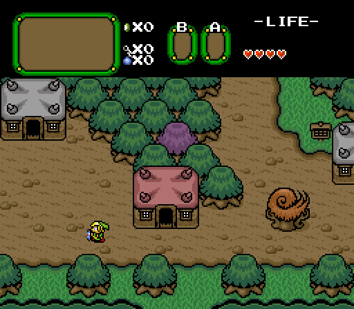
The Wonderful Town of Salamite!
ZeldaPlayer
Secrets are everywhere.
justin
Thieves are weak, gonna need to sneak around a lot.
Linkus
Things to come in the Firebird update.

 This topic is locked
May the way of the Hero lead to the Triforce.

Posted 09 November 2014 - 08:17 PM
joelmacool12
The Wonderful Town of Salamite!
ZeldaPlayer
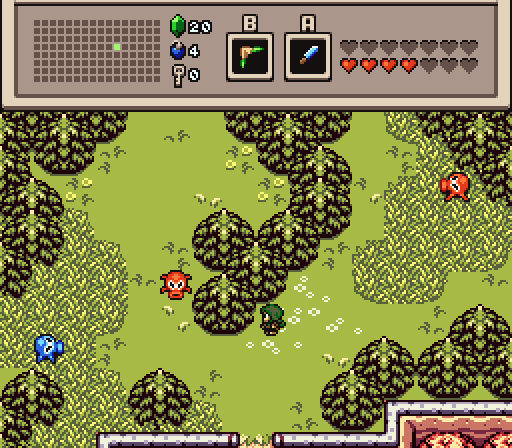
Secrets are everywhere.
justin
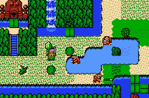
Thieves are weak, gonna need to sneak around a lot.
Linkus
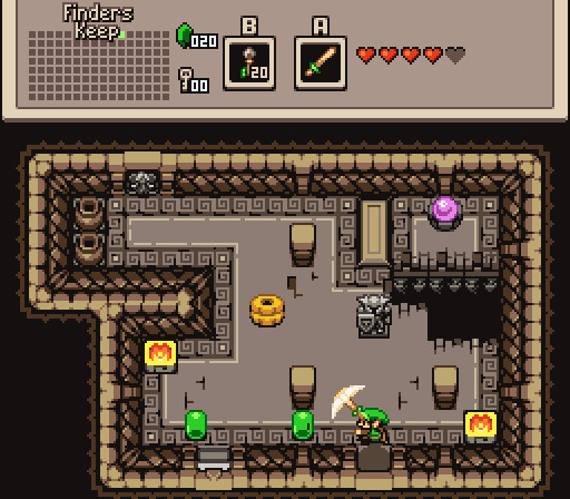
Things to come in the Firebird update.
What's up my playas

Posted 09 November 2014 - 08:21 PM
ZeldaPlayer
Secrets are everywhere.
Oops, I a tile error on the bottom right corner of the edge of the water.
Edited by ZeldaPlayer, 09 November 2014 - 08:21 PM.
Tiny Little Questmaker

Posted 09 November 2014 - 08:21 PM
Holy crap, Firebird has dungeon tiles?! /overused joke
Linkus wins, not because Firebird hype, but because it's an all around fantastic screen. Great job!
Has more posts in Doomworld than in PureZC

Posted 09 November 2014 - 08:50 PM
Oops, I a tile error on the bottom right corner of the edge of the water.
Doesn't matter, it's hardly noticable anyway. ![]()
My name is NOT Jason!

Posted 09 November 2014 - 08:53 PM
Linkus by a landslide. No contest here.
Deified

Posted 09 November 2014 - 09:35 PM
This is one of the few times my vote actually turned out against the majority.
I picked ZeldaPlayer. That's a very impressive use of the tile set.
Also, check out the name of the dungeon in Linkus' shot. ![]()
Edited by NewJourneysFire, 09 November 2014 - 09:36 PM.
don't look for me, i'm just a story you've been told

Posted 10 November 2014 - 12:04 AM
I'm also voting for ZeldaPlayer. Love the tileset and it feels like a breath of fresh air. justin was a close second for me.
💙

Posted 10 November 2014 - 12:12 AM
It was close between Linkus and ZeldaPlayer, but Linkus won me over for the atmosphere the colours provoke. For some odd reason, the colours really remind me of the Lanayru Mining Facility (in present-time) from Skyward Sword.
Lurking in the shadows...

Posted 10 November 2014 - 07:09 AM
ringle

Posted 10 November 2014 - 11:18 AM
ZeldaPlayer and Linkus were pretty close this week.
In the end though, I voted for Linkus mostly because that is some really nice content and it just looks overall beautiful!
What's up my playas
Posted 10 November 2014 - 02:32 PM
Wow ![]() This was better than I expected! I didn't even know Firebird Tileset had dungeon tiles.
This was better than I expected! I didn't even know Firebird Tileset had dungeon tiles. ![]()
Unbeknownst to danger we call upon your help

Posted 10 November 2014 - 10:29 PM
Zelda Player's looks really interesting because i been creating my own unique tileset by constantly modifying the original older NES pieces and learning from you all in a very short span.
Firebird is nice by already having things made for the developer to use just instantly.
But I am mostly one who marvels at those 'the most' who take the older NES tile- sets and make them their own shining them brighter and being more pleasant too the eyes.
Even if Zelda players might be using one set made that others may be using already.
It graphs the concept constantly in the mind of modifying the older pieces to make them up to date.
The older NES is the grassroots
as the newer LTTP and Minish cap sets can at times get a bit bulky looking as Duplo legos, even though the shadowing/colored effects in firebird already are obsessive to some.
Edited by SkyLizardGirl, 10 November 2014 - 10:35 PM.
you're going to have a bad time

Posted 11 November 2014 - 09:45 AM
Been awhile since I've done one of these! ![]()
joelmacool12 - Nothing at all wrong with this screen, really, though it is a bit bland for a "featured" screen. Adding an NPC or two could help the screen pop a bit. Though, if it's just meant to be a part of the village, it's perfectly fine at that.
ZeldaPlayer - I can't put my finger on exactly what it is I love about this screen so much, but it works really well. I actually really like how it's laid out similar to old-school NES games, especially in how the dungeon is kind of tucked up in the corner, right at the edge of the screen. On top of that, the colors work amazingly well here. Big thumbs up.
justin - While the idea of being a thief and being a bit more squishy is certainly an enticing idea, the screen doesn't have anything to really make it pop. Much like joelmacool12's screen, it's perfectly fine as a part of a bigger area, but not really something that stands out. That said, I do like the screen.
Linkus - I really dig the new Firebird dungeon tiles being shown here, and it's a really well composed screen. It certainly seems like part of a dungeon that I would want to explore. I really have nothing negative to say, the screen is really good. Colors all work well, enemies make sense and are interesting, Link in action is a nice touch. Great screen!
Overall, it was a close race between Linkus and ZeldaPlayer this week, but I'm giving the nod to ZeldaPlayer because that screen just really worked well for me for some reason. Great work! ![]()
Deified

Posted 11 November 2014 - 11:38 AM
joelmacool12 - The placement of tiles is very good, but I question a certain decision: Trees on top of a dirt ground. It doesn't feel all that natural to me. It works good under those buildings, but not so much under the trees. Might need an additional greener ground type to address that, or shallower grass combined with a dirt road layout. I'm sure there are plenty of ways to go with that.
ZeldaPlayer - I do like those tiles, especially the mountains, but I am not into your design of the screen. The upper left corner, and to a lesser extent, the lower right corner, feel like they were crammed in. The solid green combined with the other grass choices don't sit well with me when it comes to appearance. It feels inconsistent. At the same time, you have the upper right corner being very open. So overall, I see a screen that is a mixture of spread out and crammed in, giving it an awkward sense of dimension and spacing. As for the tile error you mentioned, to me that was a very minor issue in comparison.
justin - At first glance, you might dismiss this screen, but I find that the more I look at it, the more I like it. The screen design is excellent, and dependence on skill at screen design with limitations in place is what this one is all about. Everything flows very well, and it feels natural. The taller grass is a nice complement to the solid green ground, which I feel is necessary for this screen to pull it all off. The solid green is a nice light shade to go with the rest of the vegetation, giving a mostly green screen a very reasonable amount of contrast. I have a soft spot for screens successfully pulling off shades of one color.
Linkus - I love those tiles, and I love the room you put together with them. Your screens have a reputation for speaking for themself.
It was a hard choice between justin and Linkus for me, but I voted for justin. Both had their share of subtle details, but justin's clearly required more of it to pull it off, and he did so successfully. Linkus won on obvious details, while justin won on the subtle side.
one point nine hero

Posted 11 November 2014 - 01:04 PM
I actually dislike each of these, but ZP's is bearable so I voted for it.
0 members, 0 guests, 0 anonymous users


