Voted for Jared's pretty ruins. The perspective on the bridge in TheManHimself's shot doesn't feel quite right, I might have voted for him if not for that.
I see what you mean but honestly I'm going for a playable screen over over a slavish adherence to perspective here. I could have kept a consistent perspective between the bridge and the tower, but that would either A.) take up too much screen space to detail, making the screen less playable or B.) require me to draw the bridge as sidescrolling section, which I genuinely think is a bad idea. Since I am designing these screens within the context of a game --- not just as a pretty mockup --- I will always 100% stand by decisions that make my screens more playable, even if that means sacrificing consistent perspective (whatever that actually means when you are using the classic tileset).
A tileset with sprites that look like they are laying down when they are facing left/right, and trees tiles that are essentially laying flat on the ground from an overhead view will never have a consistent perspective --- This flattened sense of depth on a per-tile basis is a stylistic "limitation" that you have to accept when you choose to work within the confines of the classic tileset: it's a popup book made with flat objects, not a diorama made of three dimensional ones.
----
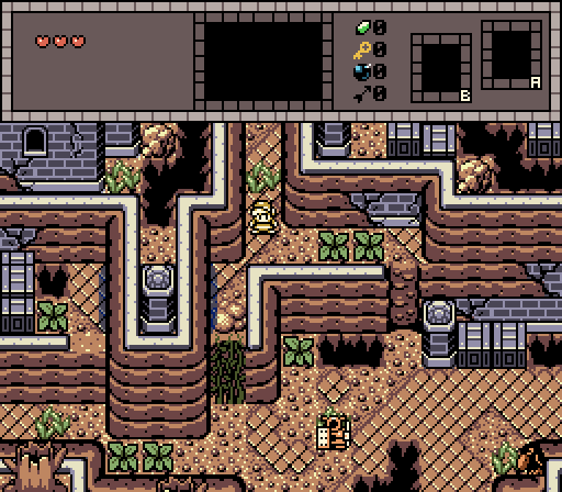
Jared- this is a damn good Gameboy screen. the custom tilework on the pits and the cuttable bushes is top-notch. the transition between eroded mountain tile and the ruined bricks is one I plan on borrowing for my own quest.
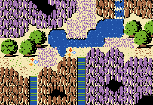
Zephvan - I like the simplicity of your screen. In my mind the purple grass are chunks of amethyst poking out of the ground.
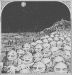
Mine - It's inspired by the cover art for Elf Power's When the Red King Comes, pretty much wrote everything else I wanted to say about it earlier in the post, vis. the the popup book perspective conceit.
Edited by TheManHimself, 21 June 2021 - 04:42 PM.

 This topic is locked