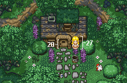
Guys, the point of it is it isn't supposed to have color, it's stuck in time!

Screenshot of the Week 309
Started by
Mitchfork
, Jan 25 2011 11:06 AM
-
 This topic is locked
25 replies to this topic
#16

Jared
-

- Members
-

Deified
- Real Name:Jared
- Pronouns:He / Him
- Location:New Hampshire
Posted 28 January 2011 - 04:00 PM
#17
Moosh
-

- ZC Developers
-

Tiny Little Questmaker
Posted 29 January 2011 - 12:41 AM
Lynker's shot FTW! Haters gonna hate, but I simply LOVE those Link tiles.
#18
Christian
-

- Members
-

Summoner
- Real Name:Chris
- Location:New Jersey
Posted 29 January 2011 - 05:06 AM
Molten Onyx
#19
Gouanaco
-
- Members
-

Death Knight
- Real Name:Max
- Location:Australia
Posted 29 January 2011 - 05:10 PM
Molten Onyx my vote goes to you.
I just love green and lush screens and nice mixture of colours.
I just love green and lush screens and nice mixture of colours.
#20
William
-

- Members
-

Banditos
- Real Name:You'll have to guess.
- Location:Between the Pacific Ocean and the Atlantic Ocean
Posted 01 February 2011 - 01:02 AM
I nulled, since I'm in it, but I thought I'd put up my opinions on the other two shot regardless.
Molten Onyx- 9/10
Beautiful work! The detail is great, as with the design, and the colors and palette are incredible as well. The whole screen is crisp and pleasing to the eye. Great job.
Lynker- 6/10
It's okay. The design seems a little boring, and I don't like the colors. I know it's "stuck in time", but that doesn't make the colors any better. It seem functional, however, and it isn't too bad at all. It just isn't particularly great either, or all that interesting to the eye.
#21
Shane
-

- Moderators
-

💙
- Pronouns:He / Him
- Location:South Australia
Posted 01 February 2011 - 01:26 AM
Molten Onyx is the only one that but in effort IMO, ZeeLiam looks like he throw too much soilds. And Lykers's try to keep the overload away but its too empty. I love Lyker's Link tiles there unqiue then anyone elses.
#22
William
-
- Members
-
Banditos
- Real Name:You'll have to guess.
- Location:Between the Pacific Ocean and the Atlantic Ocean
Posted 01 February 2011 - 01:31 AM
QUOTE(Midnight_King @ Feb 1 2011, 01:26 AM) 
Molten Onyx is the only one that but in effort IMO, ZeeLiam looks like he throw too much soilds. And Lykers's try to keep the overload away but its too empty. I love Lyker's Link tiles there unqiue then anyone elses.
I think it's pretty obvious that Lynker and I put effort in, if we didn't there wouldn't be a screenshot from he and I. Just remember, there is a difference between saying that you don't like a shot and saying that the shot took no effort.
#23
Shane
-
- Moderators
-
💙
- Pronouns:He / Him
- Location:South Australia
Posted 02 February 2011 - 12:22 AM
QUOTE(Midnight_King @ Feb 1 2011, 12:26 AM)
IMO
Simple, its my opinion in my eyes MO but in best effort.
#24
Rambly
-

- Members
-

Hero of Time
Posted 02 February 2011 - 12:29 AM
ZeeLiam's and Molten Onyx's are both really solid shots, but Molten Onyx's took the cake for me. I'm a sucker for the vibrant colors.
Lynker's isn't HORRIBLE, and I don't mind monochrome, but the color selection could've been better. I'm not fond of that particular shade of tan/brown/whatever. Link's sprite's shading and palette especially could be better.
Lynker's isn't HORRIBLE, and I don't mind monochrome, but the color selection could've been better. I'm not fond of that particular shade of tan/brown/whatever. Link's sprite's shading and palette especially could be better.
Edited by Rambly, 02 February 2011 - 12:31 AM.
#25
Eddard McHorn Van-Schnuder
-

- Members
-
smash the bye button
- Real Name:Ronny Wiltersen
Posted 02 February 2011 - 09:12 AM
QUOTE
Molten Onyx

Just look at those single-layer mountains! Look at 'em I say, look at 'em!
Just look at those single-layer mountains! Look at 'em I say, look at 'em!
Get that idea from Radien?
It's a very nice screen though, and other than the fact that it looks like the mountain is floating over the water, I see nothing wrong with it. I also never get tired of seeing that grass
QUOTE
Lynker

Is this town abandoned....or stuck in time?
I've told you before, DoR is a complex tileset, and takes more skill to make the screens look good. First off, again you used the grass in a way that I really don't like. I mean, it's your game, you're free to do whatever you want, but without actually using the grass texture given with the tileset, I simply cannot give my vote. Also, the Link tiles? No-go. Look at the screenshot from Radien I just posted above. It shows you why larger NPC and Link graphics doesn't work too well without at least editing the doors and other objects such as those. I'd also suggest putting some grass where the houses meets the ground. Not everywhere, but in some places. You know, in real cities, grass often grow out of little cracks in the ground, and it's a nice way to simulate that effect. The forest brush looks completely off when it's on that floor by the way. Put some grass under it instead. I've never seen something like that grow on stone tiles xDIs this town abandoned....or stuck in time?
QUOTE
ZeeLiam

Honestly, did you even try to play through this screen? It looks cluttered, messy and uneasy to navigate. When a player has trouble seeing exactly where he's supposed to be able to walk, it becomes a problem. I like that you have layered the treetops and such, but it almost feels like you've tried to fill up all the extra space you got from being able to push the trees closer together. This is not a good idea. Also, at the bottom of the screen, you're basically forced to walk in a straight line while fighting the enemies. Not a good idea, and it gets worse when you realize that moving off the path just a little would send you down to the screen below. You don't want the player to accidentally switch screens, especially while they're in a fight. It's just a poorly designed screen from a gameplay-perspective, in my opinion, and it doesn't really look all that good either. It just looks messy
#26
Mitchfork
-

- Members
-
no fun. not ever.
- Real Name:Mitch
- Location:Alabama
Posted 04 February 2011 - 04:34 AM
Molten Onyx - 39 votes = [69.64%]
Lynker - 4 votes = [7.14%]
ZeeLiam - 13 votes = [23.21%]
Total Votes: 56
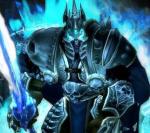
Molten Onyx
Just look at those single-layer mountains! Look at 'em I say, look at 'em!
Congratulations Molten Onyx on winning in a week with more votes than I've seen in a long time!
Lynker - 4 votes = [7.14%]
ZeeLiam - 13 votes = [23.21%]
Total Votes: 56
Molten Onyx
Just look at those single-layer mountains! Look at 'em I say, look at 'em!
Congratulations Molten Onyx on winning in a week with more votes than I've seen in a long time!
0 user(s) are reading this topic
0 members, 0 guests, 0 anonymous users

