Hergiswi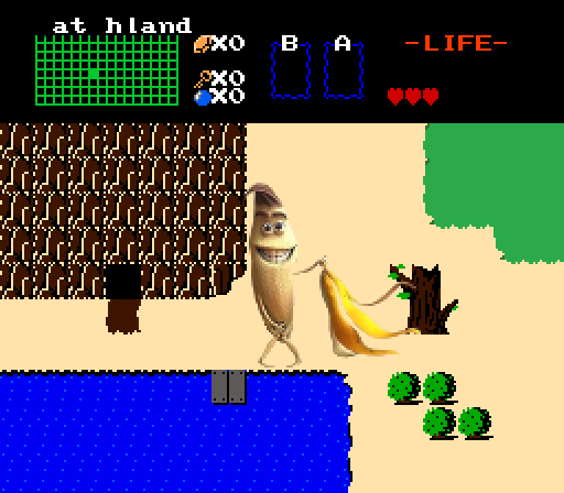
I really, really, really like this screenshot.
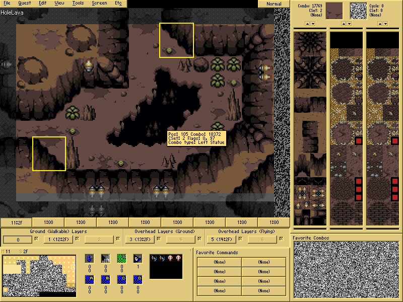
ywkls
So, I guess we're not going in that door right now...
Dwarlen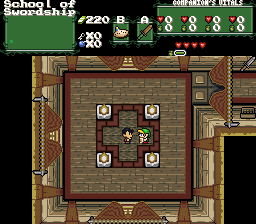
Demonlink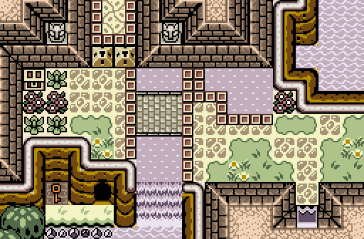
"The Temple of Seasons was once a beautiful sanctuary built with grace for the four stationary seasons. With time, evil monsters have plagued the Temple's Halls, and a dangerous poison has contaminated the once clear waters of the palace. Be aware of the dangers within O Chosen Hero; that is, if you are brave enough to retrieve the Rod of Seasons from its depths..."

Screenshot of the Week 508
Started by
The Satellite
, May 17 2015 04:51 PM
Demonlink Hergiswi ywkls Dwarlen
-
 This topic is locked
20 replies to this topic
#1

The Satellite
-

- Members
-

May the way of the Hero lead to the Triforce.
- Real Name:Michael
- Pronouns:He / Him
Posted 17 May 2015 - 04:51 PM
#2
ZeldaPlayer
-

- Members
-

What's up my playas
- Location:USA
Posted 17 May 2015 - 04:52 PM
Demonlink gets my vote this week.
Edited by ZeldaPlayer, 17 May 2015 - 04:52 PM.
- Demonlink likes this
#3
Alestance
-

- Members
-
Saint Alestance - Eliminator of the ZGP format
- Real Name:Lonk
- Location:Pennsylvania
Posted 17 May 2015 - 04:56 PM
Hergiswi's shot would have been a clear winner, except that the banana wasn't fighting Kongs. If the Banana was locked in an epic duel to win his family back from Donkey Kong, I'd have voted for that shot.
Alas, the banana is doing a burlesque show. Stripping? This is a PG-13 community! This offense is worthy enough for Hergiswi to be banned!
Alas, the banana is doing a burlesque show. Stripping? This is a PG-13 community! This offense is worthy enough for Hergiswi to be banned!
- The Satellite and Lightwulf like this
#4
MarinaraSauce
-

- Members
-

Magus
- Real Name:Grant
- Location:New York
Posted 17 May 2015 - 04:57 PM
HERGISWI 12/10 WOULD BANG PLAY AGAIN
Edited by GrantGreif, 17 May 2015 - 05:03 PM.
- coolgamer012345 and SkyLizardGirl like this
#5
Theryan
-

- Members
-

Burrito
Posted 17 May 2015 - 05:24 PM
Hergiswi - Really like it but the mountains and dirt clash really bad. Try making the mountain brown lighter
ywkls - it could use more detail and the transition between water and ground is a bit rough
Dwarlen - no complaints, but there's nothing too exciting about the screen.
Demonlink - I really like it, especially the palette. Good work, this got my vote
ywkls - it could use more detail and the transition between water and ground is a bit rough
Dwarlen - no complaints, but there's nothing too exciting about the screen.
Demonlink - I really like it, especially the palette. Good work, this got my vote
- Demonlink likes this
#6
nicklegends
-

- Contributors
-

Trofessional Pransposer
- Real Name:Ed
- Pronouns:He / Him
Posted 17 May 2015 - 05:39 PM
Hergiswi
...!?
ywkls
Comes off as rather square and could use more texture on the platform on which Link is standing.
Dwarlen
Nice curtain details, though I'd think the ripples would pass more from ceiling to floor than they would across the width of the curtains.
Demonlink
Nice palette and nice setting, but I'd like it more if the perspective were more consistent. The clash between the orientation of the cave opening and southern door in the wall highlight this. Still, voted here.
- Demonlink likes this
#7
ywkls
-
- Members
-

Master
Posted 17 May 2015 - 05:51 PM
Didn't vote because I'm in this one, so here's my thoughts on the others.
Hergiswi- This one is so crazy, I don't know where to begin... but one thing I feel compelled to ask is how in the world did you do that banana in the first place? Except for that, it could be any screen in the original Legend of Zelda.
Dwarlen- I like this one a lot. Aesthetically, the curtains are the highlight. However, the subscreen hints at things you won't learn until you play the game which makes it more interesting.
Demonlink- Wow! Is this a dungeon, an overworld or what? Even though this is in the GB tileset and there aren't that many colors, I think it is the best and would have voted here.
As for my own shot, it's kind of hard to create rounded walls when none exist in the tileset for that type of area. (In this case, the Minish Cap caves.) And the transition to the water is something I'd like to improve... perhaps some sort of border on the edge of the water that would overlap the land?
I had about three or four screenshots I thought about entering this time so even if I don't win I may use one of them in the future. (It's not like I've won any of these yet...)
- Demonlink likes this
#8
Demonlink
-

- Members
-
Lurking in the shadows...
- Real Name:Miguel
- Location:Wouldn't you like to know?
Posted 17 May 2015 - 06:22 PM
Demonlink- Wow! Is this a dungeon, an overworld or what? Even though this is in the GB tileset and there aren't that many colors, I think it is the best and would have voted here.
Thanks! It is actually both BTW XD. I started to make the shot out of sheer boredom, but then I got inspired by OoS Temple of Seasons, and this is my tribute to what that temple would look like as an actual dungeon in a GB quest! Oh, and BTW:
As for my own shot, it's kind of hard to create rounded walls when none exist in the tileset for that type of area. (In this case, the Minish Cap caves.) And the transition to the water is something I'd like to improve... perhaps some sort of border on the edge of the water that would overlap the land?
There are no round corners, yes, but here's a little trick I learned from Russ in his The Darkness Within quest:
That's what I normally do to simulate variety in various of my cave areas. I don't remember what Combo IDs these are, but heck, it makes cave areas look way nicer when someone uses the Minish Cap cave set ![]() I give you this as a general tip to help you improve your cave areas!
I give you this as a general tip to help you improve your cave areas!
- ywkls likes this
#9
Geoffrey
-

- Members
-
Chosen One
Posted 17 May 2015 - 06:49 PM
I think I just had a hergasm.
- coolgamer012345 likes this
#10
SyrianBallaS
-

- Members
-

Defender
- Real Name:Samer
- Location:Detroit, Michigan
Posted 17 May 2015 - 06:53 PM
voted Demonlink since his screen is sexy
- Demonlink likes this
#11
Mudkipz
-

- Members
-

Lurking Khajiit
- Real Name:Connor
- Location:Newcastle, England
Posted 17 May 2015 - 06:59 PM
Demonlink, you have my vote.
How on earth did you make EZGBZ look so beautiful? What sort of witchcraft did you use? I need to know.
Also, Hergiswi, lewd...
- Demonlink likes this
#12
ywkls
-
- Members
-
Master
Posted 17 May 2015 - 07:21 PM
There are no round corners, yes, but here's a little trick I learned from Russ in his The Darkness Within quest:
That's what I normally do to simulate variety in various of my cave areas. I don't remember what Combo IDs these are, but heck, it makes cave areas look way nicer when someone uses the Minish Cap cave set
I give you this as a general tip to help you improve your cave areas!
Yeah,,, I used those in some other parts of the cave. However, for this area it wasn't really practical. The reason for that is fairly complicated (you'd have to see the dungeon map to understand) and as for adding stuff to the ground... there's not a lot of room to do that in. (I think there's only about 8 combos of space there, actually.) Still, gave me some ideas I might use to improve some of the other areas in that cave. Thanks for the tips!
- Demonlink likes this
#13
Demonlink
-
- Members
-
Lurking in the shadows...
- Real Name:Miguel
- Location:Wouldn't you like to know?
Posted 17 May 2015 - 08:21 PM
Demonlink, you have my vote.
How on earth did you make EZGBZ look so beautiful? What sort of witchcraft did you use? I need to know.
Also, Hergiswi, lewd...
I'm a wizard from Ancient Hyrule Times. The spell I used was "Beautifulia", the most powerful spell to turn even the most gruesome and horrifying shots into masterpieces! I can teach you if you want sometime ![]()
Seriously speaking, I appreciate your kind words ![]()
#14
trudatman
-

- Members
-
one point nine hero
- Real Name:that guy
- Location:State Of Love And Trust, The United State Of Amorica.
Posted 17 May 2015 - 11:46 PM
decent stuff this week.
1. love the photorealism but stupid screen looks unplayable
2. epic screen but needs better detailing and the lava looks like a mound
3. neat scene but suffers from too many perspectives
4. great work but also underwhelming
- Demonlink and ywkls like this
#15
Eddy
-

- Moderators
-

ringle
- Real Name:Edward
- Pronouns:He / Him
- Location:London, United Kingdom
Posted 18 May 2015 - 11:55 AM
Pretty neat set of screens.
Hergiswi - Oh dear lord, what have you done XD I would have voted solely for that amazing banana though lol
ywkls - A pretty decent screen, though there doesn't seem like a whole lot is happening. The ground is lacking quite a lot of detail on the top-left corner of the screen, and the water is quite lacking in detail too. Finally, that roof area on the bottom-left seems to repeat the same tile making it look a little odd.
Dwarlen - This looks really cool! I'll admit though, the room seems a bit empty, probably some statues or pots would help, but besides that, it's a really good effort.
Demonlink - This is an amazing screen! The mix between overworld and dungeon is really perfect together, and I gotta say that screen design is superb here.
I voted for Demonlink this week. Good job everyone!
- Demonlink and SkyLizardGirl like this
Also tagged with one or more of these keywords: Demonlink, Hergiswi, ywkls, Dwarlen


0 user(s) are reading this topic
0 members, 0 guests, 0 anonymous users

