Awesome round, I like all of these screens a lot.
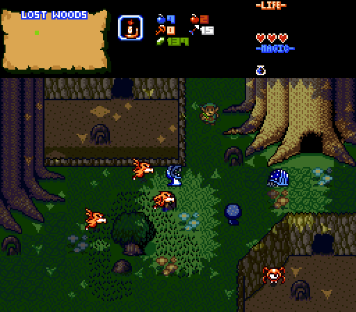
FireSeraphim: I like what you are doing with those bigger trees, the small ones are certainly not as impressive. The whole atmosphere is pulled off very well and these graphics are very nice. However, I feel you are missing a chance by not doing more with the transparent foliage, you could have much more detail with it. I also think there is too few vegetation for a distant and unexplored part of the forest, you'd expect that part to be much harder to travel through because of the trees and bushes. Anyway, I like where you are going with this screen.
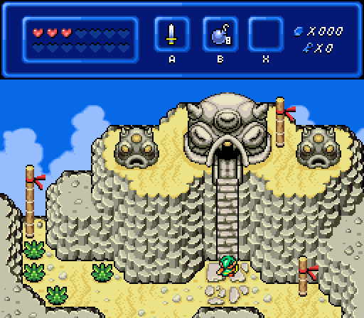
Zaxaphone: While you weren't very creative with the whole screen design, this was obviously intentional for the battle taking place there. In that sense, the screen is well designed, but think it kind off lacks the interesting look a SotW screen needs. I really like the flooring here and the BS walls are always sweet. Those blocks clash a little with their thick border, I think, but it's good overall.
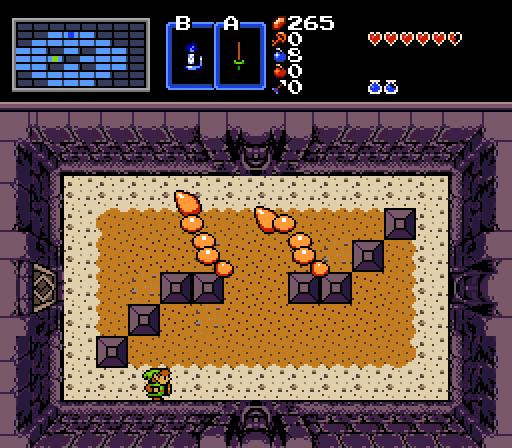
Joel: I like how you bring the overworld into a dungeon with this screen, but I'm unsure about the classic trees in this context. The other graphics are much more detailed and thus they clash a lot. But this screen design is great and I like how all elements with together real nicely. This would've gotten my vote if not for the trees, I think.
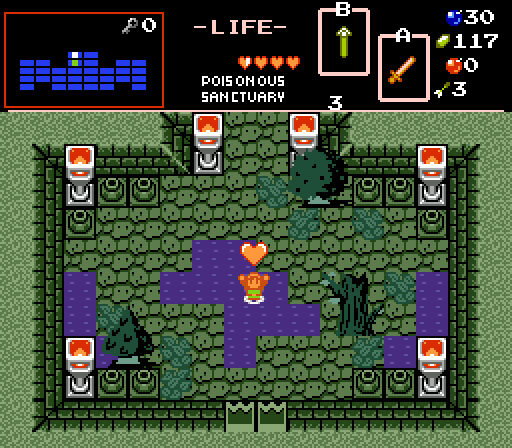
But I've voted for Sheik. That's a really nice design and the graphical style is pleasing. This might be useless advice, but I feel you need to be more careful with the shading of some of the graphics. Some of the shading is far more detailed than the original BS graphics. But, things don't clash and it's still an awesome screen.
Edited by Twilight Knight, 09 October 2017 - 11:32 AM.

 This topic is locked


