Jenny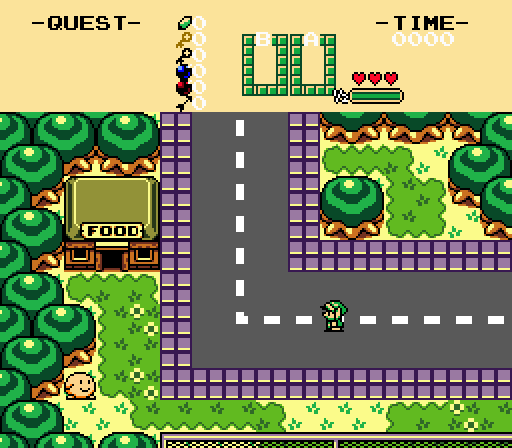
A mans gotta eat...
P-Tux7

Mitchfork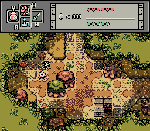
campfire screens forever
Valerie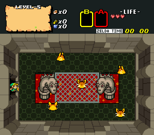
Lizards and bunnies....

-
 This topic is locked
11 replies to this topic
#1

Matthew
-
- Administrators
-

- Real Name:See above.
- Pronouns:He / Him
- Location:Ohio
Posted 08 July 2021 - 12:06 PM
- Hari likes this
#2
Shane
-

- Moderators
-

💙
- Pronouns:He / Him
- Location:South Australia
Posted 08 July 2021 - 12:09 PM
P-Tux7's is really cute, I adore the style. My only complaint is the leftmost sprite could be more vibrant. In fact, the whole palette could use a little more vibrancy.
- Matthew likes this
#3
P-Tux7
-

- Members
-

💛
Posted 08 July 2021 - 12:24 PM
Excellent work on adding unique elements to your BS quest, Valerie. If this is a real quest then I'm definitely looking forward to playing it.
- Valerie and Matthew like this
#4
Ether
-

- Contributors
-

Pale Stranger
- Pronouns:She / Her
Posted 08 July 2021 - 12:59 PM
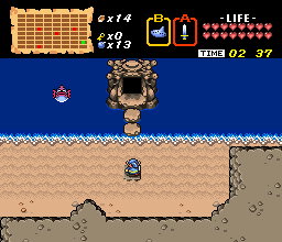
I'm not really sure what to say about Jenny's screen! It's basic and functional, but doesn't feel very SotW-y. I'm not a huge fan of the LA trees, they look offputtingly smooth and shiny compared to the Oracle games trees, and the high contrast in the palette accentuates that a little. But that's kind of minor.
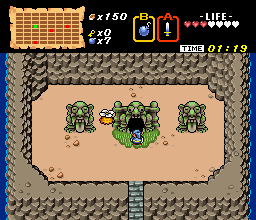
I...have no idea what to make of P-Tux's screen! Or why its caption is brought to us by Stan Kelly. It feels like there's just this major lack of context to what's going on in a plot-heavy game, but it's the kind of lack that leaves me cold instead of making me want to know more. The middle guy's sprite is pretty neat. I don't think I agree with Shane on the palette. I don't think this is doing it for me...it probably doesn't help that I don't have any desire to play Cave Story in Zelda Classic.
I voted Mitch, instantly. It's no secret that I love the GBC style, but I don't think it's very good at portraying forests that actually feel like you're surrounded by trees. Some people try to use this kind of hedge thing that never manages to convincingly be trees...I think this is the first approach I've seen that makes that kind of hedge canopy work, and it works really well. The colors and the subscreen and the little details like the mushrooms are also really neat, this is just a very good screen. Also the heroine looks pretty cool too.
Valerie's tile choice is...odd. I like the walls in isolation, but their lack of black outlines and whole geometric look convey this kind of mood that the rest of the screen doesn't live up to. The lava looks so flat in contrast with how 3D the walls are, like it's painted onto the floor instead of being in a deep pit. The thick outlines of the lizard statues and the way they're shaded also feel very out of place.
- Sheik likes this
#5
Valerie
-

- Members
-

Illustrious
- Real Name:Valerie
- Location:K-Town
Posted 08 July 2021 - 02:31 PM
It's a real quest, a remake of the 1st quest. I drew the lizard heads and the grating, and added the smaller door (the dungeon tiles originally only had large doors). Most of the rest of it is from the BS Zelda prototype.Excellent work on adding unique elements to your BS quest, Valerie. If this is a real quest then I'm definitely looking forward to playing it.
Thanks for the feedback, I'll look into these things, and try tweaking some things.Valerie's tile choice is...odd. I like the walls in isolation, but their lack of black outlines and whole geometric look convey this kind of mood that the rest of the screen doesn't live up to. The lava looks so flat in contrast with how 3D the walls are, like it's painted onto the floor instead of being in a deep pit. The thick outlines of the lizard statues and the way they're shaded also feel very out of place.
#6
P-Tux7
-
- Members
-
💛
Posted 08 July 2021 - 03:08 PM
I...have no idea what to make of P-Tux's screen! Or why its caption is brought to us by Stan Kelly. It feels like there's just this major lack of context to what's going on in a plot-heavy game, but it's the kind of lack that leaves me cold instead of making me want to know more. The middle guy's sprite is pretty neat. I don't think I agree with Shane on the palette. I don't think this is doing it for me...it probably doesn't help that I don't have any desire to play Cave Story in Zelda Classic.
It's okay if the screen doesn't make you want to play it, because it's not a real quest. I just chose a screenshot to remake that had A. an environment B. a good amount of characters, including a boss-size one and C. a portrait to get varied types of practice in. May I ask what you meant about the palette?
And yes, this screenshot caption trend does remind me of Stan Kelly. Not sorry!
I voted Mitch, instantly. It's no secret that I love the GBC style, but I don't think it's very good at portraying forests that actually feel like you're surrounded by trees. Some people try to use this kind of hedge thing that never manages to convincingly be trees...I think this is the first approach I've seen that makes that kind of hedge canopy work, and it works really well. The colors and the subscreen and the little details like the mushrooms are also really neat, this is just a very good screen. Also the heroine looks pretty cool too.
I'm tempted to try and figure out how to solve this "problem" without breaking the four-colours-per-8x8-square rule. I'll go ask Mitch for his transparency-free screenshot and see if I can keep it looking presentable within those limitations - watch this thread.
Thanks for the feedback, I'll look into these things, and try tweaking some things.
Oh wait, that's supposed to be a pit of lava? I thought it was indeed supposed to be level with the ground as a damage hazard. I'd add a combo or at least half a combo of blackness at the top of the pit and beneath the statues.
Also the heroine looks pretty cool too.
oh you son of a
#7
Ether
-
- Contributors
-
Pale Stranger
- Pronouns:She / Her
Posted 08 July 2021 - 04:05 PM
I'm not sure I understand how people using captions screams "smug parody of a Republican political cartoonist." x_x
Shane said the palette could use more vibrant colors, but I didn't have any problem with the colors, that's all.
Valerie's lava actually does have a bit of blackness at the top of the lava pit...it's just very hard to make it out against the dark floor. (Other than that, I think the floor fits pretty well with the geometric walls, even if the walls are the star of that show.) I can give more criticism on the lizard statues if she's interested, either here or in private.
#8
Riflezen
-

- Members
-

sometimes does stuff
- Real Name:Gus
- Location:in the trees
Posted 08 July 2021 - 04:47 PM
Normally I don't like GB because of how overused it is and how bland it can look (see Jenny's, for lack of a better criticism, incredibly generic screen), but Mitchfork did a fantastic job with every inch of screen, voted without regrets.
P-Tux7: I mean, I see what you're going for, but the aesthetic of that area in the og Cave Story doesn't work with ZC's screen size very well imo. Also, "Cave Story remade in ZC" doesn't sound like a very appealing idea in general, honestly.
As for Valerie's shot, I second what Ether said.
#9
Valerie
-
- Members
-
Illustrious
- Real Name:Valerie
- Location:K-Town
Posted 08 July 2021 - 05:01 PM
The lava is from the BS tileset, here is a pic of it from the original game, it behaves the same as the lava from the NES Zelda.Oh wait, that's supposed to be a pit of lava? I thought it was indeed supposed to be level with the ground as a damage hazard. I'd add a combo or at least half a combo of blackness at the top of the pit and beneath the statues.
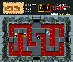
You can give more criticism here (in public). This is a BS tileset expansion, so I'm trying to make the tiles fit in with the existing BS tiles. These two pics are examples of what I was using for style reference from the original game. The Lizard design is from the original NES manualValerie's lava actually does have a bit of blackness at the top of the lava pit...it's just very hard to make it out against the dark floor. (Other than that, I think the floor fits pretty well with the geometric walls, even if the walls are the star of that show.) I can give more criticism on the lizard statues if she's interested, either here or in private.

EDIT: Here is what I've changed so far.

Edited by Valerie, 08 July 2021 - 05:43 PM.
#10
Ether
-
- Contributors
-
Pale Stranger
- Pronouns:She / Her
Posted 08 July 2021 - 05:43 PM
Ah...I think that the walls feel out of place compared to other BS art, unfortunately. They seem like they'd make the most sense in Classic. (Neither BS nor Classic are tilesets I'm a huge fan of, so grain of salt. BS's real walls are one thing I do like about them, though, it would be cool if there were more of them.)
The biggest thing that stands out to me with the statues is how pillow shaded they are...treating shading like a gradient from the black outline to the lighter inside is a really common trap. It's most obvious in narrower places like the snake's muzzle, but it's pretty much always something you want to avoid. How you want to handle things instead depends on the style--if you wanted to match those walls from the screen, you probably shouldn't have a black outline at all, but obviously BS does use black outlines.
The snake heads also look too big for the pillars they're on. In some tilesets like Minish Cap, tall objects are narrower closer to the base to give an illusion of 3D perception, but that doesn't really apply here. You would want more of a trapezoidal shape on the pillars if you were trying to emulate that, and it would probably affect the way that the snake heads held themselves too.
#11
Valerie
-
- Members
-
Illustrious
- Real Name:Valerie
- Location:K-Town
Posted 09 July 2021 - 07:27 PM
Thanks for the feedback, lots of times I feel like something is off, but I can't quite figure out what it is, now I know what areas to work on.Ah...I think that the walls feel out of place compared to other BS art, unfortunately. They seem like they'd make the most sense in Classic. (Neither BS nor Classic are tilesets I'm a huge fan of, so grain of salt. BS's real walls are one thing I do like about them, though, it would be cool if there were more of them.)
The biggest thing that stands out to me with the statues is how pillow shaded they are...treating shading like a gradient from the black outline to the lighter inside is a really common trap. It's most obvious in narrower places like the snake's muzzle, but it's pretty much always something you want to avoid. How you want to handle things instead depends on the style--if you wanted to match those walls from the screen, you probably shouldn't have a black outline at all, but obviously BS does use black outlines.
The snake heads also look too big for the pillars they're on. In some tilesets like Minish Cap, tall objects are narrower closer to the base to give an illusion of 3D perception, but that doesn't really apply here. You would want more of a trapezoidal shape on the pillars if you were trying to emulate that, and it would probably affect the way that the snake heads held themselves too.
#12
David
-

- Administrators
-
Fallen leaves... adorn my night.
- Real Name:David
- Pronouns:He / Him
Posted 01 August 2021 - 01:00 PM
With 55.26% of the vote, the winner of Screenshot of the Week 759 is Mitchfork!
campfire screens forever
Congrats!
Voting totals:
- Jenny - 4 votes [10.53%]
- P-Tux7 - 5 votes [13.16%]
- Mitchfork - 21 votes [55.26%]
- Valerie - 8 votes [21.05%]
- Matthew likes this
Also tagged with one or more of these keywords: Mitchfork, Jenny, P-Tux7, Valerie
PureZC Events →
Screenshot of the Week →
Poll Screenshot of the Week 812Started by Taco Chopper , Yesterday, 04:02 AM |
|

|
||
 |
Matthew
PureZC Events →
Screenshot of the Week →
Poll Screenshot of the Week 811Started by Taco Chopper , 01 Apr 2024 |
|

|
|
PureZC Events →
Screenshot of the Week →
Poll Screenshot of the Month 200Started by Taco Chopper , 01 Apr 2024 |
|
|
||
|
|
Jenny
PureZC Events →
Screenshot of the Week →
Poll Screenshot of the Week 809Started by Taco Chopper , 06 Mar 2024 |
|
|
|
|
|
Twilight Knight
PureZC Events →
Screen Rebirth →
Poll Screen Rebirth 7! The Contest!Started by Taco Chopper , 26 Feb 2024 |
|
|
1 user(s) are reading this topic
0 members, 1 guests, 0 anonymous users

