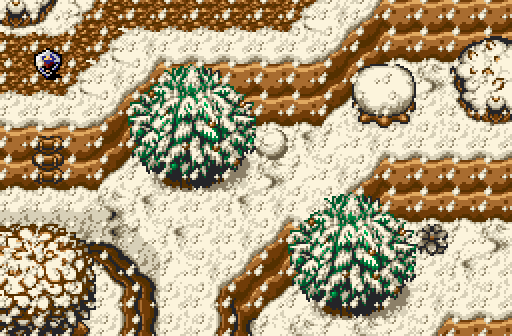
Justin wins my vote, no contest. His screen was the only screen that actually felt alive and easy to read. Legend27 and Dwarlin had decent ideas going for them but lacked in execution. Zeldaplayer's didn't feel well constructed - There doesn't seem to be much breathing space, it is very difficult to read because of the falling snow and what is that Hylian's Shield doing in the top left corner?
Feedback -
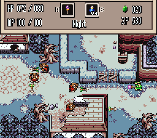
Legend27: Either tone down the yellow highlights on the screen or desaturate the purple on the ground. The way they are set up here together right now is jarring to the eye. Otherwise, it is fine given the tileset. The only other thing I would suggest is to remove some of the trees in the water to make it more readable.
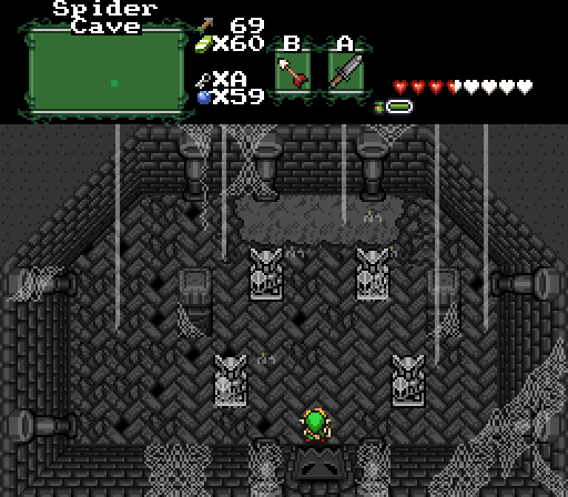
Dwarlin: Give this screen some more colour. The colours don't have to be bright either - the screen would work better with darker colours. Maybe put some green or red down in on the webs?
Zeldaplayer: Firstly, remove the snow falling - It obscures the screen. Secondly, remove the Hylian Shield - it looks like a random item placed on the screen for the heck of it. Lastly, try to make the screen feel more open. Remove the small tree on the middle and snow brush on the right side of the screen - those look like unnecessary clutter. Maybe try modifying the mountain layout to create more open room?
Justin: Not much, except for maybe to tone the whites on the outer walls on the houses a little bit because they stick out like a sore thumb.
Edited by Orithan, 25 November 2014 - 05:19 AM.

 This topic is locked