Jump to content

Photo

[WIP]Super Gameboy Tileset


  • Please log in to reply
44 replies to this topic

#16 NoeL

NoeL

    Legend

  • Members
  • Real Name:Jerram

Posted 07 March 2013 - 07:25 PM

QUOTE(Koh @ Mar 7 2013, 08:06 AM) View Post

That looks really amazing actually. I do need to work on my palette skills; perhaps you can give me a piece of your expertise =O?

I just gave you some - as has Shiek, Shane, and even Moosh threw in a bit. icon_razz.gif As Shiek said, you need to always keep your environment in mind - particularly your light sources. What colour is the light? What direction is it coming from? Your highlights should be influenced by your primary light source, e.g. in sunlight your highlights should be skewed toward a pale yellow. Conversely, your shadows should be influenced by ambient light (not hugely important in bright, outdoor environments, but definitely in dark caves/dungeons). Shadows should also be indigo/violet shifted, because when light is obstructed the high frequency red and yellow waves are lost before the more penetrating, lower frequency blues (which is why you see very few reds when you start going deeper underwater). This is also why you can only really see blue at night time. Speaking of night time, our eyes have two kinds of cells - cones and rods. Cones are for seeing colour, and require bright light, while rods are used for seeing tone, and can work even in poor light. This is the other reason (main reason, actually) why our eyes only work in monochrome in the dark - we can make out shapes and shadows and things easily, but everything looks blue/grey because only the rods are working. I think dogs lack cones, which is how we know they're colourblind.

Anyway, this tutorial is one I always link to. It's a great introduction to colour picking and gives you immediate results.

QUOTE(Koh @ Mar 7 2013, 04:30 PM) View Post

What about this

IPB Image

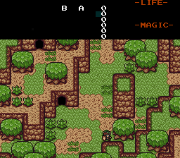
I combined the dirt/treestump/mountain colors, and shared the lightest green for the trees/bushes and grass, and the darkest universal color is now the outline of the bush and tree? (Not in ZC yet, this is MS Paint work.)

Looks good, although since it's MS Paint I'm assuming the picture is 24/32-bit so I won't be able to check your palette. DO NOT USE MS PAINT FOR PIXEL ART! icon_lol.gif Seriously, 24/32-bit bitmaps aren't your friend. Grab Graphics Gale (the free version is fine for ZC stuff, but the commercial version is better), and only work in 4/8-bit mode (16/256 colour, respectively). I recommend working in 256-colour mode even if you're doing a 16-colour sprite, as it gives you space to arrange your palette better (as opposed to a straight line). You can then reduce the image to 16-colour and reorder your palette how you want it (hold shift and drag the slots around). This makes it more like ZC, where if you want to change a colour you don't have to make a new colour then manually recolour every pixel in the image (like you'd have to in MS Paint), you just change the palette and it's applied to the whole image.

#17 Yapollo

Yapollo

    To Discover

  • Members
  • Location:Somewhere in the U.S.

Posted 07 March 2013 - 10:12 PM

I like the idea of an inspired Gameboy set, as the several Gameboy sets have always been huge favorites of mine. Noel makes a great point, nothing is more discouraging than 24 bit palettes. They haunted me when I was briefly working with the MZC set in the past, working on importing tiles in a very difficult manner icon_frown.gif

I feel Noel's changes to the palette and tile design feel more along the lines that you are thinking of, while also being fairly pleasant to the eye.

One area I feel that could be a solid booster (and mind you this would come much later into tileset design) would be the design of grasslands akin to OoS' Summer scheme (mind you, I know you are going for a good look, but it can be a source of inspiration) as I always felt the greenery merged with the dirt well to create fairly pleasant landscapes. Likewise for dirty, dark swampy areas, OoA past offers, I feel, a solid example of that.

What i confess I am more interesting in, is your sprite design, as the Link design you have shown looks promising. I feel a clever creation of the whole range of sprites (from items to NPCs) could breathe in a whole new life into a GB set, as such sets can lamentably seem so repetitious in sprite design (not that i don't love the sprites icon_smile.gif).

In any case, I look forward to other updates and I wish you good luck with your design

#18 Koh

Koh

    Tamer Koh

  • Members
  • Real Name:Dominic
  • Location:Monsbaiya, Virginia

Posted 08 March 2013 - 06:50 AM

But Noeelllllll....I like MS Paint for spriting D=. You're totally right about the color swapping thing being a pain in the ass, but I circumvent that by going into Game Maker and using the color swapping tool XD. But it's mostly ease of access and because I've been using it for so long...once you've made/imported the palette in ZC, you can rip from 24/32 bit PNGs perfectly by pressing R. I make the colors in ZC by dividing the RGB values I see in MSPaint by 4 (I didn't think it'd actually be that straight forward XD).

Thanks guys~ I'll put the new colors I made in soon, but I wanted to try my hand with Link's palette (this was a doozy).

IPB Image

His original palette (top row) actually used too many colors, and has to do some sharing (like hair color for sleeve color) which ended up getting reduced to what you saw in one of the beginning preview shots. So I used that logic, tampered with his colors more, and came up with a new palette (bottom row). Link's tunic setup is still to be two-tone. Whether or not you're consistent (light green hat/dark green tunic, light blue hat/dark blue tunic, etc.) or go LTTP style (light green hat/dark bluish green tunic, yellowish hat, blue tunic, etc.) will be up to you, but I'll probably do it consistent style.

Edited by Koh, 08 March 2013 - 07:08 AM.


#19 aaa2

aaa2

    Wizard

  • Banned

Posted 08 March 2013 - 07:23 AM

Would definately love to see this tileset take off. Why not always upload your progress while you go along. This way if somebody wants to show you how to make a palette work or similar things they can do it directly in the file this would make this much easier and less trial and error i guess. (upload with mega takes about 10 sec so shouldnt be an issue)

Edited by aaa2, 08 March 2013 - 07:24 AM.


#20 NoeL

NoeL

    Legend

  • Members
  • Real Name:Jerram

Posted 08 March 2013 - 08:16 AM

QUOTE(Koh @ Mar 8 2013, 05:50 AM) View Post
But Noeelllllll....I like MS Paint for spriting D=. You're totally right about the color swapping thing being a pain in the ass, but I circumvent that by going into Game Maker and using the color swapping tool XD. But it's mostly ease of access and because I've been using it for so long...once you've made/imported the palette in ZC, you can rip from 24/32 bit PNGs perfectly by pressing R. I make the colors in ZC by dividing the RGB values I see in MSPaint by 4 (I didn't think it'd actually be that straight forward XD).
As opposed to using Graphics Gale, which allows you to zoom in more than 8x, make arbitrary NxN grids (e.g. 16x16) that allow snapping, making it piss easy to move around tiles and making sure they're aligned properly for importing, and create palettes that can easily be imported straight into ZC without ever having to touch ZC's awful colour picker or rely on the "recolour" tool - importing graphics from a file that already has the same palette gives perfect imports every time. Oh, and layers. And animation frames.

Honestly, it sounds like you're making a TON of unnecessary work for yourself. Seriously, opening up a whole other program just to change a colour? Dividing by 4? You're willingly doing math!? Just introducing more hassle and more room for error. Get Graphics Gale.


EDIT: Supindahood tells me Photoshop is good too, once you set it up correctly.

Edited by NoeL, 08 March 2013 - 08:58 PM.


#21 Jared

Jared

    Deified

  • Members
  • Real Name:Jared
  • Pronouns:He / Him
  • Location:New Hampshire

Posted 08 March 2013 - 09:06 AM

Koh, that Link isn't as good as your others to be honest. I think it's the shape of his hair when facing down. It just doesn't look right in my eyes. I would maybe try a different approach. Love the colors, though.

#22 Koh

Koh

    Tamer Koh

  • Members
  • Real Name:Dominic
  • Location:Monsbaiya, Virginia

Posted 08 March 2013 - 11:25 AM

QUOTE(NoeL @ Mar 8 2013, 08:16 AM) View Post

As opposed to using Graphics Gale, which allows you to zoom in more than 8x, make arbitrary NxN grids (e.g. 16x16) that allow snapping, making it piss easy to move around tiles and making sure they're aligned properly for importing, and create palettes that can easily be imported straight into ZC without ever having to touch ZC's awful colour picker or rely on the "recolour" tool - importing graphics from a file that already has the same palette gives perfect imports every time. Oh, and layers. And animation frames.

Honestly, it sounds like you're making a TON of unnecessary work for yourself. Seriously, opening up a whole other program just to change a colour? Dividing by 4? You're willingly doing math!? Just introducing more hassle and more room for ever. Get Graphics Gale.
EDIT: Supindahood tells me Photoshop is good too, once you set it up correctly.

QUOTE(Jared @ Mar 8 2013, 09:06 AM) View Post

Koh, that Link isn't as good as your others to be honest. I think it's the shape of his hair when facing down. It just doesn't look right in my eyes. I would maybe try a different approach. Love the colors, though.

How's this then~ I worked with it in Graphics Gale; it's actually a REALLY nice program; I'm surprised it's mostly free o.o.

IPB Image

Accord to GG, this uses 15 colors (which includes what will be the transparent color). So I have 2 colors left I can use...probably for a red of some sort and a darker blue.

QUOTE(aaa2 @ Mar 8 2013, 07:23 AM) View Post

Would definately love to see this tileset take off. Why not always upload your progress while you go along. This way if somebody wants to show you how to make a palette work or similar things they can do it directly in the file this would make this much easier and less trial and error i guess. (upload with mega takes about 10 sec so shouldnt be an issue)

I could do that, but that'd be too many out and about versions to mess around with.

Edited by Koh, 08 March 2013 - 11:27 AM.


#23 Jared

Jared

    Deified

  • Members
  • Real Name:Jared
  • Pronouns:He / Him
  • Location:New Hampshire

Posted 08 March 2013 - 11:49 AM

That does look better! His hat facing down looks a bit strange, though. D:

#24 Koh

Koh

    Tamer Koh

  • Members
  • Real Name:Dominic
  • Location:Monsbaiya, Virginia

Posted 08 March 2013 - 04:51 PM

IPB Image

You guys have no idea how perfect this is now, in the sense that I still have 1 color I can add to Link's palette, and 4 I can add to just 1 CSet for the Overworld colors (probably need colors for rocks now XD). This helped like A LOT. Tiles no longer even use 256 color mode =O.

#25 NoeL

NoeL

    Legend

  • Members
  • Real Name:Jerram

Posted 08 March 2013 - 08:56 PM

QUOTE(Koh @ Mar 8 2013, 10:25 AM) View Post
Accord to GG, this uses 15 colors (which includes what will be the transparent color). So I have 2 colors left I can use...probably for a red of some sort and a darker blue.
Might want to check your math there. icon_razz.gif

QUOTE(Koh @ Mar 8 2013, 03:51 PM) View Post
You guys have no idea how perfect this is now, in the sense that I still have 1 color I can add to Link's palette, and 4 I can add to just 1 CSet for the Overworld colors (probably need colors for rocks now XD). This helped like A LOT. Tiles no longer even use 256 color mode =O.
But but but, ZC sucks because it has palette restrictions! Exorbitant colour usage is the best thing EVAR! icon_lol.gif

Also, 256 colour mode... *cringe* XD


Your overworld is looking much nicer now though. I think the dirt is still a bit dark, but I like most everything else.

#26 Koh

Koh

    Tamer Koh

  • Members
  • Real Name:Dominic
  • Location:Monsbaiya, Virginia

Posted 09 March 2013 - 08:00 AM

QUOTE(NoeL @ Mar 8 2013, 08:56 PM) View Post

Might want to check your math there. icon_razz.gif

But but but, ZC sucks because it has palette restrictions! Exorbitant colour usage is the best thing EVAR! icon_lol.gif

Also, 256 colour mode... *cringe* XD
Your overworld is looking much nicer now though. I think the dirt is still a bit dark, but I like most everything else.

I bet if I brighten the browns, the mountains are going to look too light XD. This was one of my major problems with sharing colors; you change one thing and it affects almost everything else. I'll probably leave that alone XD.

IPB Image

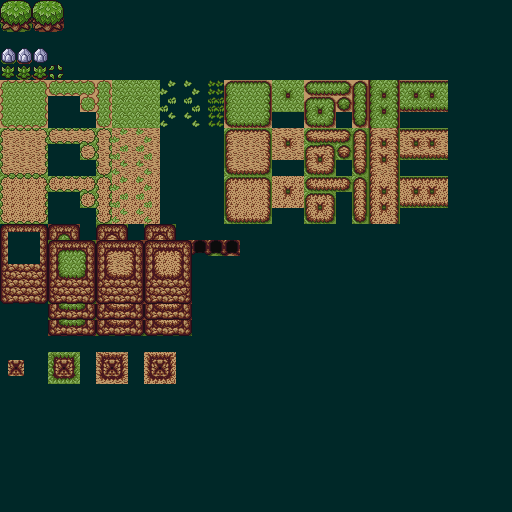
Making most possible variations on the ground...Ignore the Power Bracelet rocks, because I haven't changed their colors or design yet (they pre-existed on the sheet from before the palette editing). I still need to do divots, but I thought I'd keep you guys updated.

Edited by Koh, 09 March 2013 - 08:01 AM.


#27 NoeL

NoeL

    Legend

  • Members
  • Real Name:Jerram

Posted 09 March 2013 - 09:07 AM

QUOTE(Koh @ Mar 9 2013, 07:00 AM) View Post

I bet if I brighten the browns, the mountains are going to look too light XD. This was one of my major problems with sharing colors; you change one thing and it affects almost everything else. I'll probably leave that alone XD.

Which brings me back to my initial point on the importance of nailing down a palette before laying down pixels (or at least during the early stages of doing so). icon_razz.gif If you built the palette first you could have drawn your mountains without quite so many highlights.

In this screenshot the mountain highlights share a colour with the bright sand/dirt, but because the colour is used sparingly the mountains don't look like sandstone:
Spoiler


If you've still got those 4 extra slots it might be worth adding a lighter brown, or you could try and find a middle ground that makes the dirt look a bit better without completely ruining the mountains. Alternatively, try darkening the grass. That'll make the dirt look brighter by comparison. Optical illusions are handy. icon_razz.gif

#28 Marco

Marco

  • Banned

Posted 09 March 2013 - 09:39 AM

I dislike your dirt grounds Koh.

The transitions of your grass/dirt are below par, and could use a bit more definition IMO. Even so, the dirt/sand tiles themselves are quite an eye sore. I say rework them, or at least make the sand more...smooth but not loosing its rustic look.

Other than that wonderful work there.

#29 Surreal Canine

Surreal Canine

    Master of Disaster

  • Members
  • Real Name:Brian
  • Location:Somewhere

Posted 09 March 2013 - 11:27 AM

I really don't see a problem with the original screenshots you posted, Koh. The trees and grass and mountains have very vibrant colors that blend smoothly with each other, and the result is beautiful. Honestly, they look like something out of Pokémon Ruby and Sapphire. However, I agree with NoeL that it is probably a bad thing to do in ZC, as the more CSets you use in your tile palettes, the fewer you will have to draw enemies, items, and the like.

Also, don't feel like you have to get caged in on a palette right away. Personally, I would prefer a very bright palette. Real is not brown, people! XD

#30 Koh

Koh

    Tamer Koh

  • Members
  • Real Name:Dominic
  • Location:Monsbaiya, Virginia

Posted 09 March 2013 - 07:28 PM

QUOTE(NoeL @ Mar 9 2013, 09:07 AM) View Post

Which brings me back to my initial point on the importance of nailing down a palette before laying down pixels (or at least during the early stages of doing so). icon_razz.gif If you built the palette first you could have drawn your mountains without quite so many highlights.

In this screenshot the mountain highlights share a colour with the bright sand/dirt, but because the colour is used sparingly the mountains don't look like sandstone:
Spoiler


If you've still got those 4 extra slots it might be worth adding a lighter brown, or you could try and find a middle ground that makes the dirt look a bit better without completely ruining the mountains. Alternatively, try darkening the grass. That'll make the dirt look brighter by comparison. Optical illusions are handy. icon_razz.gif

I totally understand why now XD. Oh and I really want to save those for the special grays we'll be needing for rocks and things, lol. I might just have to tamper with the browns a bit more to see what I can cook up.

QUOTE(Marco @ Mar 9 2013, 09:39 AM) View Post

I dislike your dirt grounds Koh.

The transitions of your grass/dirt are below par, and could use a bit more definition IMO. Even so, the dirt/sand tiles themselves are quite an eye sore. I say rework them, or at least make the sand more...smooth but not loosing its rustic look.

Other than that wonderful work there.

The first dirt variant I drew myself, while the second is the cave dirt graphic from Oracle of Seasons and Ages....As for the edges....I was doing what I've been doing with every graphic in this tileset so far if you've noticed~ I kept the OUTLINES of the tiles the exact same as the original graphics, but whatever's INSIDE the outlines are free game and edit worthy~ So technically I COULD make my own grass meets dirt edges, since there wasn't a solid black outline as a delimiter for such on the original tiles, but rather a dark green.

QUOTE(Surreal Canine @ Mar 9 2013, 11:27 AM) View Post

I really don't see a problem with the original screenshots you posted, Koh. The trees and grass and mountains have very vibrant colors that blend smoothly with each other, and the result is beautiful. Honestly, they look like something out of Pokémon Ruby and Sapphire. However, I agree with NoeL that it is probably a bad thing to do in ZC, as the more CSets you use in your tile palettes, the fewer you will have to draw enemies, items, and the like.

Also, don't feel like you have to get caged in on a palette right away. Personally, I would prefer a very bright palette. Real is not brown, people! XD

Bright colors ftw. I might just include a bright color palette as an alternate when I get there =).


AAAAAAAAAAaaand I really appreciate all the feedback and help you've guys have been providing....but now I need moar!

Introducing, Palm Trees and Power Bracelet Rocks!

IPB Image

-Which palm tree looks more appealing to you guys (as it will be the one put into the set): The one on the left, or the one on the right?
-I just used the browns I have for now for the first Power Bracelet Rock variant, but I do need to start conjuring up the 3 or 4 grays I'll be needing for the other variant(s) as I mentioned above....

Edited by Koh, 09 March 2013 - 07:37 PM.


0 user(s) are reading this topic

0 members, 0 guests, 0 anonymous users