Jump to content

Photo

Screenshot of the Week 237


  • This topic is locked This topic is locked
21 replies to this topic

Poll: SotW 237 (43 member(s) have cast votes)

Vote for your favorite screen!

You cannot see the results of the poll until you have voted. Please login and cast your vote to see the results of this poll.
Vote

#1 Shoelace

Shoelace

    The Shaman of Sexy!

  • Members
  • Real Name:Michael
  • Pronouns:He / Him
  • Location:Arizona

Posted 18 November 2008 - 05:23 AM

billy ronald
IPB Image
From a new side project

Joe123
IPB Image
You can even jump off the bridge ^_^

Lithium
IPB Image
Hooray, a forest.

lucas92
IPB Image

Molten Oynx
IPB Image
A screenie from my three week quest, featuring the sky castle...one the ground!

SerpitaX
IPB Image
Ayst; where insanity reigns and the dead speak from the Edge.

Twilight_Knight
IPB Image
Ooh! A real heart, what should I do with it? Eat? Enhance it to gain extra life power??? No, no, I will give it as birthday present!

#2 Titanium Justice

Titanium Justice

    Justice is served!

  • Members
  • Real Name:Jared
  • Location:Ontario

Posted 18 November 2008 - 07:57 AM

I voted for Molten Onyx. I love the Incendia graphics. icon_biggrin.gif

#3 Marco

Marco

  • Banned

Posted 18 November 2008 - 10:37 AM

SerpitaX....

Its so darn great!

#4 Bayta

Bayta

    Follower of Destiny

  • Members
  • Real Name:Robin Evans
  • Location:Suffolk County, NY

Posted 18 November 2008 - 03:57 PM

Lithium. Gotta love the ground detail! icon_cool.gif

#5 Aslion

Aslion

    End Fascism

  • Members
  • Real Name:Ryan
  • Location:Plug One's spectacles

Posted 18 November 2008 - 06:40 PM

Yay, I have a chance.
Also,
IPB Image
I like this one better.

billy
The trees look bad clustered up like that. There's little to no ground detail. You have too much empty space. The road or whatever down the middle is too straight. And why is one puddle of water frozen but the other isn't? 2/10

Joe
It's not bad, but it really has that "generic cave shot that everybody's seen 10 times before" feeling to it. 6/10

Lithium
Octorocks? They make the screen bad. No soup for you. fish/7.16

Lucas
The trees are too symmetrical, the dirt is too blocky and boring, and that corner really needs to be covered up. 4/10

Molten Onyx
Nice. 9/10

SerpitaX
It could use a little work, but it's still good. 7/10

Twilight Knight
The tiles look like crap. I can't tell what the shot's supposed to be. 2/10

Migokalle
What? Migo didn't enter? hrmph.

#6 Colin

Colin

    Coblin the Goblin

  • Members

Posted 18 November 2008 - 07:34 PM

I voted for Molten Onyx... no bias towards the tileset here AT ALL.

But that's cool that you ripped that castle into the tileset. I didn't think of that before. But it fits surprisingly well. My only suggestion here is to give the castle graphics an outline in places. But not everywhere, only where an outline would work well, like on the spots where it's hard to tell the difference between the wall and the battlements. Basically, edit the castle graphics so you can see all of the fine details.

Also, I'm impressed that you pulled off the transparent water correctly. It took me FOREVER to tweak the palette just right to get the water to work.

#7 Espilan

Espilan

    Peahat.

  • Members
  • Real Name:Michael
  • Pronouns:He / Him
  • Location:Ohio

Posted 18 November 2008 - 08:17 PM

Voted for Molten Onyx here too.

And to answer Lithium's question about Billy's water/ice/both(?), smaller bodies of water do tend to freeze over quicker than larger ones, so it could be considered a touch of realism.

However, even the larger pool should have ice near the edges in that case, as the water at the edges would theoretically have been shallower and have probably frozen over by now.

#8 BitZero

BitZero

    Junior

  • Members
  • Real Name:William
  • Location:The End of the World

Posted 18 November 2008 - 08:29 PM

Some good screenshots this week!

billy: A little too symmetrical and not enough variety in the trees. 6/10

Joe: It looks like a generic cave screenshot. There isn't really anything that's wow! 7/10

Lithium: I like the detail used, but the palette seems too ordinary. 7/10

Lucas: The big trees look nice and so does the overhanging shadows. The palette looks foresty too. However, the trunk looks small and disproportioned to me. 8/10

Molten: Something you don't see everyday. I like the castle and the transparent water. It also has a good amount of detail. 9/10

SerpitaX: Something that'll be in my three-week contest, I guess. I just made it for the screenshot contest as it didn't have any screenshots. Plus, I wanted to experiment with transperant water.

Twilight: Uhm...the tiles look really pixel-ly and the tree's green is hard to see with the grass. I couldn't really see the entire area easily (Kind of hard on the eyes...). You get kudos for the heart, though. 6/10

Well, I nulled...but if I voted for someone it would have been Molten Onyx; love the castle!

#9 hinsburg

hinsburg

    Doyen(ne)

  • Members
  • Real Name:Joe
  • Location:Broccoli

Posted 18 November 2008 - 08:41 PM

Onyx's castle is just too awesome to turn down. Most of the other shots felt bland, except for Lithium and Lucas.

#10 Radien

Radien

    Courage

  • Members
  • Real Name:Steve
  • Location:Oregon

Posted 19 November 2008 - 04:40 AM

Billy:

Way too basic. Everything is at 45 degree angles. I prefer it when GB trees are less patterned. Also, those are really old tiles; the black outlines are starting to look pretty dated. Being a ZQuest-only shot doesn't really help.

Joe123:

Yes! DoR cave tiles used to their full capacity. icon_biggrin.gif ...Well, mostly. The perspective looks a bit weird in places where you've put two objects with conflicting angles next to each other. Also, that ravine at the bottom is pretty shallow for an over/under bridge. But still, this shot is my favorite overall, taking the subscreen into account.

Voted.

Lithium:

A decent shot, but I'd simplify the grassy areas a bit and cut down on the debris. Also, I agree, the alternate palette is better.
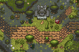
lucas92:

A good shot for the most part, but a few things bug me about it. First of all, why bother using a log that short in the middle of the screen? It'd work better on a screen border. Also, we've got a big shadow in the center of the screen that's just hovering like a cloud. What kind of tree casts that? Also, it'd look better if the big trees aren't half-covered by a shadow; it makes them look flat.

Molten Onyx:

A good shot for the most part, but lack of use of shadows makes it hard to tell what object is at what height. Is that bridge in the center of the structure higher than the platforms on the left and the right? If so, you need some more shadows to bely that fact. Also, the palette seems to need more dark greens for transition.

SerpitaX:

Is that dark sand actually translucent water? If so, good job. icon_smile.gif It probably looks good in motion, even if it's hard to tell in the screenshot. This screen is very nice except for having little variation in tiles.

Twilight_Knight:

Pretty decent custom tiles, though it's a bit blocky, grainy, and in some places repetitive. Keep at it, though! It's nice to see new drawings.

#11 octorok

octorok

    Lord of the Octoroks

  • Members
  • Real Name:Derek
  • Location:Southern Indiana

Posted 19 November 2008 - 07:17 AM

I voted Molten Onyx, I love the castle! Most of these shots this week were really good. But MO's shot is really neat looking, I love the two level effect with the castle up on the hill, but the entrance still on the first lower level. It looks so cool! And how the pillar is going into the water for support. It looks so great. Good job! And good job to everybody else this week! icon_slycool.gif icon_thumbsup.gif

#12 Old Inactive Member

Old Inactive Member

    I'm back sorta.

  • Members

Posted 19 November 2008 - 11:57 AM

The screen is a whole lot better now I only entered cause we needed more shots I never thought I would win aclly the excapt opsitate so please keep that in mind

Espaicly the frist comment


#13 Russ

Russ

    Caelan, the Encouraging

  • Administrators
  • Location:Washington

Posted 19 November 2008 - 12:06 PM

They're all very good, but I'm going with SerpitaX because it's good not because it uses flashy graphics, but because the screen design itself is good.

#14 SpacemanDan

SpacemanDan

  • Members
  • Location:Ontario, Canada

Posted 19 November 2008 - 12:22 PM

I nulld. There's so many good shots, I can't really decide. I don't actually have time to comment on each shot, though. Sorry. icon_frown.gif

#15 lucas92

lucas92

    Defender

  • Members

Posted 19 November 2008 - 05:13 PM


Hey thanks for the comments. I really appreciate them. icon_smile.gif

QUOTE(Lithium @ Nov 18 2008, 06:40 PM) View Post


Lucas
The trees are too symmetrical, the dirt is too blocky and boring, and that corner really needs to be covered up. 4/10


Hum... I don't understand... How are the trees too symmetrical? How is the dirt too boring and "blocky"? icon_eek.gif

billy ronald

Pure shot. What else to say? Also the shapes of the screen are too straight.

Joe123

I can't wait to see that script! Otherwise it's an average mc cave.

Lithium

Palette is not very good... Too much blue I think. Or too much red. Otherwise it's a good shot. icon_smile.gif

Lucas92

ThAt'Z ScReEn iS tHe ****Z! icon_deformed.gif

Molten Onyx

I think that the greys lack contrast... And the shadows are kind of weird. But I love so much the new tiles. icon_smile.gif

SerpitaX

The palette is too dark... Else it's a good screen (at least to me). icon_smile.gif

Twilight_Knight

Good effort on ripping the tiles... icon_unsettled.gif


0 user(s) are reading this topic

0 members, 0 guests, 0 anonymous users