
Screenshot of the Week 233
Started by
Neppy
, Oct 19 2008 07:18 PM
-
 This topic is locked
41 replies to this topic
#16

Titanium Justice
-

- Members
-

Justice is served!
- Real Name:Jared
- Location:Ontario
Posted 20 October 2008 - 07:45 AM
I voted for CastChaos. I like how the overlook is made, other than that I see SD3 grass is going to be used in SB. 
#17
Mitchfork
-

- Members
-

no fun. not ever.
- Real Name:Mitch
- Location:Alabama
Posted 20 October 2008 - 08:42 AM
ZebraStallion: 7/10
It's an alright shot- it's too sparse on detail and there are too many vertical lines in the design, though.
Zenith: 8/10
You could've been a it more liberal with the floor detail, but otherwise a well-designed shot.
Angeal: 7/10
Good sot, but I don't have much love for the style. It feels overused and bland. BUT, because you asked:
CastChaos: 7/10
The detail is good, but the screen is too sparse on actual objects. It's just flat and empty.
It's an alright shot- it's too sparse on detail and there are too many vertical lines in the design, though.
Zenith: 8/10
You could've been a it more liberal with the floor detail, but otherwise a well-designed shot.
Angeal: 7/10
Good sot, but I don't have much love for the style. It feels overused and bland. BUT, because you asked:
- Pretty much any default palette in almost any main tileset isn't very good, and this is no exception.
- The mountains are straight and angular, killing any natural vibe from the shot.
- The graphics may be standard Pure, but that house does not look good.
CastChaos: 7/10
The detail is good, but the screen is too sparse on actual objects. It's just flat and empty.
#18
Russ
-

- Administrators
-

Caelan, the Encouraging
- Location:Washington
Posted 20 October 2008 - 09:45 AM
I'm voting for Zenith.
CC: For some reason, that mountain looks like it's only one tile high. Try adding clouds around the edge of it.
CC: For some reason, that mountain looks like it's only one tile high. Try adding clouds around the edge of it.
#19
ElLibertador
-

- Members
-

Love and Peace
Posted 20 October 2008 - 04:32 PM
CC I think you should take those shadows out or make the shadows a lot smaller. If those clouds are as high as I think they are supposed to be than their shadows would not be that big as the player is supposedly really high up.
#20
CastChaos
-

- Members
-
Deified
Posted 20 October 2008 - 06:35 PM
QUOTE(LinkMystro @ Oct 20 2008, 11:32 PM) 
CC I think you should take those shadows out or make the shadows a lot smaller. If those clouds are as high as I think they are supposed to be than their shadows would not be that big as the player is supposedly really high up.
Waaait... you think that the clouds are as big as Coral and so their shadow should be smaller than a pixel? No, this is a great height and the clouds are far from the "camera", so their shadow must equal their size.
Perspective error? Sue Nintendo for making ALttP Mt.Death. I took the idea from there. Otherwise it would have been just the blue air, like at BB Mt.DeadEnd. My brother prefers that method, but I need to show plants in a spring overworld...
#21
ElLibertador
-
- Members
-
Love and Peace
Posted 20 October 2008 - 10:05 PM
Yes the cloud shadow would be the same size, if not bigger, depending on how close the cloud is to the ground/sun, but you are high up therefore the shadow would look smaller. It's just how those trees get small tree sprites as well.
Edited by LinkMystro, 20 October 2008 - 10:17 PM.
#22
ZebraStallion
-

- Members
-

Follower of Destiny
Posted 21 October 2008 - 09:36 PM
Does this screen look any better? I took everyone's advice and remade the screen.


Does it need more ground detail?

Does it need more ground detail?
#23
Dawnlight
-
- Members
-
My name is NOT Jason!
- Real Name:Justin
- Location:Chicago, IL
Posted 21 October 2008 - 09:54 PM
Well it still needs a little bit of work. Here's my version of it.
You first have to add variety so that one color does not dominate over another. So instead of using the gray road try using the color coded road. Also, for mountains, try not to make it so generic and straight. Make the mountains breathe and come up with inventive ideas of formation. As for ground detail try using flowers or any anything that doesn't make the screen look empty. I hope this helps.
You first have to add variety so that one color does not dominate over another. So instead of using the gray road try using the color coded road. Also, for mountains, try not to make it so generic and straight. Make the mountains breathe and come up with inventive ideas of formation. As for ground detail try using flowers or any anything that doesn't make the screen look empty. I hope this helps.
#24
ElLibertador
-
- Members
-
Love and Peace
Posted 21 October 2008 - 10:04 PM
I guess Dawnlight, but that extra mountain bit at the top of the screen, behind the others, I feel is useless. Could be something else. Or just walking room, but the screen is nice. The only problem with yours ZS was the very straight castle and the mountain at bottom was too close to the edge. It did look nice though. Could be that awesome palette 
Oh and ZS don't use Pure Grass or DoR grass. I like the grass you are using now, but with that grass make sure to make it not look empty but clean at the same time. Although in some parts it shouldn't be too clean By clean I mean not too random, not too patterned.
I suck at explaining.
/me runs
Oh and ZS don't use Pure Grass or DoR grass. I like the grass you are using now, but with that grass make sure to make it not look empty but clean at the same time. Although in some parts it shouldn't be too clean
I suck at explaining.
/me runs
Edited by LinkMystro, 21 October 2008 - 10:07 PM.
#25
Neppy
-

- Members
-
Grand Overlord Empress
- Real Name:It's dangerous to go alone. Take Nep!
- Location:Minnesota
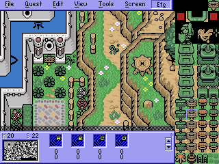
Posted 22 October 2008 - 08:40 AM
Old New
New 
This is what I have done to remedy the Basiciness of my shot. It looks tons better if you ask me.
New This is what I have done to remedy the Basiciness of my shot. It looks tons better if you ask me.
#26
Alestance
-

- Members
-
Saint Alestance - Eliminator of the ZGP format
- Real Name:Lonk
- Location:Pennsylvania
Posted 22 October 2008 - 09:08 AM
its still pretty bland though... and pillow shaded.
#27
Neppy
-
- Members
-
Grand Overlord Empress
- Real Name:It's dangerous to go alone. Take Nep!
- Location:Minnesota
Posted 22 October 2008 - 10:13 AM
Does anyone read anything? It's a sequel to a Pure quest, so I have to stay using Pure. Making a sequel with a different set would make no sense...... If people are going to have this big of an issue because of how the screens look, I might just as well cut the project now while I'm ahead. Plus, once again, I've not built in ZQuest for 2+ years. Now I know how newbies feels...
#28
link3505
-

- Members
-

Ancient
- Real Name:Ben
- Location:The Edge of Infinity
Posted 22 October 2008 - 11:24 AM
If Pure has them, put a few leaf tiles around on the ground, and a couple of those spiraly grass thingies from Link's Awakening. It looks good now, but it'd be more interesting to look at with those
[edit] Lolcrap wrong thread. Should say i voted for Zenith so I don't make this off topic. Good, solid cave shot. Can't say there's anything really outstanding about it, but it is very appealing to look at
[edit] Lolcrap wrong thread. Should say i voted for Zenith so I don't make this off topic. Good, solid cave shot. Can't say there's anything really outstanding about it, but it is very appealing to look at
Edited by Relic, 22 October 2008 - 11:31 AM.
#29
SpacemanDan
-

- Members
-
- Location:Ontario, Canada
Posted 22 October 2008 - 12:05 PM
ZebraStallion
A great pure shot overall. I would add some more ground detail, but aside from detail, it's pretty good.
Zenith
A solid cave shot. It could use a little extra ground detail but the design is pretty good, and tile usage is great. *Vote
Angeal
(Commenting on the new shot)
It looks much better than the original, but I'd add a little more ground detail. Maybe some dirt and what not. Maybe a different pallette.
CastChaos
A solid shot. The detail is good, and overall is done nicely. My only problem is that the mountains at the top don't look that high up. They appear more like a small ledge than a really high-up mountain.
Very good this week! All well-done shots, IMO. Keep it up everyone!
A great pure shot overall. I would add some more ground detail, but aside from detail, it's pretty good.
Zenith
A solid cave shot. It could use a little extra ground detail but the design is pretty good, and tile usage is great. *Vote
Angeal
(Commenting on the new shot)
It looks much better than the original, but I'd add a little more ground detail. Maybe some dirt and what not. Maybe a different pallette.
CastChaos
A solid shot. The detail is good, and overall is done nicely. My only problem is that the mountains at the top don't look that high up. They appear more like a small ledge than a really high-up mountain.
Very good this week!
#30
Dawnlight
-
- Members
-
My name is NOT Jason!
- Real Name:Justin
- Location:Chicago, IL
Posted 22 October 2008 - 04:28 PM
QUOTE(Angeal @ Oct 22 2008, 08:40 AM)
Old
New This is what I have done to remedy the Basiciness of my shot. It looks tons better if you ask me.
I don't recommend using P. Enhanced Trees. Just add more ground detail. *shrug*
0 user(s) are reading this topic
0 members, 0 guests, 0 anonymous users

