Demonlink, you're certainly dominating SOTW these days.
Also, you seem very talented with the use of the tileset (Koten, am I right?). Great job!

 This topic is locked
Deified

Posted 02 June 2014 - 05:01 PM
Demonlink, you're certainly dominating SOTW these days.
Also, you seem very talented with the use of the tileset (Koten, am I right?). Great job!
Hero of Time

Posted 02 June 2014 - 08:21 PM
Demonlink's suffers from poor, cramped composition and a confused, scatterbrained aesthetic. This might offend some I guess, but it doesn't feel like it was composed for any real reason but just thrown together because hey new tileset Koten fancy exciting woo. I'm sorry if I'm slamming it too hard; I just don't understand its popularity and it actually had the least appeal to me of any of the shots this week.
legend27's may not be the greatest compositionally, but it captures a certain kind of... "imagination", I guess, that's lacking from some of the other entries. It's a little bit messy, but it's also pretty and it has a lot of heart in it. It sticks to a limited color palette (the green/pink/blue thing it has going on), which really, really helps it stick out aesthetically, and it uses forest overhangs in a way that makes it prettier without making it harder to tell what's going on. I like it! I voted for it!
Lightwulf's is cool too. A little monochromatic, and the layering the mountain over the raised land in the bottom left is a little confusing to my eyes and brain, but it has an interesting setting, which is cool.
Avataro's works fine but it's boringer than Plainsville and does nearly nothing to distinguish itself. It'd work fine in a quest but I wouldn't call it a standout screen or anything.
Edited by Rambly, 02 June 2014 - 08:22 PM.
Lurking in the shadows...

Posted 02 June 2014 - 08:38 PM
Demonlink's suffers from poor, cramped composition and a confused, scatterbrained aesthetic. This might offend some I guess, but it doesn't feel like it was composed for any real reason but just thrown together because hey new tileset Koten fancy exciting woo. I'm sorry if I'm slamming it too hard; I just don't understand its popularity and it actually had the least appeal to me of any of the shots this week.
Well, I didn't actually throw it all together just because of "new tileset, yay!" If that were the case, I can grab my set and make a total random screen. I actually dedicated around 10 minutes to throw the screen together. But alas, I guess not everybody likes my designs ![]()
Pixel Dragon

Posted 02 June 2014 - 08:53 PM
Edited by DragonDePlatino, 02 June 2014 - 08:53 PM.
Master

Posted 03 June 2014 - 10:35 AM
Thanks, guys! ![]() I hope you enjoy this spoiler of a top-secret hidden area I just added to my quest (which, BTW, is on the verge of release).
I hope you enjoy this spoiler of a top-secret hidden area I just added to my quest (which, BTW, is on the verge of release).
...
Lightwulf's is cool too. A little monochromatic, and the layering the mountain over the raised land in the bottom left is a little confusing to my eyes and brain, but it has an interesting setting, which is cool.
...
...
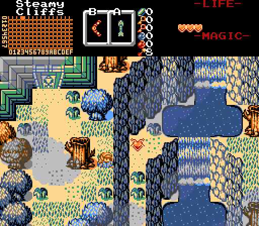
Lightwulf - A bit on the bland side, but it's nice seeing people branch out and make caves more dynamic than those of the original LoZ...The very few additions of tiles makes this a very clean shot, but what's up with the cliffs in the lower-left? Are the outer walls supposed to be in the foreground, covering up the pits? It's not really clear at all....
Yeah, sorry for the confusion. Since this is a cave, there is a lower ceiling over the left edge of the screen, and yes, there's a foreground that the player can walk under when going west.
The palette is a darkened version of the palette of the area that led to this place.
o_o

Posted 03 June 2014 - 01:44 PM
Charizard, please translate or else 0 stars ![]()
Demonlink, you are really good with this tileset. These graphics look pretty and they compliment the nice and solid screen design. I don't think the player should be able to enter the screen from the right here.
legend27, the canopy is used a bit weird and unusual, but it's still an amazing screen! Nice subscreen ![]()
Lightwulf, this area looks fun to explore but annoying to traverse (I hate bats they never stop flying xD). I love the way you used the mountains and you are doing more with Classic, graphically, than most people.
About my screen, I have to say thank you everyone for your comments. You don't know how glad I am to hear that my screen works well and looks natural for use in a quest. This means that I finally got more confident with this tileset again. I lost my faith in my ability of using it, ever since I used the Classic tileset.
💙

Posted 04 June 2014 - 12:44 AM
Charizard: Best screen ever! Simply breathtaking! 11/10 ![]()
(Note: Only pretty pink mermaid princesses can decipher the message. Therefore, I cannot give a translation. (j/k))
Demonlink: Personally, I'm rather not fond of your Koten screens. I for one have never been a huge fan of those clouds since they seem like mountains recoloured to black. Also I am curious if these clouds would even fit in with NES restrictions. Besides the clouds, the colours you chose seem really strange and not in a surreal sense either. Sorry if I'm tearing this to pieces, I just didn't expect you would make something I wouldn't like. ![]()
However, I will say the screen structure getup is nice and it's unique to see dungeon walls as the dungeon entrance. ![]()
legend27: Where to begin? I really love your palette choice (Sheik's Deepwood Shades palette, right?) but the design choices seem a bit random to me. I really love the way you are going for an enchanting mystical forest but however, I don't think spamming mushrooms and flowers is going to achieve that effect fully. Use forest brush to block the spaces you don't want Link to walk on instead. And then use mushrooms and flowers as secondary backup source of solidity and do not put them on the very edge of the screen.
The Catfish's Maw dungeon entrance tiles do seem a bit odd, but I'll let it slide. It's a really nice screen with big potential. ![]()
Lightwulf: Looks great! I'll admit I was a bit confused at first; I thought the red stuff was lava! ![]() I realized the black tiles were pits soon after, so no worries. Besides the fantastic mountain usage, there's nothing special that the shot has to offer. I'm just not "feeling" it you know? Still, an overall lovely screen with no flaws from what I see.
I realized the black tiles were pits soon after, so no worries. Besides the fantastic mountain usage, there's nothing special that the shot has to offer. I'm just not "feeling" it you know? Still, an overall lovely screen with no flaws from what I see. ![]()
Avataro: I would of voted here for two reasons. a) Because your video told me to and b) I really love your use or Pure Remembrance... it feels like a breath of fresh air. I'll admit I would of loved to see a different, more brighter and less stale palette used, but the atmosphere I get from it makes up for the lack of such a palette. ![]()
Edited by Charizard, 04 June 2014 - 12:46 AM.
you're going to have a bad time

Posted 04 June 2014 - 07:34 AM
💙
Posted 04 June 2014 - 09:24 PM
OMG yes.
ringle

Posted 07 June 2014 - 04:40 AM
That made my morning XD
That should also be the mascot of SotW
May the way of the Hero lead to the Triforce.

Posted 09 June 2014 - 02:36 PM
With 41.27% of the vote, the winner of Screenshot of the Week 458 is Demonlink!
Congratulations!
 |
Demonlink
PureZC Events →
Map of the Month →
Poll Map of the Year 2021: Seasons BracketStarted by Eddy , 03 Jan 2022 |
|

|
|
|
|
Mitchfork
PureZC Events →
Screenshot of the Week →
Screenshot of the Week (Old) →
Poll Screenshot of the Month 188Started by David , 12 Sep 2021 |
|

|
|
|
|
Demonlink
PureZC Events →
Screenshot of the Week →
Screenshot of the Week (Old) →
Poll Screenshot of the Week 761Started by David , 15 Aug 2021 |
|
|
|
|
|
Aslion
PureZC Events →
Screenshot of the Week →
Screenshot of the Week (Old) →
Poll Screenshot of the Week 760Started by David , 01 Aug 2021 |
|
|
|
|
|
Demonlink
PureZC Events →
Map of the Month →
Poll Map of the Month 135Started by Eddy , 01 Jul 2021 |
|
|
0 members, 0 guests, 0 anonymous users

