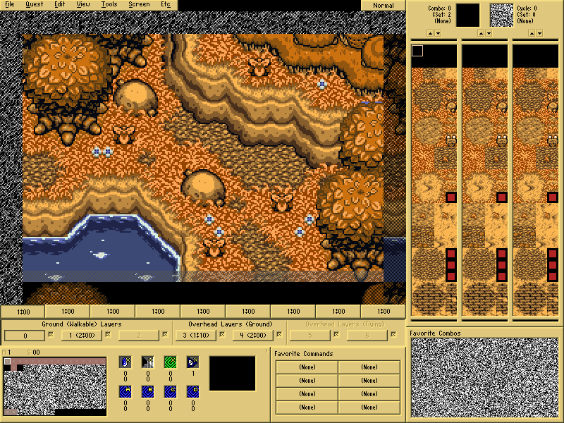
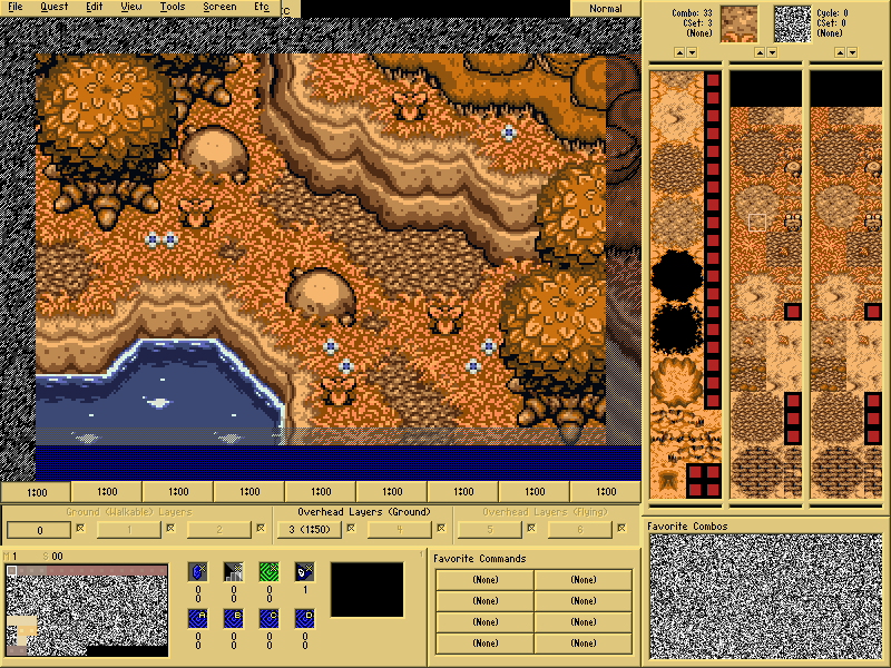
Your monitor might not be the best for colour management so the contrast might look more pronounced to you than it actually is.Here, I made a quick palette change showing the hue shifting I was talking about (see how the leaf shadows are reddy-pink rather than orange). Changed the grass colour too because there was too much orange going on, though now the tree shadows look a little weird. Could still use some balancing but it's a start:
Well, that's WAY better than I've done, balanced or not, it looks perfect to me. I thank you for your help NoeL!  I'll fix mine when I get to my PC. Thank you once again. (And I'll see what I can do about the shadows for them to look okay
  )
)
Edit: Looks like the shadows, grass highlights and tree leaves all use the same colors, so technically, I think I'll need to make an adjustment.
Edited by Demonlink, 28 April 2014 - 07:03 PM.