With a quest contest in full swing, we've got screens from all kinds of different projects this time. Vote for your favorite, and leave some comments. I'm sure the participants will appreciate it.
Avaro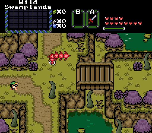
This place looks dangerous and... uncomfortable.
Hookshot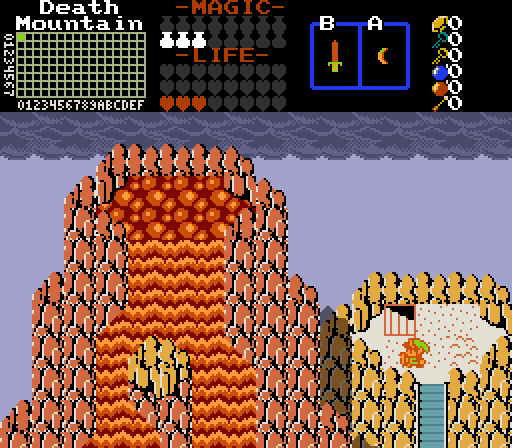
Link climbs the fiery peak of Death Mountain.
Joelmacool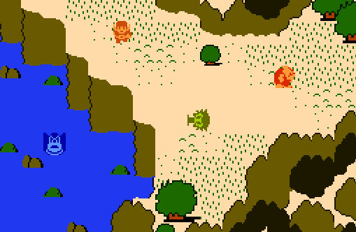
an experiment with perspective
Lordkronos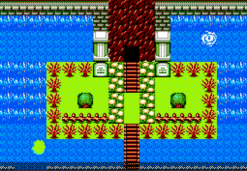
The Old Aqueduct Long Time Ago Abandoned now Infested with Monsters ![]()
Matthew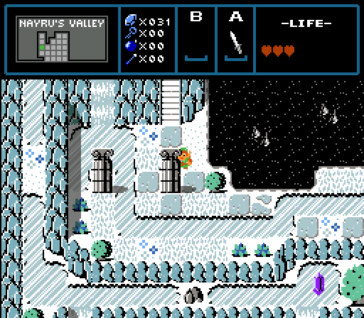
_O (stares at you from behind pillar) ((From the 6th quest contest ![]() ))
))
Shane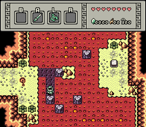
Trying to solve this puzzle like I am will result in you bursting into flames in a matter of seconds. So why am I doing it? Developer commentary.

Screenshot of the Week 717
Started by
Aevin
, Nov 17 2019 11:25 AM
Matthew Avaro Hookshot Joelmacool Lordkronos Shane
-
 This topic is locked
8 replies to this topic
#1

Aevin
-

- Members
-

- Pronouns:He / Him
- Location:Oregon
Posted 17 November 2019 - 11:25 AM
- Shane, Hari, Deedee and 1 other like this
#2
Nick A
-

- Members
-

Newbie
- Location:Illinois
Posted 17 November 2019 - 12:27 PM
Here is my review of all the screenshots
Avaro: I love the look of the swamp and the placements of the enemies is good. It also gives just the right amount of detail.
Hookshot: I love that the volcano is the main focus on this screen, especially due to it being a great design.
Joelmacool: I love the enemy placement and the Zol in the lake helps give the screen more detail. The lake is not too big, but also not too small, it is just the right size.
Lordkronos: I love that the entrance to the Aqueduct is the main focus, by putting it right in the center. It helps show the player how important it is. Also I love the design of the waterfall and the whirlpool is a nice touch.
Matthew: I love the placement of the pillars and that the Rupee is just in the right place, in order to draw the player's attention and cause them to try to obtain it.
Shane: I love the concept of the puzzle and the lava lake is just big enough to not make the puzzle feel cramped. Also everywhere that the player can stand on, is just big enough for it not to be cramped. The floor tiles are also well placed.
- nicklegends, Shane, Avaro and 4 others like this
#3
Titanium Justice
-

- Members
-

Justice is served!
- Real Name:Jared
- Location:Ontario
Posted 17 November 2019 - 04:01 PM
I'm going to have to go with Matthew. The scene has got some really nice colors going on. Hookshot was a very close second.
- Aevin, Hari and Matthew like this
#4
Sheik
-

- Members
-

Deified
Posted 17 November 2019 - 05:28 PM
I voted for Matthew. I like the pillars.
- Matthew likes this
#5
nicklegends
-

- Contributors
-

Trofessional Pransposer
- Real Name:Ed
- Pronouns:He / Him
Posted 18 November 2019 - 05:28 PM
I may expand this post later with other reviews.
I went for Avaro this week for assembling an elegant screen that is distinctive without being too gimmicky. I like the overall mechanical flow of the area as well. It's not a simple open space, but it's walkable. The enemy is a nice touch, but its colors stand out a bit too much.
I went for Avaro this week for assembling an elegant screen that is distinctive without being too gimmicky. I like the overall mechanical flow of the area as well. It's not a simple open space, but it's walkable. The enemy is a nice touch, but its colors stand out a bit too much.
#6
Matthew
-

- Administrators
-

- Pronouns:He / Him
- Location:Ohio
Posted 19 November 2019 - 06:33 PM
Here are my thoughts on the screens:
Avaro: Really nice Pure-esque shot. Those tentacles are kinda freaky, but cool. o_o
Hookshot: As I said in discord, This is a really cool screen and the shadow effects are a nice touch ![]()
Joelmacool: If this project were to increase in seriousness, there would obviously need to be more texture on the mountains, but for now, this is nifty exercise in perspective.
Lordkronos: I like what this screen is getting at, but I am having a bit of a hard time parsing it. I think if you want to go for more of that elevation difference look, you should add some wall/structure underneath the green middle platform.
Shane: Cool Hot puzzle and nice palette, another solid shot ![]()
As a side note, it's nice how much bigger the turnout on these SotWs have been. Looks like the bi-weekly method is working well.
Edited by Matthew, 19 November 2019 - 06:33 PM.
- Shane, Hari and Lordkronos like this
#7
Joelmacool
-

- Moderators
-

Addicted to Overwatch
- Real Name:Joel
- Location:Country of Europe
Posted 20 November 2019 - 05:37 AM
Joelmacool: If this project were to increase in seriousness, there would obviously need to be more texture on the mountains, but for now, this is nifty exercise in perspective.
The tileset itself was meant to be an extremely simplistic version of Classic. So the aim was to simplify everything while also making the tiles easy to differentiate.
#8
Lordkronos
-

- Members
-

Hero of Dark World
Posted 20 November 2019 - 05:54 AM
Here are my thoughts on the screens:
Avaro: Really nice Pure-esque shot. Those tentacles are kinda freaky, but cool. o_o
Hookshot: As I said in discord, This is a really cool screen and the shadow effects are a nice touch
Joelmacool: If this project were to increase in seriousness, there would obviously need to be more texture on the mountains, but for now, this is nifty exercise in perspective.
Lordkronos: I like what this screen is getting at, but I am having a bit of a hard time parsing it. I think if you want to go for more of that elevation difference look, you should add some wall/structure underneath the green middle platform.
Shane:
CoolHot puzzle and nice palette, another solid shot
As a side note, it's nice how much bigger the turnout on these SotWs have been. Looks like the bi-weekly method is working well.
Thats an nice Idea Thanks for that ![]()
- nicklegends and Matthew like this
#9
Hari
-

- Members
-

Snivy Gang
- Pronouns:She / Her
Posted 01 December 2019 - 05:49 PM
I voted for Matthew because I like the way he uses classic mountains. It looks very nice. I also really like the palette.
|_O
- Matthew likes this
Also tagged with one or more of these keywords: Matthew, Avaro, Hookshot, Joelmacool, Lordkronos, Shane


0 user(s) are reading this topic
0 members, 0 guests, 0 anonymous users

