Screenshot of the Week 310
#16

Posted 06 February 2011 - 06:58 PM
#17

Posted 06 February 2011 - 07:08 PM
MO - Great, as always. But I don't like the bush on the edge of the screen. 9/10.
Orin - Very good! But not just my taste
ZL - I like it, but its jsut a bit too simple. Add a roadblock so the character has to go around! 8/10
PkmnMster - No complaints at all! 10/10
Yoshidude - A bit more ground detail and you'll be great! Lots of potential! 7/10
Furion - Not my style, but it's great! 8.5/10
My final choice is Pokemonmaster64. Just an amazing screen buddy!
#18

Posted 06 February 2011 - 07:09 PM
But honestly, I like Furion's. I don't know, his just stands out of the crowd a bit, and it just looks amazing to me. Maybe I'm weird, but I had to question if that was even made in Zquest. I am exaggerating, I know. But it's really good. A runner up would be Pokemonmaster64 probably, but I just like tropical themed things.
#20

Posted 07 February 2011 - 12:16 AM
#21

Posted 07 February 2011 - 03:03 AM
I shall comment without a further ado.
Molten Onyx: I know it is bright anc colourful, but I don't like that open corner in the top-right. 7/10.
Myself: Geeze, I wonder what went so wrong that nobody voted for this. I feel that it is a good step up from my past entry, and I followed everyone's critique on that entry (and Pokemonmaster, there were less enemies and projectiles in my pervious entry, and you voted for that too).
ZeeLiam: A decent Classic shot, but it is not my cup of tea when it comes the amount of activity onscreen. 6/10
Pokemonmaster64: It looks alright, but I feel that how the mountaintops are used incorrectly. This is the only one that would have voted if I hadn't entered. 7/10.
Yoshidude: This forest screen looks a little bland for my tastes. If it is a forest, then add a couple more things on the ground. 6/10.
Furion: Again, yet another Metroid shot. It is on par with a standard Metroid shot, but that standard is not that good when it comes to ZC... 5/10.
#22

Posted 07 February 2011 - 03:33 AM
#23

Posted 07 February 2011 - 07:33 AM
Pokemonmaster64: It looks alright, but I feel that how the mountaintops are used incorrectly. This is the only one that would have voted if I hadn't entered. 7/10.
I wouldn't say I used the mountain tops incorrectly as much as just in an unusual manner. I layered on some grass borders to give the 2 layer effect.
#24

Posted 07 February 2011 - 12:39 PM
I don't know about "dying," but yellow bushes are available, since that's a function of the palette rather than the tiles.
However, if I'm seeing it correctly, you are using a custom palette. If that's the case, it's up to the person who made the palette: they should use the various CSets to include any alternate colors you may need.
Personally, I recommend that at the very least, most overworld palettes should have an alternate color for dead/dying trees, probably yellow or orange or brown or red. It's not really necessary to have all of those, though. Just a green gradient and one other tree color gradient (in another CSet) are really all you need for one palette.
#25

Posted 07 February 2011 - 12:53 PM
I don't know about "dying," but yellow bushes are available, since that's a function of the palette rather than the tiles.
However, if I'm seeing it correctly, you are using a custom palette. If that's the case, it's up to the person who made the palette: they should use the various CSets to include any alternate colors you may need.
Personally, I recommend that at the very least, most overworld palettes should have an alternate color for dead/dying trees, probably yellow or orange or brown or red. It's not really necessary to have all of those, though. Just a green gradient and one other tree color gradient (in another CSet) are really all you need for one palette.
I just realized that DoR has more tree colors than I thought it did. It really is an amazing tileset if you know how to use it right...which I don't at the moment...
#26

Posted 07 February 2011 - 12:55 PM
Myself: Geeze, I wonder what went so wrong that nobody voted for this. I feel that it is a good step up from my past entry, and I followed everyone's critique on that entry (and Pokemonmaster, there were less enemies and projectiles in my pervious entry, and you voted for that too).
You didn't do anything wrong. Your screen's a great screen, with no flaws at all (other than the murder of innocent animals.
#27

Posted 07 February 2011 - 02:30 PM
Orin XD

Yet another avanced shot of Diamond quest. I have made new ghosts; Muh, ha, ha!
I like it, there's no mountain errors, which is great. But I will say that there is not enough colour. Try placing some of the treetops in a different CSet, and maybe add a few bushes.
ZeeLiam

Yes! This is what I've been wanting to see in Classic! AMAZING. The one thing I would change is making a less random placement of the grass. But it's great either way.
Pokemonmaster64

Too late for Screen Rebirth, but there's always Screenshot of the Week!
I wouldn't call it bad, but there are parts which are definitely overdone. The double grass overlay thing you have going on with the cliffs doesn't work for me. Also, use the normal grass/sand transition tiles instead of those more defined ones you used. Honestly, this screen looks like it could've been better if you'd put less effort in.
Yoshidude

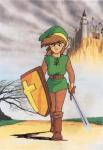
Link senses a great energy in the forest
It's a nice, basic Pure shot. I have no complaints, yet no compliments either. It's just...really basic, and don't take that as a bad thing either.
Furion

Ǝxɬarу Ħaʝэɳs
Ah, now that light is really nice. This is really unique for a ZC shot, I like it. May I ask, what item is that?
Edited by Molten Onyx, 07 February 2011 - 02:30 PM.
#28

Posted 07 February 2011 - 02:32 PM
#29

Posted 07 February 2011 - 02:44 PM
We're all tired of people complaining about the kinds of comments they get. You can't force people to like your screens, so if you're unhappy with the feedback you're getting, the only thing you can do is design better screens by listening to peoples complaints. If you're happy with the way your screens look, you can of course choose not to improve on them, but then you can't complain about what kinds of comments you're getting.
Anyways, my vote went for Molten Onyx this week. Nice design, though the open corners bothers me slightly. It's not a huge deal in this screen, seeing as the rest of it is so good all-around, but adding something to that corner would still drastically improve its look.
#30

Posted 07 February 2011 - 02:47 PM
We're all tired of people complaining about the kinds of comments they get. You can't force people to like your screens, so if you're unhappy with the feedback you're getting, the only thing you can do is design better screens by listening to peoples complaints. If you're happy with the way your screens look, you can of course choose not to improve on them, but then you can't complain about what kinds of comments you're getting.
Anyways, my vote went for Molten Onyx this week. Nice design, though the open corners bothers me slightly. It's not a huge deal in this screen, seeing as the rest of it is so good all-around, but adding something to that corner would still drastically improve its look.
0 user(s) are reading this topic
0 members, 0 guests, 0 anonymous users

 This topic is locked


