Screenshot of the Week 341
#16

Posted 16 October 2011 - 03:03 PM
#17

Posted 16 October 2011 - 03:05 PM
#18

Posted 16 October 2011 - 03:06 PM
Voted for Blue_Knight, mostly because I love Zelda 2, but also because it's a fantastic take on the concept. The chest's perspective irks me a bit, though, but I saw the new one in your thread, so it's all graaaaaaavy.
#19

Posted 16 October 2011 - 04:37 PM
Well, as far as I can see, Jared, you're still using the 2-color grass tile (located near the bottom middle, basically) that shouldn't even be used at all, except maybe for just laying out a screen before detailing it. Only use the main 4 that are boxed together, it looks way better that way.
Voted for Blue_Knight, mostly because I love Zelda 2, but also because it's a fantastic take on the concept. The chest's perspective irks me a bit, though, but I saw the new one in your thread, so it's all graaaaaaavy.
Yeah, I completely redesigned the treasure chest but did it after submitting for SotW.
Now time for feedback:
Ovasity: The sky is very simple, but clean. However the ground is very noisy, which also makes it kind of hard to look at Melvin. Since Melvin is the center-piece, it seems like he should stand out more from the environment.
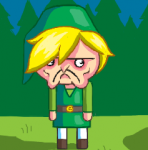
blackbishop89: I like this screen. While the river is missing something (too straight to be natural?), the screen tells a story... even if that story is Link having a really bad day.
Koh: I really like the perspective and shading on the waterfall. This is a pretty good screen I think.
Yoshidude: I like the palette and gamespace. This is probably my second favorite screen out of this bunch.
Jared: Great atmosphere. The water and waterfall are very well done. I would have voted for this screen if I didn't enter the contest (I nulled).
#20

Posted 16 October 2011 - 09:21 PM
Ovasity: As Nathaniel said, title screens aren't that impressive in SotW. However, I seem to recall you mentioning most of your tiles are custom. While that might not seem like a whole lot with a glance, I applaud you nonetheless.
blackbishop89: A solid shot! No complaints.
Koh: See above.
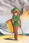
Yoshidude: I wound up putting my vote, here. While I'm not a fan of Hybrid Link in the slightest, the detail on this one is relatively pleasing and I don't see anything I'd change. Well, other than the Link sprite.
Jared: Lovely shot, and may have won my vote had I not already seen it.
blue_knight: I approve of your graphics. Heh. No real complaints other than Link's coloring looks a little odd.
Fireblast124: Ahh! Fire.
Ventus: Ponies.
Edited by Adem, 16 October 2011 - 10:27 PM.
#21

Posted 16 October 2011 - 11:51 PM
blackbishop89- Pretty decent screen. Nice that you have diagonal water tiles set up in your quest, that makes the river look much nicer then trying to use the normal classic corners to make the river change direction. Not really sure what the fire is for, if it's a campfire, might want to add a little something in that would indicate that. I like the hud though, looks nice, but might be good if you darken the grey on the wording a bit, as it is just a little hard to read.
Koh- This screen is great. I especially love the waterfall, how it transitions into darker blue as it gets further down! The design is pretty good too. The brown on the treetops is a little odd, but changing things up a bit is a good thing.
Yoshidude- Pretty decent screen, but to me it doesn't seem to have a whole lot happening within the screen itself. I almost think there should be something in the middle to break it up a bit, but you don't want all your screens to be packed with things to avoid while traveling abroad, so perhaps it works out in your case. I do like the pallete, looks nice.
Jared- *VOTES* This is the screen I voted for this week. It just has a really nice feel to it. Great use of the LttP Mountains. (I LOVE Link to the Past) and awesome use of shadowing. Overall, this screen has a very natural feeling to it, at least for me it does.
blue_knight- *Runner-up* This was my second choice, but was very close to being first. I LOVE what you are doing blue_knight! I enjoy Zelda II quite a bit, and seeing you actually pulling the engine part of it off, is just AWESOME! Your reworking of the tiles is wonderful, and adding your own touch to the engine, like the ladder, and doors is pretty sweet too. I look forward to seeing more of this in the future!
Fireblast124- Well, that is a lot of fire.
Ventus- Odd... Too bad I am not part of the MLP movement.
#22

Posted 17 October 2011 - 06:55 AM
Hmmm. Here is one of the hazards of entering a title shot into SotW: we see it, mentally process what type of game it is, and then we say "and...?"
A title screen is a mere few seconds of any game. If you give us a screenshot of some action happening, it'll stoke the imagination a little bit more. I know title screens are a disproportionate amount of work if you only look at it in terms of the screenshot, so just think of it as something only the person playing the quest will appreciate.
blackbishop89:
I am trying SO hard not to say something inappropriate about this particular shot. >_>
Koh:
A fairly standard Pure-like screen. It looks good, but it's nothing too unusual or exciting. Hmm... Personally, I think that heart piece is not hidden well enough. You slash the bushes to get at it, correct?
Yoshidude:
Not bad, not bad. Good use of Pure and/or DoR. It's a little bare, though. And I'm not sure whether it's from the tileset default, but I Don't think the MC rocks or Octorocks look good next to Gameboy mountains.
Jared:
Very nice, solid use of DoR and LttP small mountains.
blue_knight:
Excellent, very nice reenvisioning of Zelda II graphics here.
I realize you are concerned with making the tiles look "weathered." For that purpose, I recommend looking at Link's Awakening graphics. Particularly the side-view graphics, of course. That game did a good job of creating weathered wall tiles with a minimum of colors AND screen space. LA's Eagle Tower looks especially good.
I voted for blue_knight. It's detailed, it's different, and it has a fresh take on Z2 with a great new palette.
#23

Posted 17 October 2011 - 08:12 AM
blackbishop89 - I'd say there isn't enough variation, and the Classic Set comes with a bunch of other extraneous tiles and what not. 6/10
Koh - The palette is deluded and murky. Kinda blegh to my eyes. Screen design is fairly well done though. 7/10
Yoshidude - There is too much wide open space. 6/10
Jared - I really like this screen, its well put together, but I'm not fond of the shadow placement. 8/10 (voted)
blue_knight - Those graphics look far too saturated, far too underdetailed, and far too pillowshaded. There's very little depth, and none at all in some places, in others there may be too much. 4/10
Fireblast124 - There's... just too much fire! 3/10
Ventus - -10/10
#24

Posted 17 October 2011 - 08:27 AM
#25

Posted 17 October 2011 - 08:31 AM
Ventus - -10/10
O_O Wow a negative Score?. is that even possible?....Well of course it is I'm looking at it
Achievement Earned {Make worst screen shot ever!!} 20 Achievements points!!
wow i hit a all time low
Note: Yeah its a joke shot Sorry but i had to do it
#27

Posted 17 October 2011 - 10:35 AM
You noticed that too?
http://www.zak-site....files/zakjp.gif
(It's a graphical adventure game so it doesn't really use any repeated tiles, but still)
Despite the Japanese text this is actually an American game (or at least, it was originally...)
Oh, here's a better example (same game):

#28

Posted 17 October 2011 - 12:16 PM
For the record, I specifically avoid pillow shading - the light is coming from the top left which is why the highlights on the pillars is off-center. Other then that, thanks for the comments. It's good to know that people are enjoying the art direction so far.
--Edit:
I should talk a little about the weathering. If you read the latest post in the game thread (see my signature in the link) I actually talk about this a little. Basically much of the Tower is in near new condition but there are a few areas where things are in much worse condition. So most areas will get little or no weathering which will transition into other areas where entire sections of walls are missing and things in general are in bad condition (i.e. areas of the dungeon that take place partially outside or with dangerous platforming). It goes along with the story where the tower is maintained by the dead but they cannot keep up and the decay is spreading - so you can see what it was and what the tower will become.
Edited by blue_knight, 17 October 2011 - 12:44 PM.
#29

Posted 18 October 2011 - 02:55 AM
#30

Posted 18 October 2011 - 03:16 PM
I am working on a screen that I will submit to the next sotw, and it will use the graphics that come with Zelda Classic 2.5 RC2.
0 user(s) are reading this topic
0 members, 0 guests, 0 anonymous users

 This topic is locked