
I think we're going to need examples of non-filler screens at this point.

-
 This topic is locked
37 replies to this topic
#32

Eddy
-

- Moderators
-

ringle
- Real Name:Edward
- Pronouns:He / Him
- Location:London, United Kingdom
Posted 14 November 2017 - 01:59 PM
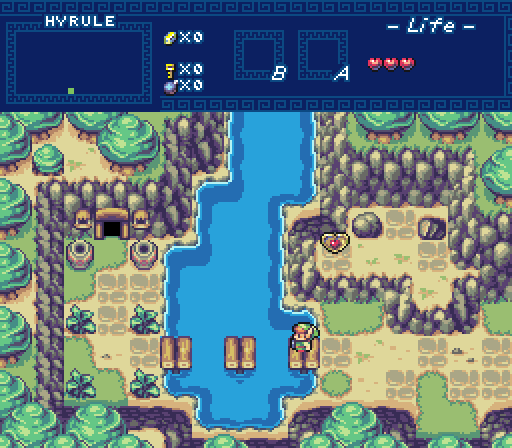
It's not a first I see them but a first I see them AND really like them. Jared made them, right? I remember him using them and while the screens were good, I would have clearly prefered other walls. In your screen I think they look great.
The details of the walls are a bit much for EZGBZ IMO, but the colors you used melts everything perfectly together. The green of the trees below also really stands out, but the same goes for the color of Amy (the pink also stands out) and is the needed extra to make it fit. And Amy herself is IMO also not exactly EZGBZ and in a more typical screen she would stand out more.
Shane made them actually, don't you remember this thread? You even liked the post and all ![]()
But anyways, fair enough with the complaints. A lot of them don't sound like style clashing problems at all to me though, just minor palette stuff which I can't do much about (I would destroy the palette otherwise if I had tried to change the colours lol). I used the default Black Tower Interior palette for this, so I didn't adjust anything at all. I guess I can see why the green would stand out, but I think it still looks fine to me IMO. Same can be said with Amy's graphics and colours, though I would take this any day over a recoloured GB Link (which was what I had to begin with). Thanks for the comments though, now to get back to actually finishing this quest ![]()
- Shane and WindRobe like this
#33
Jared
-

- Members
-

Deified
- Real Name:Jared
- Pronouns:He / Him
- Location:New Hampshire
Posted 14 November 2017 - 02:33 PM
Cukeman put well some critiques whose sentiments I agree with but lacked eloquence for. and Naru is very much right, Jared. are you able to block me or is that not a thing here? you cannot handle the "this one sucks" feedback from me. in fact, you don't handle basic praise well from me. you struggle to field positive constructive suggestion well from me. pretty much anything I post gets a reaction from you. if I incite rage by saying that I think your demo is great and that you should finish something from it, well... maybe stop subjecting yourself to my content. skip over my interest in the screenshots threads. it shouldn't be too hard -- I am not active often. blah! you won't convince me that I need to be all flowery in general dislike for a weak week of wack offerings. sometimes I can say "this is a bad batch" without derailing lives. or maybe try feeling like "laughing aloud! where is your best ever that is worse than these, old man?"
What? I got over it already. ![]() No harm done. I don't like fighting with anyone anyways. I don't block people either. I appreciate all feedback, as long as it's well thought out. For example, now I can go back to my screen and wonder if anything needs to be improve or I can move on. Overall, my goal is a finished quest though.
No harm done. I don't like fighting with anyone anyways. I don't block people either. I appreciate all feedback, as long as it's well thought out. For example, now I can go back to my screen and wonder if anything needs to be improve or I can move on. Overall, my goal is a finished quest though.
Sheik and Jared's shot both have the same... I don't want to say "tile error" because I think there's probably new transition tiles that need to be made, but having a 2 tile high wall next to a 3 tile high wall (the middle right edge of Sheik's, and the upper right of Jared's) is troublesome because one of the large stones in the wall gets cut in half (it should have the other half on the adjacent tile). Like I said a "tile error" is when you place a tile incorrectly, in this case I believe new tiles need to be made, but visually speaking it does look like a tile error.
Yeah, this was a tile "error" even in the officially released quest. Just a new tile needs to be made or edited is all. ![]()
- Anthus, Shane, Cukeman and 1 other like this
#34
Naru
-

- Members
-

Magus
Posted 14 November 2017 - 02:50 PM
I sometimes confuse the work of Shane and Jared, they are just both damn good. And of course I like good new tiles, I just don't think they fit well into EZGBZ.
- Jared and WindRobe like this
#35
Shane
-

- Moderators
-
💙
- Pronouns:He / Him
- Location:South Australia
Posted 14 November 2017 - 06:37 PM
Eddy, I'm going to have to say I agree with you. I don't see any real style clashing myself (it all fits the style) so I say keep them. ![]() Good luck with the rest of the dungeon!
Good luck with the rest of the dungeon!
- Anthus, Eddy, Jared and 1 other like this
#36
Eddy
-
- Moderators
-
ringle
- Real Name:Edward
- Pronouns:He / Him
- Location:London, United Kingdom
Posted 15 November 2017 - 06:42 AM
Eddy, I'm going to have to say I agree with you. I don't see any real style clashing myself (it all fits the style) so I say keep them.
Good luck with the rest of the dungeon!
I was planning on keeping them anyway ![]() But thanks! I'm looking forward to expanding more on this neat idea I have.
But thanks! I'm looking forward to expanding more on this neat idea I have.
- Shane and WindRobe like this
#37
Cukeman
-

- Banned
-

"Tra la la, look for Sahasrahla. ... ... ..."
- Location:Hyrule/USA
Posted 17 November 2017 - 09:27 AM
The big trees in Sheik's screen (and in Jared's) look like underwater trees to me. The "mass of leaves" looks like a jellyfish with ridges on it (man o war jellyfish have a ridge along the top). Were those originally created as underwater trees?
Edited by Cukeman, 17 November 2017 - 09:27 AM.
#38
Neppy
-

- Members
-
Grand Overlord Empress
- Real Name:It's dangerous to go alone. Take Nep!
- Location:Minnesota
Posted 19 November 2017 - 11:55 PM
With 47.62% of the vote, the winner of Screenshot of the Week 636 is Sheik!
Congrats!!
Voting totals:
- TheRock - 2 votes [4.76%]
- Sheik - 20 votes [47.62%]
- Eddy - 14 votes [33.33%]
- Jared - 6 votes [14.29%]
Also tagged with one or more of these keywords: Sheik, TheRock, Eddy, Jared


1 user(s) are reading this topic
0 members, 1 guests, 0 anonymous users

