
Lake Floria
Octorockoncrack - SotW 387

In the dead of night.....
Jared - SotW 388

*Insert "Here Comes the Bride" here*
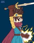
Evan20000 - SotW 389

Trying something a little different here.

 This topic is locked
Grand Overlord Empress

Posted 26 November 2012 - 01:08 AM
May the way of the Hero lead to the Triforce.

Posted 26 November 2012 - 01:32 PM
Caelan, the Encouraging

Posted 26 November 2012 - 08:07 PM
Deified

Posted 26 November 2012 - 09:56 PM

Caelan, the Encouraging
Posted 26 November 2012 - 10:15 PM
Courage

Posted 27 November 2012 - 04:46 AM
Redeemed
Posted 27 November 2012 - 05:16 AM
~ Hope of Energy Nede ~

Posted 27 November 2012 - 05:55 PM
Edited by Zephyr_Eevee, 27 November 2012 - 05:56 PM.
Grand Overlord Empress
Posted 03 December 2012 - 01:50 AM
0 members, 0 guests, 0 anonymous users


