Edited by Charizard, 14 January 2014 - 10:53 PM.

Screenshot of the Week 438
Started by
The Satellite
, Jan 14 2014 03:26 AM
Rambly EddyTheOliveira jetbox Demonlink Avataro
-
 This topic is locked
24 replies to this topic
#16

Shane
-

- Moderators
-

💙
- Pronouns:He / Him
- Location:South Australia
Posted 14 January 2014 - 10:51 PM
This post wasn't pointed to you speifically, but rather the subject of "designing things the way you want". That's the point when developing games/quests, but doing so won't mean the final product will be successful. You need to know from others what things could be improved on so that your quest gets more poisitive feedback and whatnot.
#17
Ventus
-

- Members
-

Legend
Posted 14 January 2014 - 11:31 PM
Voted for jetbox I very much liked the over all layout and design of the screen.
Also, I know the tileset doesn't matter, but does it being Classic diminish it, and If I made it in let's say Dance of Remembrance, would it get a better rating? I am trying to find out why my screens aren't doing well. I can only use Classic, as I am very challenged with art and such, like tilesets.
If you made it in Dance of remembrance I'm sure people would be flocking all over like with every other screen made with that set. ![]()
Which would be totally boring since it would look like everyone else's screens.
#18
Shane
-
- Moderators
-
💙
- Pronouns:He / Him
- Location:South Australia
Posted 14 January 2014 - 11:34 PM
And classic quests will look like any other classic quests. Pure quests will look like any other pure quest. You got to put, you know, effort to make it look different. 
Also a classic screen won last week against shots that used DoR and what not. It's not about the tileset - it's about how you use it. I fail to see the "bias" in all this but that's just me.
Also a classic screen won last week against shots that used DoR and what not. It's not about the tileset - it's about how you use it. I fail to see the "bias" in all this but that's just me.
Edited by Charizard, 14 January 2014 - 11:38 PM.
- Jared likes this
#19
Xenix
-

- Members
-

Well excuse me princess.
- Real Name:Chris
- Location:Newport News, VA
Posted 15 January 2014 - 12:55 AM
Eddy and Demonlink were the two that I REALLY liked the most out of the bunch. It was a tough choice, but I eventually went with Demonlink's. That atmosphere man. ![]()
Good job from everyone this week!
#20
Haylee
-

- Members
-

~ Hope of Energy Nede ~
- Real Name:Haylee
- Pronouns:She / Her
- Location:Italian Restaurant in Koorong
Posted 15 January 2014 - 01:29 AM
To me, it was either Eddy or Rambly. In the end, I picked Eddy though, since that screen is replicated quite nicely. (Plus, I just really like the color orange.)
Edited by Goriya, 15 January 2014 - 01:30 AM.
#21
Rambly
-

- Members
-

Hero of Time
Posted 15 January 2014 - 07:18 AM
I'm just gonna say that I'm honestly really surprised and pleased to see the positive response that my shot has gotten. I seriously just submitted it on a whim expecting to finish last handily; I definitely didn't expect people to say as nice things about it as they have, haha. Thank you, everyone!
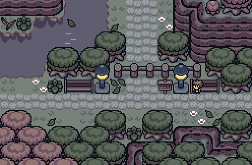
Not to downplay the effort of the other people in the contest, 'cause this is a really good week! I'm quite fond of Demonlink's -- compositionally, it manages to be clean yet atmospheric and detailed at the same time, which is hard to pull off when everything's covered in forest canopy. Design-wise, it's a good example of how to keep a shot interesting without getting it messy, and that's something I can appreciate. I like Avataro's, too, largely for the same reasons.
EddyTheOliveira's is all right, but I'm not that fond of the palette... it's not that there's anything really wrong with it -- I'm just not personally all that fond of gold/brown schemes. It's a personal thing, really.
As for jetbox's... it works compositionally and would look pretty good in a quest, but it's not really... attention-grabbing aesthetically, I guess. Good screen, but not the best screenshot, I guess.
#22
Dawnlight
-

- Members
-

My name is NOT Jason!
- Real Name:Justin
- Location:Chicago, IL
Posted 15 January 2014 - 08:44 AM
Coin toss between Demonlink and Rambly.
*flips coin*
Okay, Demonlink gets my vote.
#23
Eddy
-

- Moderators
-
ringle
- Real Name:Edward
- Pronouns:He / Him
- Location:London, United Kingdom
Posted 15 January 2014 - 11:33 AM
EddyTheOliveira's is all right, but I'm not that fond of the palette... it's not that there's anything really wrong with it -- I'm just not personally all that fond of gold/brown schemes. It's a personal thing, really.
You probably don't like the Ancient Ruins then ![]()
#24
Kalox
-
- Members
-

Newbie
Posted 15 January 2014 - 04:49 PM
Rambly
Because it is an image without a Link or Zelda Thing
Edited by Kay009, 15 January 2014 - 04:49 PM.
#25
The Satellite
-

- Members
-
May the way of the Hero lead to the Triforce.
- Real Name:Michael
- Pronouns:He / Him
Posted 19 January 2014 - 04:25 PM
With 36.36% of the vote, the winner of Screenshot of the Week 438 is Rambly!
Congratulations!
Also tagged with one or more of these keywords: Rambly, EddyTheOliveira, jetbox, Demonlink, Avataro
PureZC Events →
Screen Rebirth →
Poll Screen Rebirth 9! The Contest!Started by Taco Chopper , 22 Apr 2024 |
|

|
||
 |
Bourkification
PureZC Events →
Screenshot of the Week →
Poll Screenshot of the Week 806Started by Taco Chopper , 25 Dec 2023 |
|

|
|
|
|
Anthus
PureZC Events →
Screenshot of the Week →
Poll Screenshot of the Week 800Started by Taco Chopper , 30 Oct 2023 |
|
|
|
|
|
Sheik
PureZC Events →
Screenshot of the Week →
Poll Screenshot of the Week 797Started by Taco Chopper , 01 Oct 2023 |
|
|
|
|
|
Demonlink
PureZC Events →
Map of the Month →
Poll Map of the Year 2021: Seasons BracketStarted by Eddy , 03 Jan 2022 |
|

|
0 user(s) are reading this topic
0 members, 0 guests, 0 anonymous users

