Joelmacool
Isolation is the best cure.
RedTribeLink
The Darkness grows...
Eddy
Another random Geometry Dash-like mockup screen. Tried to base this off the Gravity Ball game mode ![]()

 This topic is locked
May the way of the Hero lead to the Triforce.

Posted 26 June 2016 - 09:55 PM
Joelmacool
Isolation is the best cure.
RedTribeLink
The Darkness grows...
Eddy
Another random Geometry Dash-like mockup screen. Tried to base this off the Gravity Ball game mode ![]()
ringle

Posted 27 June 2016 - 02:44 AM
Joelmacool - Hot damn, that's some 10/10 screen design. You need to make a quest out of this tileset at some point, it looks great ![]()
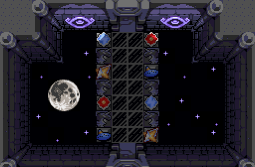
RedTribeLink - Looks neat though I don't really see the appeal personally. It's mostly just an empty screen with a big moon in the background, and that's about it. I guess it looks alright, but I don't really get all the items being displayed like that, looks a bit weird to me IMO.
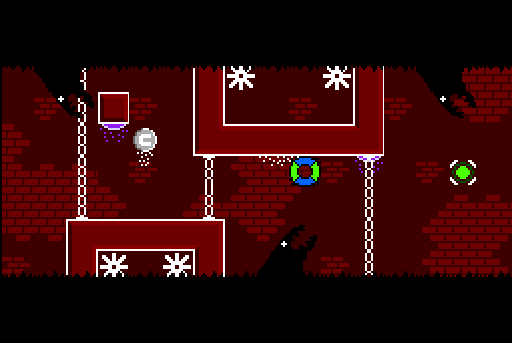
Eddy - Looking back at this, those monsters (or dragons as they're called in-game) really look like ants or something. Tried to make them look like these guys, but failed pretty badly:

Probably should've gone for the alternative ones lel
Either way, I nulled for this contest since I'm in it, but I would've voted for Joel if I wasn't in this contest.
"Tra la la, look for Sahasrahla. ... ... ..."

Posted 28 June 2016 - 05:27 AM
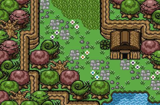
Joelmacool- Some nice colors, but it feels like you took a plain screen and filled it up with a whole buncha trees. Ground detail is working though.
RedTribeLink- I love the glowing purple effect and the tones of the colors, I can't tell what's going on though, is it a bunch of items sitting in a room? It's kinda just... four walls and a floor.
Eddy- I want to like this screen, it looks really interesting, but I can't tell what's going on. Is there a player character? Are things rising or falling? The reds are far too dark to see things clearly- they are almost as dark as the black liquid/creatures, which are very difficult to see. The only things I can clearly make out are white. It feels like I need to turn on the lights so I can see.
ringle
Posted 28 June 2016 - 11:55 AM
Eddy- I want to like this screen, it looks really interesting, but I can't tell what's going on. Is there a player character? Are things rising or falling? The reds are far too dark to see things clearly- they are almost as dark as the black liquid/creatures, which are very difficult to see. The only things I can clearly make out are white. It feels like I need to turn on the lights so I can see.
If you can't tell what's going on from that one screenshot, you probably will lose track of everything that happens in the real game (I kid, I kid lel). Nah, but seriously, the playable character is the green and blue ball riding on the ceiling (since you're supposed to switch gravity a lot, I figured it would look cool for it to ride on the ceiling like that). I really don't get the complaint about the reds though. If anything, they seem to look much brighter on my end. Thanks for the comments though, I guess trying to go as crazy with this on ZC isn't really as great as it is on GD by the looks of things ![]()
Posted 28 June 2016 - 12:58 PM
Eddy's is creative. I voted for his. ![]()
Addicted to Overwatch

Posted 28 June 2016 - 01:06 PM
Joelmacool- Some nice colors, but it feels like you took a plain screen and filled it up with a whole buncha trees. Ground detail is working though.
The screen is meant to be a forest. ![]()
"Tra la la, look for Sahasrahla. ... ... ..."
Posted 28 June 2016 - 02:07 PM
The screen is meant to be a forest.
In ZQ, trees are also objects distributed in space. The design of that distribution has been better in other entries of yours, I feel.
Edited by Cukeman, 28 June 2016 - 02:07 PM.
Addicted to Overwatch
Posted 28 June 2016 - 02:58 PM
In ZQ, trees are also objects distributed in space. The design of that distribution has been better in other entries of yours, I feel.
I agree with this. Though, if I may ask, do you realise you are able to walk behind the trees? So, this would make the screen easier to walk across than trees that do not allow you to walk behind them. If you do already know this, then ignore my question. ![]()
Yes I'm that guy who dreamt Dani was Zelda. LOL Cimfam/zelda

Posted 28 June 2016 - 10:28 PM
Eddy's creativity is great, but RedTribeLink gets my vote. That Moon feels a bit random, but it actually fits this screen perfectly. All that is going on here looks pretty well done. It's not perfect by any means and it's not your best work, but this gets my vote.
Deified

Posted 29 June 2016 - 03:27 PM
Voted for joel again.
Joel is soon gonna have to start making some shitty dayday images again before I start looking like a joel fanboy or something.
Edited by NewJourneysFire, 29 June 2016 - 03:27 PM.
Yes I'm that guy who dreamt Dani was Zelda. LOL Cimfam/zelda
Posted 29 June 2016 - 04:19 PM
RedTribeLink is that image for like level 8 or 9 or something?
Hero of Time

Posted 29 June 2016 - 07:13 PM
It was close this time around, but I voted for Joel.
Saint Alestance - Eliminator of the ZGP format

Posted 29 June 2016 - 08:34 PM
These sacrifices are unworthy! UNWORTHY, UNWORTHY, UNWORTHY! Each and every one of these screenshots will not accumulate a vote from myself! I don't like them, and the great demon Salazepans will not be summoned today.
Doyen(ne)
Posted 30 June 2016 - 12:08 AM
RedTribeLink is that image for like level 8 or 9 or something?
Technically. It leads to the final main dungeon in the game, but you do access it fairly early.
So, this place is in the skies, hence why the stars and the moon are below you. This room is meant to be somewhat of a shrine, signifying some of the most key items in the game on those pedestals. Those are meant to be displays, so I think I should probably make it more display-like. I wanted to give it a kind of surreal look as well.
Thanks for the critiques so far. I apologize if I haven't been responding to this more than I probably should.
Addicted to Overwatch
Posted 01 July 2016 - 10:18 AM
Tight match!
I like your screen RedTribeLink, it's creative and looks really cool! Eddy's screen is also very creative, but the monsters don't look too good.
Thanks for the feedback everyone.. Do you think I should make a short quest out of the tileset? ![]()
0 members, 0 guests, 0 anonymous users


