Jump to content

Photo

Koten - Reimagined Classic

Tileset

  • Please log in to reply
237 replies to this topic

#1 DragonDePlatino

DragonDePlatino

    Pixel Dragon

  • Members

Posted 20 March 2014 - 11:28 PM

DATABASE DOWNLOAD

===

SFX Download


Zelda Classic is an amazing program which spawned one of the greatest gaming communities on the net. Over the past 14 years, we've witnessed dozens of creative quests made by the community. Custom scripts, enhanced MIDIs, creative ZQuest tricks...we've seen it all. But in Zelda Classic's past decade, one thing has remained stagnant...and that is the default tileset.
 
Mind you, there are plenty of incredible classic tilesets out there but the default tileset has stayed the same. It's an antiquated old thing made 28 years ago and it really shows it's age. Full of mixed perspectives, poor palette allocation and lack of detail, it's about time it's gotten an update. And so I present a little personal project called "Koten", which is just Japanese for "Classic".

Koten aims to fix many of the problems of the Classic tileset while incorporating more robust pixel art techniques up to today's standards. You'll see copious anti-aliasing and a maximum amount of detail throughout. It will feature...

  •  100% custom graphics - No edits, no recolors, no exceptions. A Koten quest will be exciting to play through to see all the new graphics.
  •  An Import-friendly setup - Great for newbies and veterans alike, Koten's tiles and palettes can be easily imported over Classic quests for a new coat of paint.
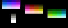
  • Intuitive palettes - Easy to pick up and use, Koten's palettes demonstrate robust hue-shifting and 3-color warm/cool ramps. All 12 ramps will work with every tile!
  • NES restrictions - And to top it all off, Koten would, in theory, work on an NES. Out of the NES's 54 usable colors, each tile and sprite will use four. All tiles will share black and all sprites will share transparency. Not even the default tileset does this!
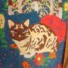
Screenshots:

koten_screens_by_dragondeplatino-d7k3xy2
 
Older Version Downloads:
 
Beta v1.0 (Old palettes, old cliffs)
Beta v1.1 (Old palettes, new cliffs)
Beta v1.2 (New palettes, new cliffs)


Edited by DragonDePlatino, 29 August 2014 - 12:45 PM.

  • 4matsy, Neppy, Rambly and 11 others like this

#2 thepsynergist

thepsynergist

    thepsynergist

  • Members
  • Real Name:Jeff Lee
  • Location:California, USA

Posted 21 March 2014 - 12:08 AM

I almost wonder if the GBC Zelda tileset would be better as the default...


#3 Koh

Koh

    Tamer Koh

  • Members
  • Real Name:Dominic
  • Location:Monsbaiya, Virginia

Posted 21 March 2014 - 05:43 AM

Off to a good start!  But time for some critiquing of what I'm catching...


The doors on the dungeon set look a little awkward.  It's like, the frame of the door is jutting out, but the bottom of it isn't.  So it's like it can't decide if it wants to be in the wall, or protruding out.  Also, you made the blocks correct with the perspective, but not the dungeon walls.  It looks inconsistent and awkward as well.  Try giving those dungeon tiles some texture too; they look too plain compared to the rest of the tiles.  Don't go overboard with it, if it's to be a tile that repeats forever like that, or else you'll get an optical illusion.  Perhaps have 4 different versions users can cycle between.  The lines on the dungeon wall bricks look too thick; it's like they're on a different pixel aspect-ratio than the rest of the tiles.


The frames on the HUD still stand out a bit too much.  If everything else on the HUD had the same top-down aspect, it would be fine, but you've got multiple perspectives going on in the HUD, and it looks awkward.  Everything should be consistent.


Edited by Koh, 21 March 2014 - 05:52 AM.

  • Jared likes this

#4 strike

strike

    life is fragile, temporary, and precious

  • Members
  • Real Name:Olórin

Posted 21 March 2014 - 05:57 AM

Koh, the doors and blocks are like that in classic. Don't make the lines on the walls thinner; they look good as they are. HUD looks great.

Ignore Koh. :lol:

I'll be using this.

-Strike
  • Shane likes this

#5 Astromeow

Astromeow

    RESPECT DA OBOE SOLO

  • Members

Posted 21 March 2014 - 08:33 AM


NES_palette.png


Good stuff here but I honestly feel your representation of the NES palette is a bit off- Here is a more unified saturation for the hues


zelda054_zps7e3b0581.png


Edited by Astromeow, 21 March 2014 - 08:54 AM.


#6 Koh

Koh

    Tamer Koh

  • Members
  • Real Name:Dominic
  • Location:Monsbaiya, Virginia

Posted 21 March 2014 - 09:15 AM

Koh, the doors and blocks are like that in classic. Don't make the lines on the walls thinner; they look good as they are. HUD looks great.

Ignore Koh. :lol:

I'll be using this.

-Strike

My response to that is what my professor said to our Workforce Development Class yesterday:  "Just because it's here (slides from previous student's presentations) doesn't mean it's the best it can be.  There's always room for improvement.  So when you get critiqued by the review board, don't say 'We just followed what was on the site,' because they aren't perfect, and some were actually pretty bad."


Basically, you can't justify the errors people will find from what they see, by noting they're the same copied errors from what you're basing your work off of.  Errors are errors, regardless of context.


Edited by Koh, 21 March 2014 - 09:19 AM.

  • Astromeow likes this

#7 Astromeow

Astromeow

    RESPECT DA OBOE SOLO

  • Members

Posted 21 March 2014 - 09:19 AM

My response to that is what my professor said to our Workforce Development Class yesterday:  "Just because it's here (slides from previous student's presentations) doesn't mean it's the best it can be.  There's always room for improvement.  So when you get critiqued by the review board, don't say 'We just followed what was on the site,' because they aren't perfect, and some were actually pretty bad."


I like your/professors thinking. Perhaps it is not improvement itself that changes for the better, rather, the efficiency and execution of the wheel itself makes it better and better, because a wheel itself cannot be reinvented


anywhoozles I like this set. 8-bit is the way to go these days in Zelda classic in my opinion


Edited by Astromeow, 21 March 2014 - 09:19 AM.


#8 Shane

Shane

    💙

  • Moderators
  • Pronouns:He / Him
  • Location:South Australia

Posted 21 March 2014 - 09:30 AM

It's fine the way it is.


Edited by Charizard, 21 March 2014 - 09:06 PM.


#9 strike

strike

    life is fragile, temporary, and precious

  • Members
  • Real Name:Olórin

Posted 21 March 2014 - 09:36 AM

They're not errors. The tiles are just being true to what they are based off of. Part of the charm of the classic tileset is wonky stuff like that. Just because YOU don't like it, doesn't mean other people who use Zelda Classic don't.

I'm tired and sick so I probably won't post anymore today.

-Strike
  • Shane, Jenny, Haylee and 2 others like this

#10 DragonDePlatino

DragonDePlatino

    Pixel Dragon

  • Members

Posted 22 March 2014 - 04:25 PM

Good stuff here but I honestly feel your representation of the NES palette is a bit off- Here is a more unified saturation for the hues
 
zelda054_zps7e3b0581.png

OMG Thanks so much for showing this to me! I really didn't want to go back and change all my palettes, but this was just too good for me to pass up. In fact, I think that's the PAL palette you've got, which I've been considering giving a go. It's definitely a much stronger palette, and the contrast is much better throughout and Link's sprite looks a lot better. Ohh, and it has ACTUAL RED in it! The only drawback is that I can't find a dark enough brown for the overworld. You win some, you loose some I guess. :shrug:

I've updated the main download with the new palette.

Edited by DragonDePlatino, 22 March 2014 - 04:26 PM.


#11 DragonDePlatino

DragonDePlatino

    Pixel Dragon

  • Members

Posted 23 March 2014 - 05:45 PM

== UPDATE 3/23/14 ==
- Suuuper secret-y stuff added to the main download. I challenge you to find it!

And your prize for finding the super secret-y stuff is that I'll upload my raw files so that you can use them however you like. :D


  • Astromeow likes this

#12 DragonDePlatino

DragonDePlatino

    Pixel Dragon

  • Members

Posted 28 March 2014 - 02:43 AM

== UPDATE 3/28/14 ==

Hey, people! Spring break's been quite easy on me so I've been having a lot of time to dedicate to this little tileset. I can safely say that all of the enemy sprites are finished! Absolutely everything, from page 00 all the way to page 38. And it didn't take nearly as long as expected! I'm really psyched to finally be getting into the actual tiles of the tileset so that I can start posting some nice screenshots. But until then, a little explanation my finalized palette system...

While Koten will feature an equal number of tiles to Classic, it will have a much more robust palette system. While tiles form the body of a tileset, it's palette is it's heart and soul! Let's break it down piece by piece.

A. At the most basic level, I will be using this NES palette. I've used many so far, but this one has a great balance of saturation and contrast.

B. From this palette, I'll be using two separate color ramps for the entire tileset. The first three colors of every Cset will be cool, and the second three will be warm. All will include black as transparency.

C. Here's the basic main palette! Csets 00, 01 and 05, to be exact. You'll notice that all of the "ramps" (half of a Cset) share the same yellow-ish shade of white. This will allow you to mix tiles from between Csets! I can slap down a rainbow of trees and the ground will still transition nicely between them. Oh, but you cannot mix colors between ramps, even if they're in the same Cset. Firstly, it will look horrible. Secondly, it would break NES restrictions for very complicated reasons.

D. And while some may think this is rather restrictive, it has it's perks! We still have Csets 06, 07 and 08. Each is simply a darker version of the first 3 Csets. These are used for times of day, caves, enemies and dungeons, but their intended usage is actually shading. In this example (excuse the hasty box sprite), only 3 tiles and a single layer are used but a very rudimentary axonometric perspective can be created by playing with Csets! With a universal light source coming from the left, a 3D 2x2 group of boxes casts a long shadow onto a tree.

E. And with just one more tile, the illusion is complete.


palette_demonstration_by_dragondeplatino


And that's how I'm going to be improving on the Classic tileset's palette system! And I haven't even gotten into level palettes! :D It's easy-to-learn, has a lot more thought behind it and every single Cset works with every single tile. To date, I don't think any tileset has ever managed this. So what do you guys think? Would people pick up on this shading system and use it in quests? It's something new as far as I know, and it'd really help quest designers add a bit more dimension to their quests while still sticking to the simplicity and prototyping speed of a single layer.


  • strike likes this

#13 Koh

Koh

    Tamer Koh

  • Members
  • Real Name:Dominic
  • Location:Monsbaiya, Virginia

Posted 28 March 2014 - 07:22 AM

It's a great idea in theory, but that illusion you mentioned only works for boxy tilesets like classic, since the shadows are so square.  For more organic tilesets, the shadows should be a bit more diagonal and defined, and possibly gradiented (through the use of alpha channels, and not a palette of grays) as they reach the edge of the shadow.


#14 Timelord

Timelord

    The Timelord

  • Banned
  • Location:Prydon Academy

Posted 29 March 2014 - 11:01 PM

It's a great idea in theory, but that illusion you mentioned only works for boxy tilesets like classic, since the shadows are so square.  For more organic tilesets, the shadows should be a bit more diagonal and defined, and possibly gradiented (through the use of alpha channels, and not a palette of grays) as they reach the edge of the shadow.


If you want an 'organic' tileset, you don't want anything derived from the classic, or most other 8-bit style sets. :P


That said, I know what you are saying here. I doubt I would ever use 'shadows' like this, as the overall effect looks more like a glitch, than a shadow. In part, this is broken, because of the shadows on the trees too. They are not at the same angle of light as the 'long shadow' that you are trying to make with the blocks, nor are they the same shade; but further, a shadow cast by the block, should overcome the shadow of a tree, in its own tile. I don't think this will work well, and really, big blocks of pure shadow, with hard edges, are going to look more like an Atari 2600 tileset in the end.


#15 DragonDePlatino

DragonDePlatino

    Pixel Dragon

  • Members

Posted 29 March 2014 - 11:06 PM

If you want an 'organic' tileset, you don't want anything derived from the classic, or most other 8-bit style sets. :P


That said, I know what you are saying here. I doubt I would ever use 'shadows' like this, as the overall effect looks more like a glitch, than a shadow. In part, this is broken, because of the shadows on the trees too. They are not at the same angle of light as the 'long shadow' that you are trying to make with the blocks, nor are they the same shade; but further, a shadow cast by the block, should overcome the shadow of a tree, in its own tile. I don't think this will work well, and really, big blocks of pure shadow, with hard edges, are going to look more like an Atari 2600 tileset in the end.

:shrug: Oh well, it was an interesting experiment anyways. But from what I've seen, I know people will find other ways to utilize the "darkened" Csets.


Later I'll try posting a demonstration with different Z-levels in dungeons or shadows under arches. I'm sure those will turn out nicer.


Also tagged with one or more of these keywords: Tileset

0 user(s) are reading this topic

0 members, 0 guests, 0 anonymous users