Jump to content

Photo

Screenshot of the Week 253


  • This topic is locked This topic is locked
30 replies to this topic

Poll: ... (41 member(s) have cast votes)

...

You cannot see the results of the poll until you have voted. Please login and cast your vote to see the results of this poll.
Vote

#16 Mitchfork

Mitchfork

    no fun. not ever.

  • Members
  • Real Name:Mitch
  • Location:Alabama

Posted 27 April 2009 - 01:24 PM

QUOTE(Questwizard88 @ Apr 27 2009, 01:42 AM) View Post
Hmm. It appears that my shot's missing here. I entered and even got a response. Odd. Anyway, here's my opinions:

...

Also, I assume my shot will be in the next one then, since it seemed to have been misplaced for this one?
I am so sorry Questwizard. It seems I didn't read far enough down in my PM box when I was setting up the poll... yes, you will be in next week. Again, I apologize, that was a major slip-up on my part.


#17 Twilight Knight

Twilight Knight

    Tell all with glee, Argon's on PureZC

  • Members
  • Real Name:Sven
  • Location:Rotterdam, NL

Posted 27 April 2009 - 03:51 PM

Vote for Radien, reason: Radien's use of DoR make it look like... OoT in 2D. The lack of ground details make it seem so OoT-ish... I guess this is meant how DoR is used. Plus I like that waterfall.

#18 Radien

Radien

    Courage

  • Members
  • Real Name:Steve
  • Location:Oregon

Posted 27 April 2009 - 04:07 PM

Hmmm. It's weird how people are calling my shot "simple." It was really complex for me to make, largely because the one screen is divided into five separate areas and seven(!) ways to enter/exit it. I guess that's because it's part of a larger map; I didn't originally intend to submit this in SotW (though I really like waterfalls, so it's not surprising).

No ground detail? So, properly used SD3 grass doesn't count? icon_razz.gif Well, there wasn't enough room for any roads or solid rocks, and to tell the truth, I don't see the need to clutter up such a busy screen with tiny bits of non-interactive debris. In Hyrule Field I'm mostly only using ground-carpeting objects when I have a reason, such as fallen leaves next to a tree.

Out of curiosity, what all does everyone think should be used on the ground for a screen like this? You all know what's in the DoR tileset. The only thing I can think of would be another sprout or two.

QUOTE(Twilight_Knight @ Apr 27 2009, 01:51 PM) View Post
Vote for Radien, reason: Radien's use of DoR make it look like... OoT in 2D. The lack of ground details make it seem so OoT-ish... I guess this is meant how DoR is used. Plus I like that waterfall.

Heh, that's funny. My first plan for DoR was to mimic OoT's Hyrule Field exactly -- here's a very old map shot. Awhile ago I totally scrapped that map and decided to draw my own Hyrule Field from scratch. But I'm still glad to hear I've got something similar going. icon_biggrin.gif

#19 Sheik

Sheik

    Deified

  • Members

Posted 27 April 2009 - 11:49 PM

QUOTE(Radien @ Apr 27 2009, 11:07 PM) View Post

Heh, that's funny. My first plan for DoR was to mimic OoT's Hyrule Field exactly -- here's a very old map shot. Awhile ago I totally scrapped that map and decided to draw my own Hyrule Field from scratch. But I'm still glad to hear I've got something similar going. icon_biggrin.gif


Wow, that impressed me! :o It looks like Hyrule Field Oo. Sadly your not using it anymore. : \ Hmm, that kinda makes me feel wanting to remake Oot icon_biggrin.gif. But really great conversation. If I ever feel like like going with OoT-Hyrule I'll look at this again I guess. icon_smile.gif


#20 Shane

Shane

    💙

  • Moderators
  • Pronouns:He / Him
  • Location:South Australia

Posted 28 April 2009 - 04:11 AM

my vote Raiden he is the DoR master after all icon_heh.gif good screen screens you all

and Miragos the MM like screen is the screen icon_lol.gif

#21 CastChaos

CastChaos

    Deified

  • Members

Posted 28 April 2009 - 04:22 AM

Radien:
Usually I would say it lacks ground detail, but as I see the screen is in perfect shape now, so I don't have reason to critize anything. As anybody could guess who is any content with Reality, you are the master of DoR.

jimmyb:
This screen has great overall feeling and the detailing is perfect.

Migokalle:
Ownage castle is ownage... ...on a very good screen. With free plot included!

Shiek:
Good TMC screen, only the palette pokes my eyes. Both grayish and warm. You should use this palette for some realistic savanna. And please say that it's not blood on that roof...icon_frown.gif


EDIT:
I forgot to tell, I voted for Radien. But that screen doesn't seem any OoT-ish for me. If it did, I would like it less.

Edited by CastChaos, 28 April 2009 - 04:54 AM.


#22 Twilight Knight

Twilight Knight

    Tell all with glee, Argon's on PureZC

  • Members
  • Real Name:Sven
  • Location:Rotterdam, NL

Posted 28 April 2009 - 06:12 AM

@ Radien: Usually people put around flowers and rocks and all kind of different stuff to detail the screen, but you use just basic stuff to do it, that makes it "undetailed", but actually this looks very good.

#23 Bourkification

Bourkification

    Magus

  • Members

Posted 29 April 2009 - 01:31 AM

I null'd. I would have gone with Radien, his shot is just the epitome of DoR usage.

QUOTE(LinkMystro @ Apr 27 2009, 07:38 AM) View Post
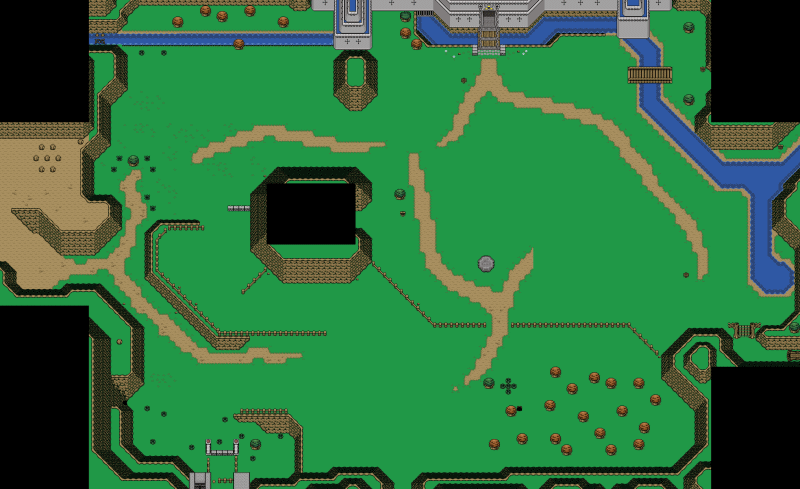
jimmyb - Nice!! Is that MM I see. Anyway, I think the palette doesn't match the original feel and there's a little too much on the ground. Also the bridge is too big. Other than that it's a great remake.

Thanks! The screen is apart of my newest map I'm working on, in which the inner section of the City is based off Clock Town. So it's not actually Clock Town, which is why I chose this palette, as the City is somewhat old and ruined.
QUOTE(T. Platinum @ Apr 27 2009, 08:04 AM) View Post
jimmyb:Looks nice, but I don't really like those passage tiles to the right of the screen. The screen reminds me that one back alley in MM.
QUOTE(Questwizard88 @ Apr 27 2009, 04:42 PM) View Post
jimmyb: The passage tiles on the right do look 'weird'. Other than that, its pretty nice. I'd give this a 7.5/10

The passage tiles are meant to be stairs, but DoR seems to be lacking in really nice stone stairways. Thanks for the comments. icon_biggrin.gif
QUOTE(Alestance @ Apr 27 2009, 08:42 AM) View Post
Also, jimmyb, stop remaking Majora's Mask icon_razz.gif
You can't force me to stop! icon_razz.gif
QUOTE(Shiek @ Apr 28 2009, 01:04 AM) View Post
I like jimmyb's this time most. But if it should be clock town than the palette is wrong : \ Need to be more orange/brownish in my opinion. But I like it anyhow.

Yeah, as I said before about the palette, I'm going for a bit of a different feel than Clock Town. Thanks! icon_biggrin.gif
QUOTE(Miragos @ Apr 28 2009, 01:25 AM) View Post
jimmyb: 9(with al little "-")/10
Looks like this place in MM. Really nice,but why are you hitting this chicken^^

Link's is happy to see the chicken... Why else would he hit it? icon_shrug.gif

Thanks for all the feedback guys!

Edited by jimmyb, 29 April 2009 - 01:32 AM.


#24 Russ

Russ

    Caelan, the Encouraging

  • Administrators
  • Location:Washington

Posted 29 April 2009 - 09:14 AM

This is one of those really tough choice ones. I think I'm going to go with Radien, because, well, I like good looking field screenshots. icon_smile.gif

#25 Zenith

Zenith

    Old Guard

  • Members

Posted 29 April 2009 - 06:21 PM

Heh. Radien wins. Definitely the best overall feel out of them. Is that the Dominion Rod? Maybe a few flowers would add to the ground detail.

Also, are you planning on submitting those updated water rocks, or the new dirt, or the MC water, or a DoR Tileset update? Come on, keeping those to yourself and leaving the rest of us with worse stuff just isn't fair, man. icon_rolleyes.gif

#26 Radien

Radien

    Courage

  • Members
  • Real Name:Steve
  • Location:Oregon

Posted 30 April 2009 - 07:13 AM

QUOTE(Twilight_Knight @ Apr 28 2009, 04:12 AM) View Post
@ Radien: Usually people put around flowers and rocks and all kind of different stuff to detail the screen, but you use just basic stuff to do it, that makes it "undetailed", but actually this looks very good.

Hmmm... not to put words in anybody's mouths, but perhaps the word you're all looking for is "minimalist"... (and as any Super Smash Bros Brawl player knows, "minimalist" can be either a good or a bad thing)


QUOTE(Zenith @ Apr 29 2009, 04:21 PM) View Post
Is that the Dominion Rod?

Hey, somebody finally asked. icon_smile.gif

It's similar. It's the Dominion Wand. The sprite is edited from somebody's Dominion Rod graphic. It'll produce an effect similar to the Dominion Rod, but more suited to ZC (and also more useful).

QUOTE(Zenith @ Apr 29 2009, 04:21 PM) View Post
Also, are you planning on submitting those updated water rocks, or the new dirt, or the MC water, or a DoR Tileset update? Come on, keeping those to yourself and leaving the rest of us with worse stuff just isn't fair, man. icon_rolleyes.gif

To tell the truth, I sometimes feel a little disheartened when I see so many DoR graphics used in other popular quests before DoR sees the light of day. I feel I want to reserve a few of the things I've edited. icon_unsettled.gif I will, however, release the new dirt (two kinds, in fact) in a little while. I'm debating releasing a large loose tiles update of many of the tiles that have dirt somewhere in them. I haven't finished that yet, so there's no reason to post it. The new tiles share the exact same format as the old ones, so ripping will be easy for you.

I'm trying not to let work on the tileset continue to interfere with the quest, though. I get so much done when I'm not editing tiles, organizing combos, packaging and uploading loose tiles, and doing sweeping graphical updates like the new dirt... much as I enjoy it all, it's a huge distraction. icon_blink.gif

#27 LostInHyru1e

LostInHyru1e

    Can you take me as far as PureZC?

  • Members
  • Real Name:Lost
  • Location:Refer to Screename

Posted 01 May 2009 - 03:02 PM

Radien- the design is decent and the waterfall looks good. Other than that, nothing about the water, ground, trees or colors makes it stick out to me. Just seems a little... plain.

Jimmyb- the detail and colors used in the screen are very eye-pleasing, but the design is entirely too square. I'm sure that screen would be great for gameplay, but it needs a little more of a natural, open feel for SoTW.

Migokalle- could use a bunch more layered detail on the stone sections, but I like the design and feel of this screen the best. Vote goes here.

Sheik- I know how hard it is to construct screens with that tileset, but it doesn't really look very good. The red in the house totally clashes with the color scheme and the rest of it looks washed-out. The design and details are good, but it's lacking in wow factor.

#28 Zemious

Zemious

    Magicite: Bahamut

  • Members

Posted 01 May 2009 - 03:30 PM

Migokalle gets my vote. icon_smile.gif

#29 Adem

Adem

    -

  • Members
  • Real Name:Anything except rap and country.
  • Location:New England

Posted 01 May 2009 - 06:20 PM

Radien - A little iffy in the top left corner. Something about the tree bugs me a lot.

jimmyb - Very nice shot. I almost voted for this one, but went with Radien instead.

Migo - Nice. icon_smile.gif But it seems a little plain in some areas. The bricks looks too GBish compared to the rest of the tileset.

Sheik - This is definitely not your best shot. The water is way to dull, the wood color on the house is way to dark, and the roof of the house is just...Bleh. Everything totally clashes with the bright grass of the MC set. Parts of wood that are supposed to be light are dark as well, like on the top of the stump. If you want to go with the darker colors, find something else for the grass before anything else.

#30 Radien

Radien

    Courage

  • Members
  • Real Name:Steve
  • Location:Oregon

Posted 03 May 2009 - 05:39 PM

QUOTE(Link R us @ May 1 2009, 04:20 PM) View Post
Radien - A little iffy in the top left corner. Something about the tree bugs me a lot.

What would you think if I changed it to a pine tree?...


0 user(s) are reading this topic

0 members, 0 guests, 0 anonymous users