IDGI, this has nothing to do with what Nexas said. Because he explicitly stated only one screen hurts his eyes due to the colours used, he didn't say all the shots did nor did he say they need a clean up. But I'm glad you've decided from now on, promote clean, non-eye-straining screen design, that's always a good thing. 
But yeah, I have to agree with Nexas somewhat. Funky surreal colours can work, but not if they jarring and not using the right Csets. There's a palette in the Dance of Remembrance tileset anyway that would be perfect for a magical garden. I think it was calling "Shrooming"? It's a neat surreal palette to be certain. 
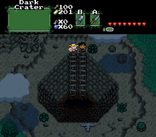
Everyscreen shot was very good this time with landscape, and you all voted for a Hole in the ground with not a clue for being a complete landscape and probs the most less of landscape this time around as what the hole is, as it's excuse is being Diagonal and everyone bought it ups.
Zahalfor
Is the winner and you all know it.*
I'm still going to do what i'm going to do by
saying you all choose the 'darkest looking picture' in all the screenshots with the highest vote even though it does not look the best.
The Best judges should Cut the corners in their votes instead of basing it in the worst possible manner.
(The highest vote for the pick with the worst color scheme ..)
So it is questionable at most, no matter how you paint it - The people seem to have voted based upon the most faded of colors.
This time and some others in the past or the Shot with the most of less color this time.
As it's a complaint over color and plainess this time around.
You are all clearly being random even though you gave cheesy liking to everyones pic, you still choose the dark hole because it represents emptyness in all your votes.
If making a big empty HOLE that takes up the whole picture in a screenshot is what it takes to win a contest.
No offense to everybody Intended by me, I think very very deeply about things and it's what people really should try doing.
I see symbolism
in screenshots as it is called Freemasonry.
Edited by SkyLizardGirl, 05 December 2014 - 04:48 AM.

 This topic is locked