Joelmacool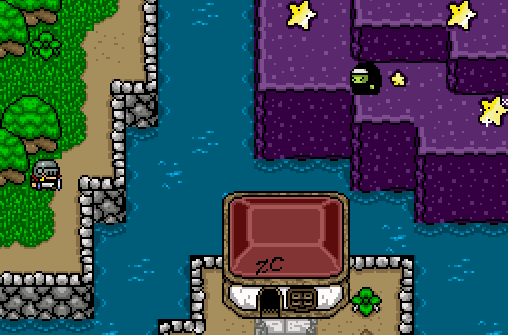
The Witch wants to destroy ZC! Protect ZC!
Whiterose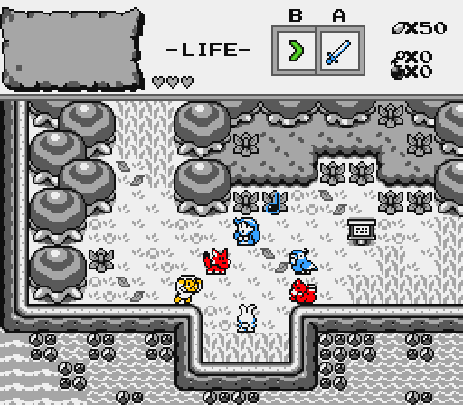
The Oracle of Ages Nayru, injecting some colour into this drab world.
Shane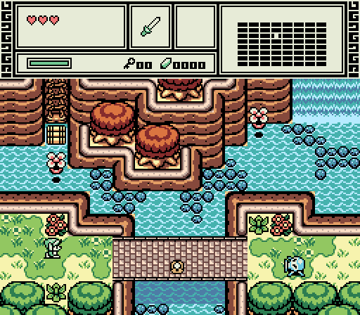
Damn, I really must find a way to reach those volcanic woods up north. (Subscreen WIP)
Anthus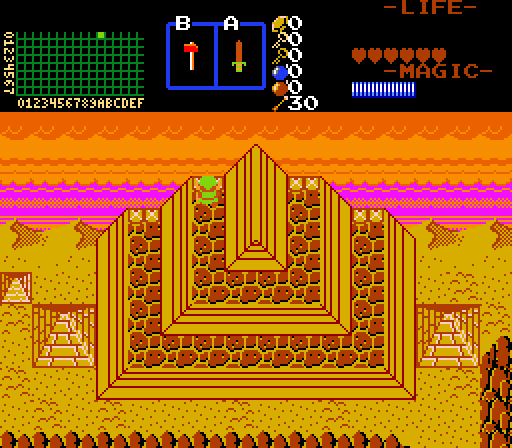
Does it really matter if Link has no bombs or rupees or even stairs reaching his location?
GrantGreif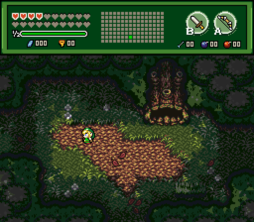
Will the boy ever make it out of the woods?
ywkls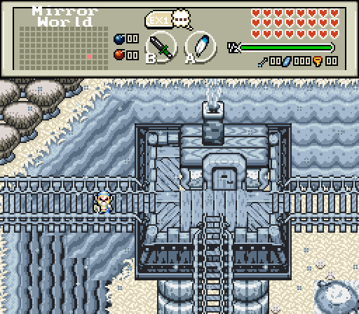
I wonder if it is possible to get down there?
Sheik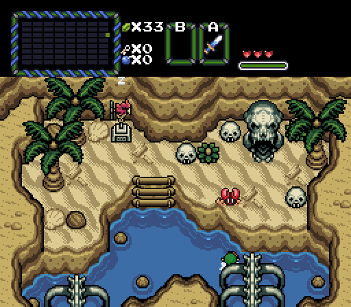
Jared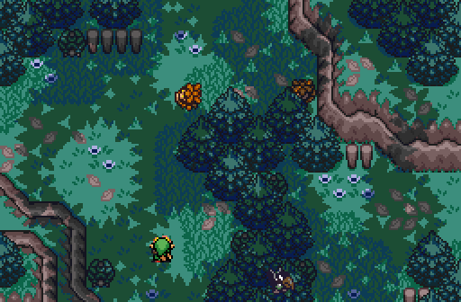
A peaceful forest, with a few enemies waiting to attack!

Screenshot of the Week 552
Started by
nicklegends
, Mar 27 2016 08:16 PM
Shane Joelmacool Whiterose Anthus GrantGreif ywkls Sheik Jared
-
 This topic is locked
18 replies to this topic
#1

nicklegends
-

- Contributors
-

Trofessional Pransposer
- Real Name:Ed
- Pronouns:He / Him
Posted 27 March 2016 - 08:16 PM
- Joelmacool, walomello, Matthew and 1 other like this
#2
Cukeman
-

- Banned
-

"Tra la la, look for Sahasrahla. ... ... ..."
- Location:Hyrule/USA
Posted 27 March 2016 - 09:14 PM
Joelmacool
Loving the toon vibe of the tiles in the upper-right quadrant. May I ask where they are from? Reminds me of things like Kirby, Starfy, Mario & Luigi, Paper Mario, etc. EDIT: Are the stars falling towards the building like meteors or sitting on the ground? Also the building's roof is 3 tiles high, so the base must also be three tiles high, so I guess the building's base is one tile over the edge of the cliff? Might tip over and fall into the lake.
Whiterose
Nice idea. The left-most edge is kinda plain, might be worth it to adjust the design/layout.
Shane
Very nice, very nice. 2nd place.
Anthus
Wow, this totally caught me off guard- way to capture some dramatic scenery with a classic tileset!!! Voted.
I'm not really on-board with some of the color choices to be honest (that default mountain brown is just too red-orange for a background element IMO- I would prefer a duller brown to bring the focus to the foreground), but this is such a cool shot I don't even care about the issues I have with your color choices.
GrantGreif
Great mood.
ywkls
The tower and bridges work, but the background seems a little plain. Also, looks like some connecting diagonal mountain tiles are missing.
Sheik
Nice. A very simple screen, but attractive to look at.
Jared
Sometimes canopies make things kinda hard to see. I feel this is one of those times.
Edited by Cukeman, 28 March 2016 - 01:08 AM.
#3
ywkls
-

- Members
-

Master
Posted 27 March 2016 - 09:14 PM
A crop of very nice shots this week mixed in with a few I don't know what to make of. So here's my thoughts on them since I nulled voted due to my entry.
Joelmacool- Those purple mountains look.... different. In fact, almost everything in this shot isn't something I normally see. I'm not even sure what tileset it is. The scene does seem a bit sparse of features, though.
Whiterose- If black and white with a splash of color was your objective, then you succeeded. Nothing too remarkable here otherwise.
Shane- There are a lot of nice things in this shot. Almost too many to mention. The swamps, the bridge, it's all very high quality. My third favorite.
Anthus- This shot is very.... yellow. I can't say anything else really, cause I'm practically blinded by the glare.
GrantGreif= This is my favorite competitor's shot. Dark, moody, shadows in all the right places, lots of detail. It has everything going for it.
Sheik- My second favorite shot. A beach, with Skull Woods stuff on it. You've given me idea which I might one day steal... er, borrow.
Jared- There's simoly too much excellent competion for me to give this shot a higher rating. It's good, but not as good as the three I already praised.
Very good job all around!
- Shane likes this
#4
Matthew
-

- Administrators
-

- Real Name:See above.
- Pronouns:He / Him
- Location:Ohio
Posted 27 March 2016 - 09:40 PM
Well, this is a very good week! Here's my feedback for each screen.
Joel - It looks fine, but there's a lot of style clashing and it's a tad bit too nonsensical for my tastes.
Whiterose - I like the design of the screen, but it's a bit too boxy.
Shane - Very nice screen, as usual. If I hadn't seen so many GB screens recently, I would have voted here.
Anthus - Hmm... This screen looks familiar! I believe it's a screen from an old map you posted. It's a very nice shot, but the coloration of the pyramid seems a bit off to me.
GrantGrief - This is a very nice screen, and I can tell you put a lot of work into it. However, I just do not like that Tileset at all. It's too gaudy for my tastes. Maybe someone else who shares my sentiments can explain better.
Ywkls - Again, neat concept, but I don't like that Tileset.
Sheik - A very nice screen. I would have voted here if it wasn't for...
Jared - This screen won my vote. Excellent design and atmosphere. I have no real objections. Fantastic job!
Edited by FlameCursed, 27 March 2016 - 09:41 PM.
- Shane likes this
#5
Tree
-

- Members
-

Everything must go away
- Real Name:Mundy Fumple McStroodlestein
- Location:The Milky Way Galaxy
Posted 27 March 2016 - 09:45 PM
Very hard decision this week. I ended up going for Sheik because it felt the most Zelda to me. Everyone else did a fantastic job, though. Keep up the work, everybody~!
#6
MermaidCim
-

- Members
-

Yes I'm that guy who dreamt Dani was Zelda. LOL Cimfam/zelda
- Real Name:Michael
- Location:Danbury, CT
Posted 27 March 2016 - 09:54 PM
Anthus. I don't have a really good reason other than the fact it jumps at me most, all are equally good this go-around.
#7
Joelmacool
-

- Moderators
-

Addicted to Overwatch
- Real Name:Joel
- Location:Country of Europe
Posted 28 March 2016 - 05:13 AM
Joelmacool
Loving the toon vibe of the tiles in the upper-right quadrant. May I ask where they are from? Reminds me of things like Kirby, Starfy, Mario & Luigi, Paper Mario, etc. EDIT: Are the stars falling towards the building like meteors or sitting on the ground? Also the building's roof is 3 tiles high, so the base must also be three tiles high, so I guess the building's base is one tile over the edge of the cliff? Might tip over and fall into the lake.
The tileset is: Penguin and Pie The tileset was incomplete so it was really difficult for me to create a screen without tile errors.
The stars are inside the ground... odd, right?
And the building is meant to be one tile over the edge of the cliff, it's one of these houses. (The perspective makes it look odd)
Joelmacool- Those purple mountains look.... different. In fact, almost everything in this shot isn't something I normally see. I'm not even sure what tileset it is. The scene does seem a bit sparse of features, though.
The tileset is:Penguin and Pie
Joel - It looks fine, but there's a lot of style clashing and it's a tad bit too nonsensical for my tastes.
Alright, I'll keep that in mind for next SotW... but, what tileset should I use?
Thank you all for your criticism! I will keep everything in mind for next time!
I don't know what tileset to use next, so, why don't you tell me what to use (I will not accept the bad tilesets (0-2 stars).
EDIT: I realised that Jared won the past 3 SotWs... will he be the third one to win all 4 in the month?
Edited by Joelmacool, 28 March 2016 - 05:16 AM.
#8
Sheik
-

- Members
-

Deified
Posted 28 March 2016 - 05:16 AM
Thanks for the feedback, everybody.
Sheik- My second favorite shot. A beach, with Skull Woods stuff on it. You've given me idea which I might one day steal... er, borrow.
Yep, go ahead. Since there is no Dark World in the quest I first considered making a Dark Word inspired desert area. But then I scrapped the plans for having a desert area and decided that the desert should be part of the beach area. So I chose to use the Dark World stuff on the beach screens. I actually really like how that works, I has a pirate-y vibe imo. And I am fond of the way these bones look as a water overlay, too.
Very hard decision this week. I ended up going for Sheik because it felt the most Zelda to me.
That's what I was going for. Well, am going for. So that's nice to hear! On a sidenote: the sprites and subscreen stuff is all placeholders, as per usual. Eventually it'll be all LttP-esque stuff (again - I did this in another questfile before which had the benefit of having all the sprites. Everything else was a mess, though, so I changed back to a more organized file).
I would have probably voted for Shane's. I'm a sucker for good GB Zelda.
Edited by Sheik, 28 March 2016 - 05:18 AM.
- Shane likes this
#9
Eddy
-

- Moderators
-
ringle
- Real Name:Edward
- Pronouns:He / Him
- Location:London, United Kingdom
Posted 28 March 2016 - 06:05 AM
This is a pretty tough week...
Joelmacool - What an interesting way to use a very old tileset hardly anyone has ever heard of ![]() I like how it looks and I got no complaints with it.
I like how it looks and I got no complaints with it. Now make a quest using this tileset
Whiterose - I really like the concept of what's going on here. The screen looks great and it feels very LA-like. I guess you can say this quest is gonna end up as "Zelda Colour Splash" amirite B)
Shane - This looks fantastic. Really love everything here and I'm seriously getting hyped for this quest ![]()
Anthus - Very unique screen here, especially with the classic set. Feels very Z3 like for some reason, with Pyramid in the Dark World (though I assume that's definitely not where this is taking place). Looks good anyway.
GrantGreif - Looks pretty spooky indeed. I like the screen design, but I feel like the screen may bit a bit too dark to the point where some trees and other objects around the edges look weird, but eh maybe it's just me lol Looks great anyway.
ywkls - I do like that house in the middle of the screen, though there are several errors I've spotted. First of all, that mountain to the left side looks pretty badly done, and the transition looks terrible. The rock on the bottom-right of the screen also badly fits in as the grass around it has a different colour to the rest of the grass on the screen. The white around the bottom of the house also looks weird compared to everything else around it. Good idea, but I feel like there's still much more to improve on.
Sheik - Dam son, this looks awesome. It reminds me of FSA's beach area, which was a really cool part of the game. The tileset is used amazingly well here and I love how it looks.
Jared - Really love how this looks. Not too dark, not too bright either, it's pretty perfect. The design also looks pretty spectacular too, great job!
Very close between Sheik, Shane and Jared. Even closer between Sheik and Shane, but I voted for Shane in the end. Everyone had really unique shots this week.
- Shane likes this
#10
Naru
-

- Members
-

Magus
Posted 28 March 2016 - 06:12 AM
Joelmacool - Always nice to see another tileset, but nothing special otherwise.
Whiterose - I do not like the trees too much, the tops seems a bit like stretched from 16x16 and also the sprite-colours are a bit too heavy compared to black and white.
Anthus/ywkls - Most impressive ideas, but in both cases - especially regarding colours - the screens are near to unbearable to look upon for me.
GrantGreif/Jared - I like both of your shots (though I do not really like the deku sprites or the DoR-Link), really atmospheric. Jareds is more solid, maybe a bit boring (since not much going on), but I would like a whole forest like that. GrantGreifs is far more atmospheric, but I think it will be hard to make an interesting forest like that, especially since the darker areas do not look too great.
Shane/Sheik - Regarding colours and screen design both shots are beautiful and pretty much perfect. Sheiks shot has some minor things (like the palm leaves looking odd, the mointains rendered black clash a bit, the skull entrance is too detailed), so I go with Shane. Also, I love your subscreen, only the white line is not the best transistion to the screen.
- Shane likes this
#11
Sheik
-
- Members
-
Deified
Posted 28 March 2016 - 10:19 AM
Thanks to both of you two, too. Much appreciated.
So, here's the screen just south of my entry. I think they look best together. Or well, convey the idea behind the design best. The dungeon is in a bit of a dead end, so the large bones should lead the player to investigate what's up just north. Also, you can go there before you can swim, so the idea is that you can see this earlier than you can reach it and that way it might inspire some curiosity as to what's going on there.

Edited by Sheik, 28 March 2016 - 10:20 AM.
- Rambly, Shane, Eddy and 5 others like this
#12
Shane
-

- Moderators
-
💙
- Pronouns:He / Him
- Location:South Australia
Posted 28 March 2016 - 10:36 AM
If I had not entered, I would of voted for either Jared or Sheik. Both are amazing! (Interestingly enough, I thought opposite of what Naru said; I thought Jared had something going with the enemies and exploration within a dark and deep forest! But to each their own, I suppose.)
Edit: Oh, it seems prior to this post I had at some point voted for Jared. Weird, but I'll leave my vote there.
Good entries all around regardless. ![]()
- Naru likes this
#13
Anthus
-

- Members
-
Lord of Liquids
- Location:Ohio
Posted 28 March 2016 - 11:32 AM
Wow, this is one huge turnout. I probably would have voted for Shiek had I not entered. GrantGrief and Jared ave really nice forest shots.
#14
Colin
-

- Members
-

Coblin the Goblin
Posted 28 March 2016 - 01:47 PM
Voted for Shiek because the graphics are appealing, the shot is well designed, and most importantly, it looks unique. I don't think I've seen a shot like that before, so I really appreciate the creativity.
- Rambly and Sheik like this
#15
Rastael
-

- Members
-

Wizard
- Real Name:Raphael
- Location:Austria
Posted 30 March 2016 - 03:28 AM
Too many great screenshots this week! XD
In the end, my vote goes to Sheik, because the idea of the Screen feels new. I never saw that Kind of beach in ZC before. ^^
Edited by Rastael, 30 March 2016 - 03:28 AM.
Also tagged with one or more of these keywords: Shane, Joelmacool, Whiterose, Anthus, GrantGreif, ywkls, Sheik, Jared
PureZC Events →
Screenshot of the Week →
Poll Screenshot of the Week 812Started by Taco Chopper , 15 Apr 2024 |
|

|
||
 |
Matthew
PureZC Events →
Screenshot of the Week →
Poll Screenshot of the Week 811Started by Taco Chopper , 01 Apr 2024 |
|

|
|
PureZC Events →
Screenshot of the Week →
Poll Screenshot of the Month 200Started by Taco Chopper , 01 Apr 2024 |
|
|
||
|
|
Shane
PureZC Events →
Screenshot of the Week →
Poll Screenshot of the Week 810Started by Taco Chopper , 20 Mar 2024 |
|
|
|
|
|
Jenny
PureZC Events →
Screenshot of the Week →
Poll Screenshot of the Week 809Started by Taco Chopper , 06 Mar 2024 |
|
|
0 user(s) are reading this topic
0 members, 0 guests, 0 anonymous users

