Jump to content

Photo

Screenshot of the Week 368


  • This topic is locked This topic is locked
37 replies to this topic

Poll: Screenshot of the Week 368 (53 member(s) have cast votes)

~

You cannot see the results of the poll until you have voted. Please login and cast your vote to see the results of this poll.
Vote

#31 Shane

Shane

    💙

  • Moderators
  • Pronouns:He / Him
  • Location:South Australia

Posted 30 May 2012 - 02:51 AM

QUOTE(Radien @ May 30 2012, 05:14 PM) View Post

Shane:
Very nice. icon_smile.gif You've taken a nice mixture f tiles from diffferent tilesets and put them all together in a very correctly-designed screen. (Now, I DO wonder whether it's possible to fit between the brush and the mountain on the left to access the west side warp, but I'm not going to split hairs.)

No subscreen or enemies, but due to everything else coming together so nicely, I like it quite a bit.


But Link is in there this time at least. icon_awesome.gif

As for the west side issue it's already been solved thanks to the power of layers. icon_razz.gif Thanks! icon_smile.gif

Edited by Shane, 30 May 2012 - 02:53 AM.


#32 Hergiswi

Hergiswi

    don't look for me, i'm just a story you've been told

  • Members
  • Real Name:chris
  • Location:house

Posted 30 May 2012 - 10:57 AM

QUOTE(Radien @ May 30 2012, 03:44 AM) View Post

Hergiswi:
This is all right, but a little too boxy. My eyes are also a little confused by the waterfall. Is that water sitting on top of a raised area, or is the rock portion simply a wall or a dike separating you from a lake?...

I'm curious what the half-submerged Armos is doing. Some kind of interesting obstacle or new enemy?

The screen above it is supposed to a flooded area, and the waterfall is basically supposed to show that the flooded area is spreading to the lower part of the mountain (which is the area in the shot). Somebody pointed out that I didn't really give any reason to think that the elevation of the mountain is increasing, so I think that should be my first fix.

I got the idea of the armos from the Tarm Ruins in Oracle of Seasons. When you first enter it, there are old armos statues that don't turn into actually enemies, and I believe was to give a "ruins" or destroyed feel to the area. You have to push one of them into the water to get through a pond, hence the water tile. I was pretty much emulating that, thinking that it would show that something used to belong there, but it got ruined in the flood.

#33 Marco

Marco

  • Banned

Posted 30 May 2012 - 11:44 AM

QUOTE(Radien @ May 30 2012, 01:44 AM) View Post


Marco:
Ahh, another one of your nice Metroid screens. I always have a hard time trying to decide whether to vote for these, because the tiles look fantastic, but as in cases like this one, it is merely a whole bunch of boxes, pipes, etc. being used to construct a solid area. In other words, your graphics are excellent, but the skill that goes into the actual screen design is very basic, even though that's all the quest requires. This time I decided to go with a different shot.


Meh. The reason I choose to design that solid chunk was for realism. Pipes, metals and vents because in space, that's how ships are. A protective barrier to contain an artificial environment and maintain balance.

#34 aaa2

aaa2

    Wizard

  • Banned

Posted 30 May 2012 - 11:57 AM

Dragonite:
This screen looks pretty standard but its good. 7/10
Hergiswi:
this screen is well a bit empty but because i like the gameboy tileset i will give you 3/10
Marco:
I have seen better screens in your thread so 5/10
Shane:
I didn't think i would say that but i actually like your screen(but the first triangle floortiles you had were nicer) 9/10
Artistic:
It seems a bit chaotic and its classic tileset, however its modified and creative. 6/10
Nolornbon:
I do not get this screen. some background is too similar to platforms. Not my type of screen sorry... 3/10

#35 Artistic

Artistic

    Warrior

  • Members
  • Location:Tornado Alley

Posted 30 May 2012 - 12:01 PM

QUOTE(Gonken @ May 28 2012, 01:07 PM) View Post

Voted Artistic. icon_razz.gif
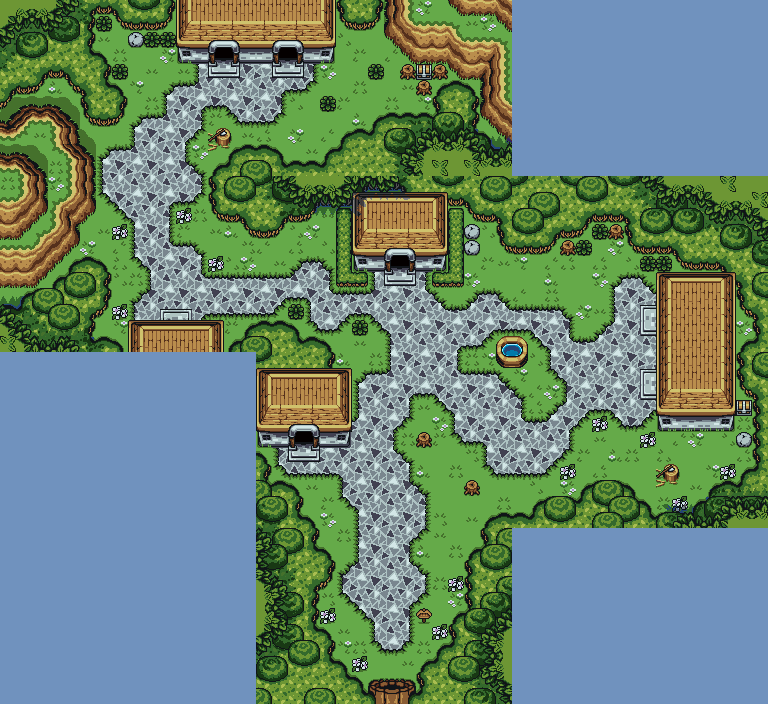
The water caught me directly.

Thank you for your vote. I glad you like the water. icon_biggrin.gif I have another river and lake in my quest.

QUOTE(Keiichi123 @ May 28 2012, 01:23 PM) View Post


Artistic: Brilliant! No idea what else to say but brilliant! 9/10

Thank you for your comment. icon_biggrin.gif

QUOTE(Shane @ May 29 2012, 05:34 AM) View Post

Artistic
Nice, love the river and use of graphics. But the thing that really bugs me is that the green-brown mountains, fuzzy styled big trees, and brown outline tiles clash the rest of the screen and how there is barely any room to walk with. 5.5/10

Thank you for you comments. Glad you like the river and use of graphics. icon_biggrin.gif Trying to just use the classic set graphics with just recoloring or editing a little. Sorry! you don't like the green and brown mountains. I tried different colors to replace the original light color in the mountains. That shade of brown is the only one that looked right to me in the palette I'm using. I might do some more experimenting.
The fuzzy styled big trees I was trying to give the trees more depth so they didn't look so flat. But being flat is what the classic set is suppose to look like. I'll probably won't keep them.
I don't know exactly what brown outline tiles your talking about. Yes, I know it is to much that thought had occur to me when I was making that screen.

QUOTE(Radien @ May 30 2012, 02:44 AM) View Post

Artistic:
While I really like the organic feel of the river and its riverbank, I feel this screen is too crammed with stuff. It really should be two screens: one for the cottage and one for the river. NES mountains tend to look squished if they are too narrow on the vertical.

Thank you for you comments. I'm glad you like river and the riverbanks. icon_biggrin.gif I think I achieved what I was going for.
When I started to put the house in I had thought it might be too much! But I did it anyway. icon_unsettled.gif I did take out some of my mountain to put the house in.
I did want a info house there but I'll have to figure something else out.

#36 Mister Snooze

Mister Snooze

    Paladin

  • Members

Posted 30 May 2012 - 02:51 PM

QUOTE(Shane @ May 29 2012, 06:46 PM) View Post

Thanks! Yeah tough competition, but that's what makes SotW fun. icon_biggrin.gif


I also took into consideration that this is a first time try for artistic and as such I think she is doing great.

#37 Linkus

Linkus

    .

  • Members
  • Real Name:Adam

Posted 03 June 2012 - 10:04 PM

You know, I forgot to input what I was going to say about this weeks competition!

I had to null, and here's my reason why.

Instead of the usual methods many voters use, I decided to let the comfort of my eyes to choose.

...My eyes had none. Either the screen was too busy, had nothing to directly focus on, or just felt too displeasing to even look at. How you build your screen also determines just how much it attracts and keeps attention of the player's eyes, and trying to maintain that balance lets the player remember that screen better, thus makes navigating the land and the dangers associated with that screen much easier. Look at the screens from LA, and you'll notice that each one is distinctly different from each other; that distinction is what makes navigation so easy and maintains the game's flow.

So remember, less is more, place that tree accordingly, and attract the player's attention enough that they will remember the screen. It will work!

(Oh, and guys, I know you like my palette, but if you still want to enjoy it, don't turn it into the next Hint of Ruin. Older members here remember that, right?)

#38 Neppy

Neppy

    Grand Overlord Empress

  • Members
  • Real Name:It's dangerous to go alone. Take Nep!
  • Location:Minnesota

Posted 04 June 2012 - 01:08 AM

Dragonite - 7 votes = 15.22%
Hergiswi - 1 vote = 2.17%
Marco - 3 votes = 6.52%
Shane - 23 votes = 50.00%
Artistic - 11 votes = 23.91%
Nolornbon - 1 vote = 2.17%

Total Votes: 46

Shane
IPB Image
Link is going on yet another grand adventure to restore the stolen light!

Congrats on a wonderful screen this week, Shane! icon_biggrin.gif


0 user(s) are reading this topic

0 members, 0 guests, 0 anonymous users