
Screenshot of the Week 279
Started by
Mitchfork
, Dec 28 2009 07:25 PM
-
 This topic is locked
20 replies to this topic
#16

Koh
-

- Members
-

Tamer Koh
- Real Name:Dominic
- Location:Monsbaiya, Virginia
Posted 29 December 2009 - 06:22 PM
Ebola Zaire won this vote  .
.
#17
Bourkification
-

- Members
-

Magus
Posted 29 December 2009 - 07:19 PM
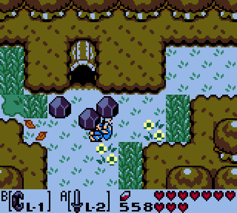
It was a really hard choice between Sheik and Ebola Zaire. I nearly tossed a coin over it. In the end I did go with Ebola, but Sheik put up a pretty good fight.
@Ebola: The have two suggestions for you. Firstly, you might want to close off the corners of the screen, unless you are purposely not closing them off, to give a sense of openness as your in a desert setting. Secondly, I don't like the way the water transitions with the DoR cliffs. It looks like the cliff comes over the top of the water, when it should look like the water hits the side of the cliff. It should look more like this on the left:

While currently it looks like it does on the right. Apart from those two little things, it is a well constructed screen.
@Sheik: Lovely screen that captures OoT very well. The one thing that really bugs me is the hollow at the very top of the screen. It just looks wrong. I suggest ripping the two tile wide one that is the the Pure tileset. It uses only two colours for the trunk bit, and it would fit in the Gameboy style.
EDIT: Or you could use it like this.
@Moo2wo: I wouldn't be discouraged by the result, as you are up against two of the best screen designers at PureZC. First off, next time you enter don't save the shot as a JPEG; it makes the shot all blury and not nice to look at. I thought it is quite a good screen however. You should make the warp tile a blue or green colour so it contrasts with the rest of the screen, as it took me quite a while to recognise what it was. Any important features of the screen should be instantly recognisable. And the lava fall comes out of nowhere. It just starts a tile down from the top of the screen, and It looks quite awkward. Keep going with it though, because you show signs of becoming a really good screen designer.
@Ebola: The have two suggestions for you. Firstly, you might want to close off the corners of the screen, unless you are purposely not closing them off, to give a sense of openness as your in a desert setting. Secondly, I don't like the way the water transitions with the DoR cliffs. It looks like the cliff comes over the top of the water, when it should look like the water hits the side of the cliff. It should look more like this on the left:
While currently it looks like it does on the right. Apart from those two little things, it is a well constructed screen.
@Sheik: Lovely screen that captures OoT very well. The one thing that really bugs me is the hollow at the very top of the screen. It just looks wrong. I suggest ripping the two tile wide one that is the the Pure tileset. It uses only two colours for the trunk bit, and it would fit in the Gameboy style.
EDIT: Or you could use it like this.
@Moo2wo: I wouldn't be discouraged by the result, as you are up against two of the best screen designers at PureZC. First off, next time you enter don't save the shot as a JPEG; it makes the shot all blury and not nice to look at. I thought it is quite a good screen however. You should make the warp tile a blue or green colour so it contrasts with the rest of the screen, as it took me quite a while to recognise what it was. Any important features of the screen should be instantly recognisable. And the lava fall comes out of nowhere. It just starts a tile down from the top of the screen, and It looks quite awkward. Keep going with it though, because you show signs of becoming a really good screen designer.
Edited by Jimmyb, 29 December 2009 - 07:36 PM.
#18
Moo2wo
-

- Members
-

Yes, you're seeing this.
- Location:The Mushroom Kingdom
Posted 29 December 2009 - 07:41 PM
The reason the lava fall comes out of nowhere is because you're supposed to fall in through a hole in a volcano.  I simply couldn't think of a better way to handle it, which is also the reason the warp tile's there. And thank you very much for the compliments, JimmyB. I'm definitely trying to learn how to be a good screen designer. For the record, I'm not discouraged in the slightest by the results; I'm happy with the one person who decided to vote for me.
  Again, thanks very much for the compliments. And if you have a suggestion on how to make the lava fall look less awkward or a image hosting-website that doesn't convert it to JPEG, please tell me.
~Moo2wo
~Moo2wo
#19
Mitchfork
-

- Members
-
no fun. not ever.
- Real Name:Mitch
- Location:Alabama
Posted 29 December 2009 - 10:18 PM
Thanks for the comment Jimmyb. One of the things I remember most people criticizing about this area was the water borders; I haven't done anything about them as of yet, but your suggestion seems solid. I'll be sure to try it next time I have the file (Plissken has it currently, and I won't be able to work on it for about a week). As for the corners, I considered doing something more with the top-right but didn't because I think the screen has enough as it is. Hopefully, as the desert gets further away from the coast big stuff will get more sparse.
Anyway, as is my custom I'll comment on the other screenshots this week. I null voted of course.
Sheik: Fantastic screen as always. If I had to pick something to improve... (and that's hard to do)... the bottom part seems a little flat to me. Maybe some logs or something down there would have helped.
Moo2wo: Lava falling into a volcano doesn't make much sense. You could go the OoT route and use light beam tiles like this and eliminate the tile warp as well; but I can't promise that it'll look less awkward going all the way to the top of the screen. Otherwise, it is a nicely designed screen, but I think you could've cut back on the floor borders.
QUOTE(lucas92 @ Dec 28 2009, 09:01 PM) 
Ebola Zaire: It's fine but I've seen it before. 
I don't think I've shown this screen anywhere; or do you mean that you've seen similar from me?Anyway, as is my custom I'll comment on the other screenshots this week. I null voted of course.
Sheik: Fantastic screen as always. If I had to pick something to improve... (and that's hard to do)... the bottom part seems a little flat to me. Maybe some logs or something down there would have helped.
Moo2wo: Lava falling into a volcano doesn't make much sense.
#20
Moo2wo
-
- Members
-
Yes, you're seeing this.
- Location:The Mushroom Kingdom
Posted 29 December 2009 - 10:32 PM
Really it's more like an ocean of lava, and there's occasional craters which, naturally, lava would fall down into.
And thanks for the tiles! I'll switch them as soon as I can.
~Moo2wo
And thanks for the tiles! I'll switch them as soon as I can.
~Moo2wo
#21
Neppy
-

- Members
-
Grand Overlord Empress
- Real Name:It's dangerous to go alone. Take Nep!
- Location:Minnesota
Posted 03 January 2010 - 01:45 PM
Ebola Zaire - 23 votes = [53.49%]
Sheik - 18 votes = [41.86%]
Moo2wo - 2 votes = [4.65%]
Total Votes: 43
Ebola Zaire

I've seen so much in so many places, so many heartaches, so many faces, so many dirty things you couldn't even believe.
Congrats Zaire! Awesome Screenshot.
Sheik - 18 votes = [41.86%]
Moo2wo - 2 votes = [4.65%]
Total Votes: 43
Ebola Zaire
I've seen so much in so many places, so many heartaches, so many faces, so many dirty things you couldn't even believe.
Congrats Zaire! Awesome Screenshot.
0 user(s) are reading this topic
0 members, 0 guests, 0 anonymous users

