Lunaria
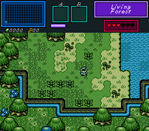
A humble beginning...
Joelmacool
The Mermaid has perished as a result of the water draining...
Lüt
I may or may not be working on some new classic dungeon tiles...
Sephiroth

 This topic is locked
May the way of the Hero lead to the Triforce.

Posted 02 October 2016 - 08:43 PM
Lunaria
A humble beginning...
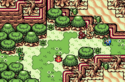
Joelmacool
The Mermaid has perished as a result of the water draining...
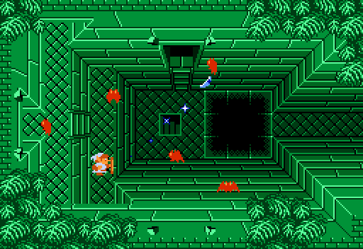
Lüt
I may or may not be working on some new classic dungeon tiles...
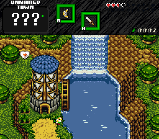
Sephiroth
Tiny Little Questmaker

Posted 02 October 2016 - 08:52 PM
How to win the Moosh vote almost guaranteed: Make a Classic screen with depth. That's a fine screen there, Lüt.
Magus

Posted 02 October 2016 - 08:52 PM
Voted for Joel. Excellent GB shot. Sephiroth was a very close second, but something about the palette just seems a bit off to me. Might just be a personal thing though.
Deified

Posted 02 October 2016 - 08:55 PM
I voted for Lut for one of the coolest Z1 dungeon screens I've ever seen. It's inspired me.
Deified

Posted 02 October 2016 - 09:13 PM
I voted for Sephiroth. Screen looks fine, simple and nice. I'm not a fan of the bushes, as they blend in with the grass. And that god awful Link...he's pretty gross looking.

Posted 03 October 2016 - 08:01 AM
Well-made classic screens always win me over, so I voted Lut.
ringle

Posted 03 October 2016 - 10:59 AM
Lunaria - Very nice simple shot. Looks very GB-like and I really like the combinations of grass and leaves in this one. Also thank you for using water tiles properly, it's a personal pet peeve of mine when people use shallow water tiles for deep water lol.
Joelmacool - The contrast between the desert setting at the bottom and the forest at the top is really cool, it's kinda like the place is going through some sort of extreme weather event or something. The screen itself looks great and the palette is great.
Lut - This is a really cool classic screen. It's pretty rare to see shots with this much depth done very well and I really love the 3 levels of elevation. The trees on top of the dungeon look really nice as well.
Sephiroth - Nice shot. I really like the watermill you have there and the river looks really cool. I do agree with Jared with the bushes though, they don't really seem to fit well with the screen at all IMO.
Overall, it was close between Joel and Lut, but I'm gonna go for Lut this week.
Yes I'm that guy who dreamt Dani was Zelda. LOL Cimfam/zelda

Posted 03 October 2016 - 12:20 PM
Between Lut and Sepiroth for me. I'm not crazy about the bushes either. They don't look like they go well here, and I think that alone decided my vote. Both were equally impressive. You know how much I love classic tilesets but there's something special about this one. Very nice.
Lut wins my vote
"Tra la la, look for Sahasrahla. ... ... ..."

Posted 06 October 2016 - 04:25 AM
Impressive week! As everyone said, Lut's is really cool (even with that one tile error), and the others are great too- hard to choose!
Germanize

Posted 06 October 2016 - 08:53 AM
GREEN WEEK!
How to win the Moosh vote almost guaranteed: Make a Classic screen with depth. That's a fine screen there, Lüt.
O.o
Well gee, thanks. Now that I know the secret, maybe I'll hijack the Moosh insta-vote more often.
I voted for Lut for one of the coolest Z1 dungeon screens I've ever seen. It's inspired me.
O.o
Both of PZC's Classic masters acknowledge my existence on the same day?
My life is complete ![]()
Heh, but you know, the more I kept expanding on the multi-tier concept, the more this notion kept growing in the back of my mind, that maybe I could possibly attempt completing the dungeon equivalent of the TRIFORCE overworld? I mean, obviously I'm a step behind you since I'm not adding additional texturing detail to the dungeon walls (King Aquamentus recently rocked that area). But in terms of layout possibilities, TRIFORCE was a huge inspiration in making me challenge all the limits I simply assumed the classic style had.
So, interesting to see the inspiration cycle come full circle. Never would've expected that.
Lut - This is a really cool classic screen. It's pretty rare to see shots with this much depth done very well and I really love the 3 levels of elevation. The trees on top of the dungeon look really nice as well.
The tree leaves were from this pack, which is apparently lifted from Contra 1.
Though, as is my usual habit, I ended up doing a massive tile expansion to make new arrangements out of them.
Impressive week! As everyone said, Lut's is really cool (even with that one tile error), and the others are great too- hard to choose!
Thanks, but, what tile error?
Yes I'm that guy who dreamt Dani was Zelda. LOL Cimfam/zelda
Posted 06 October 2016 - 03:33 PM
maybe the door on the left? IDK
The Shaman of Sexy!

Posted 07 October 2016 - 02:41 PM
I voted for Lüt. That was very unique. I approve! Really good turn out this round. ![]()
Justice is served!

Posted 08 October 2016 - 11:34 PM
I voted for Sephiroth. That DOR screenshot is looking good.
Lord of Liquids

Posted 09 October 2016 - 09:29 AM
May the way of the Hero lead to the Triforce.
Posted 09 October 2016 - 08:49 PM
With 57.14% of the vote, the winner of Screenshot of the Week 579 is Lüt!
Congratulations!
Voting totals:
- Lunaria (1 votes [2.04%])
- Joelmacool (10 votes [20.41%])
- Lüt (28 votes [57.14%])
- Sephiroth (10 votes [20.41%])
0 members, 1 guests, 0 anonymous users


